Google introduces its new logo
Google is sometimes making news for the least expected reasons. Case in point: today the search giant has changed its logo, and this already has amassed an incredible number of reactions. Some are good, some are bad (hint: people on the Internet generally don't like change).
All that aside, here's the new logo. This time around the company opted for a specially-crafted sans-serif font, as well as slightly tweaked colors. Google says it's "simple, uncluttered, colorful, friendly".
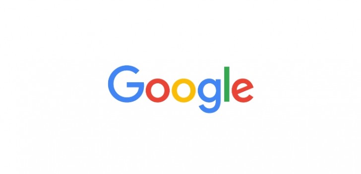
The logo obviously comes bundled with a new brand identity, one that we should be starting to notice inside Google products other than search very soon (search is the first to be updated, and that's already live if you haven't noticed).
To celebrate the introduction of the new graphics, Google has published the video you can see below, which pairs a visual history of the company's logos with quick descriptions of some of its biggest accomplishments.
There's also a smaller version of the new logo, a four-color "G" that replaces the previously used lowercase blue "g". This will mostly be seen on mobile devices, where space is at a premium.
Related
Reader comments
- ironman
- 02 Sep 2015
- 7j@
#Apple fanboy.
- AnonD-190634
- 02 Sep 2015
- B{V
It's just a logo :S
- Anonymous
- 02 Sep 2015
- Mfx
...and the rest... no, really, there are likely hundreds of typefaces and logos that use the tilted lowercase e, it's not unique to anyone in particular


 Xiaomi
 Samsung
 Huawei
 Apple
Apple Xiaomi


