Android 10 review

Conclusion
Android 10 presents us with a weird dichotomy between what it's called and what it actually packs inside. The name makes this release seem momentous, anniversary, big and even grown up because of the lack of a dessert tacked on at the end. But if you look at the new features it introduces, it seems more like an evolution than any type of revolution. And in use, it feels neither momentous, nor worthy of the anniversary number, or of being referred to as "big". It's just a new Android version, with plenty of neat improvements here and there, but nothing really special - aside from the Dark Theme, of course. And while Android has definitely grown up in most areas, the new gesture navigation system feels anything but.
It's great that Google has realized that its first attempt at a gesture navigation system was fundamentally broken and decided to fix it, but the way it chose to do that has introduced a couple of big new problems that relate to a conflict with accessing apps' navigation drawers and essentially not allowing third-party launchers to play. To alleviate the former developers could just get rid of the slide-out drawers entirely, but we don't seen that happening anytime soon. For now, you're stuck with a very imperfect system, choosing between tapping the hamburger icon to get to the slide-out navigation drawer in an app or tapping and holding on the left edge of the screen to accomplish the same thing.
Alternatively, you can just go back to the other navigation gestures, introduced in Pie, though in that case you don't gain any screen real estate. And the traditional three-button navigation bar has returned too, bafflingly. So at least you have options, even if neither of the two gesture systems is well thought through and the three-button bar just feels ancient in this day and age.

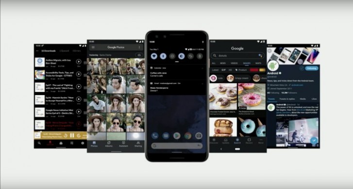
So with that in mind the Dark Theme is the headline new feature, as it's long been requested, but also because it just works. That said, there are still some Google apps (Gmail being the worst offender) that don't support it, which is pretty head-scratch-inducing. Hopefully that will be fixed soon, and we're looking forward to third-party developers adding support for the Dark Theme in their apps, so that when you flip that switch literally everything on your phone goes black.
The faster Share menu is a very welcome (and highly overdue) change, while Digital Wellbeing keeps on expanding, though it's still confusing that other OEMs aren't adding it into their skins wholesale. Google keeps modifying notifications with every new release, and shuffling things over in Settings, but if you update your Pixel from Pie to 10 the new version will definitely not feel very different and the learning curve, if there will even be one for you, is bound to be minimal.
If your phone isn't a Pixel you're still going to be in for quite a wait, as usual. Unless, that is, you happen to own an Essential Phone, in which case you are very lucky to already be able to play with Android 10. That handset aside, the unfortunate tradition in the Android world is that how many of the new user-facing improvements you'll actually get to experience when your device's manufacturer decides to issue the update to Android 10 is debatable.
Android One phones should be the closest to Pixels in this regard, and are supposed to be next in line, timeline-wise, to actually see the update - although that's the theory, in the past it hasn't always held true. Next come the skins that are customized but still don't stray far from the stock experience, like OnePlus' OxygenOS or Asus' new ZenUI 6, which should also come with almost all of these improvements, even if it could take months for the update to actually appear.

Now, we have to note that a few Android device makers have promised very quick updates this year, but we'll believe that when we see it. We're only skeptical because we've been burned before by such promises, and it's unfortunately still true that if you want to get a new Android version on day one, you need to own a Pixel - or an Essential Phone, as it turns out. Sure, OnePlus has already made betas based on the final Android 10 build available for its most recent phones, but who knows when the stable update will actually hit.
The heavier your OEM's skin, the less chance you'll have any of Google's UI changes built-in. With the heaviest of skins, such as MIUI, it doesn't even make a lot of sense to wait for a new Android version to reach you, because any new design or functional change you may see usually comes as part of a MIUI update. Regardless of which phone you have, though, all of the under the hood enhancements that Google has built into Android 10 are definitely coming your way once the update is available for you, if that's any consolation.
So, you should at least benefit from the new Google Play system updates, which in theory will make any device running Android 10 much more likely to get important security fixes quickly, as they're coming straight from Google and not the OEM. Support for TLS 1.3 being enabled by default means better security and privacy, something that's also made possible by the new location permission system. And perhaps the on-device Google Assistant and the Live Caption feature will at some point make it to non-Pixel 4 phones, if they are high-end enough to support these. If this happens, Assistant replies will be much faster, and you'll also have the added benefit of your queries not being sent to Google for processing - another privacy win.
As it stands today, Android 10 might not make your jaw drop, but it's still an update you should definitely install on your Pixel or Essential Phone, because while it's not as big as its name implies, it's still packed with a lot of added polish and neat improvements that should make your life easier, for the most part.
Reader comments
- StillOnOreo
- 22 Feb 2020
- X{u
It's great to read about Android 10, sure do wish there were a simple way to find phones with it. Any word on when 10 is going to be added as a filtering option in the Phone Finder? Apologies if this had been addressed, it's a damned difficult t...
- WirelessWonkFL
- 06 Jan 2020
- Qaa
Yep. It's true. And I really miss those old CSS tricks for making 3-D effects like beveled button edges. You could do so much with color and shading. Material Design is suitable for peeps whose right brain is numb. :)
- WirelessWonkFL
- 06 Jan 2020
- Qaa
I cannot agree with this: "And the traditional three-button navigation bar has returned too, bafflingly." What's baffling is that you spout that piece of nonsense right after you trashed the alternative - the new gesture navigation. Well that deser...