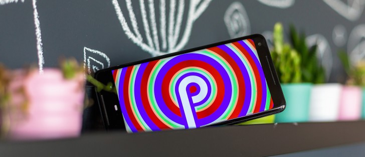
Android 9 Pie review
New features and UI changes
Jumping right into the thick of things, there are quite a few changes in Android AOSP to go through. Some pertain to the UI and navigation, making them pretty obvious. Then, there are a few behind-the-scenes and/or developer novelties as well, which we will also try to mention. That being said, however, this is far from an exhaustive run-down of every Android 9 novelty.
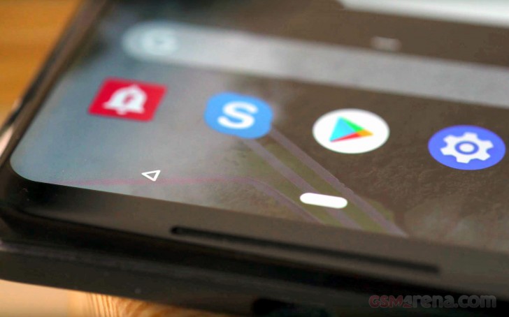
Gesture navigation
The new system navigation style is probably the most well-known and widely discussed aspect of Android 9. It is already stirring-up its fair share of controversy, as well, especially after word got out that it might be the sole navigation scheme of upcoming Pixel 3 devices.
For now, however, you can turn it on or off at leisure. Basically, what the new control scheme boils down to is a new central navigation oval control, in place of the home button. Tapping on it just does that - take you to the home screen. Long pressing it triggers the Google Assistant, so nothing new so far.
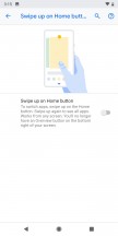
What's gone is the "menu button" or task switcher/recent apps button, as it has come to be known. To replace that you swipe up from the navigation area, or even slightly above it to bring up the revamped recent apps interface. A second swipe up, or alternatively, one longer/wider swipe, to begin with, takes you to the app drawer.
Whether you like the new gesture navigation scheme will definitely boil down to personal preference. However, we still ascertain that having two distinct actions mapped to the same gesture is a bad idea, from a UX standpoint. Back when we first installed the Android P beta on the Pixel 2 XL, as well as the Oppo R15 Pro, our distrust towards the reliability of the gesture was furthered by the difference in gesture length/distance on the pair of phones. To Google's credit, this feels a bit improved in this first, official Android 9 release.
Classic navigation • Gesture navigation • Gesture settings • Active edge
We get that the Android realm is collectively warming up to gesture navigation. However, in typical fragmented fashion, every manufacturer seems to currently be doing its own thing, making the transition away from buttons a bit of a mess. Google opted not to map the back button to any directional swipe. Instead, leaving the back button intact, in its usual location. We understand that implementing a fluent side-swipe gesture, iOS-style, would be really hard with the current state and massive control variety within the Android app ecosystem. Still, it makes the whole gesture effort come off as kind of unfinished or rough around the edges. At the very least, Google could have included a left swipe back gesture on the navigation bar itself. Especially since there is a right swipe gesture, which either scrolls through the recent apps, or, when done quickly, toggles between the last two active ones.
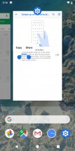
Restyled recent apps interface
The recent apps interface UI is tweaked slightly. Visually, the horizontal layout is practically unchanged. However, lo and behold, there is now a clear all button, as the leftmost item in the list. Not the most convenient location, but we'll definitely take it over having to painstakingly swipe away apps one by one. Google apparently decided to finally add this feature in some beta Android P release.
Recent apps
Near the bottom, a Predicted apps row tries to guess what your next task will be and arrange itself accordingly. Google claims that thanks to machine learning, the prediction accuracy has increased by 60% for this custom UI component, which premiered with Android Oreo and also has a dedicated space within the app drawer.
Improved text selection interface
One odd little feature in the Recent app's interface is the ability to select text within the app windows, without making them active. No other UI interaction can be done here, though.
Text selection
Speaking of the text selection tool, it now houses more options by default and is no longer in all caps. Plus, Android P also brings about a better spot zoom effect, while selecting text.
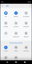
Quick toggles and notification shade
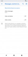
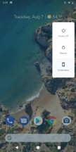
The notification shade has a new coat of paint in Android 9. It still, very much follows Google's Material design ideology, so the changes might not be too apparent for non AOSP users. Any season vanilla Android fan, however, should instantly notice that the quick toggles are now visually better defined. Plus, some have subtle added functionality, like the Night light switch, that has a little text label, indicated when it is due to turn on.
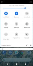
Notification shade and quick toggles
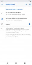
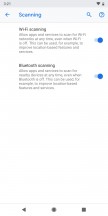
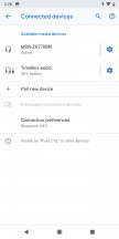
Unfortunately, Google didn't back down from its initial decision to strip some other functionality away from this menu. Just like we first observed in the initial Android P public beta. The expandable small options menus seem to be officially a thing of the past. These used to be triggered by tapping the text underneath certain toggles. Most notably, the Bluetooth and Wi-Fi ones. Now there is no convenient way to quickly switch between access points of manage Bluetooth connections. Bummer! Thankfully, long pressing these toggles still takes you straight to the relevant settings menu.
On a more positive note, the Wi-Fi settings menu now has the option to mark an access point as a metered connection. Great for those cases when we're tethering to a device with a data cap.
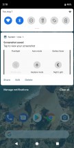
Speaking of odd downgrades, Do not disturb is now a simple toggle. Gone is the choice of the old "Total silence," "Alarms only," and "Priority only" modes.
Do not disturb mode
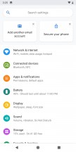
It's no secret that Google is trying its best to simplify most settings. However, there is a fine line between simplicity and actual loss of functionality and features. Take the Location settings menu. It is still accessible through a long-press of the location toggle, but the "Battery saver" option is officially gone from the mode selector. Just like the small notification shade menus, Google has not reconsidered this removal, since the original Android P public beta either.
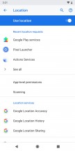
Location settings
Battery saver was great. It was the only way to let your device and its app have some sense of location, based on network cells and Wi-Fi (actually pretty accurate in dense cities), all the while, keeping the battery-hungry GPS radio off. Now, all you get is the equivalent of High accuracy, a GPS-only mode, and Location off.
This might have something to do with Android Pie's revised policies towards background app activity. While running behind the scenes, apps can no longer access the camera, microphone or device sensors. Apparently, Google feels confident enough in its restrictions to just leave the GPS on all the time. Hopefully, this doesn't backfire.
Notifications
Notifications both look and behave a bit differently in Android 9. As far as visuals go, everything seems to be a bit rounder now, if that makes any sense. It appears to be the new general direction Google is taking its signature Material design. It can be seen in other UI elements as well, like the search bar within the settings menu. However, that has been the case since the original Android P public beta.
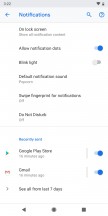
Notifications
Google is also cracking down on nagging or interruptive notifications. It is now easier than ever to get rid of pesky, persistent notifications like the dreaded "An app is running in the background". Also, the OS tries to adapt to your preferences automatically. If you swipe away a particular notification enough times, it will eventually stop popping up.
Google is also bringing new functionality to Android notifications, making them even more interactive. For instance, developers now have access to a new "MessagingStyle" notification option that lets IM apps include things like inline photos, stickers, and suggestions for smart replies, right in the notification.
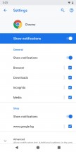
Notification management has also been improved a bit. You still can't get quite the level of management certain third-party Android skins offer, but you can manage notification channels and types on a per-app basis. The Notifications menu in settings now has a "Recently sent" section. It gives you a list of the last few apps that sent out notifications, as well as a quick toggle to silence them, as per your taste.
Re-designed settings menu with new options
The extra dash of color, we saw in the first Android P public beta was not a temporary thing. Google is sticking to this kind of "rainbow" aesthetic, which, at first glance, seems to clash a bit with the mostly two-tone nature of the rest of the UI. However, we kind of like the added visual differentiation, which makes the settings menu a little bit easier to navigate. Plus, it's a nice throwback to Samsung's TouchWiz UI or the Asus ZenUI, from back in the Holo design language days.
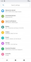
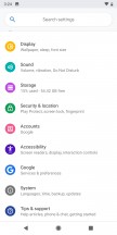
Settings menu
Speaking of color, this seems like a good place to mention Google's primary goals for the future of Material design. The online giant is working towards unification and a more consistent look and feel across the platform. In a move to facilitate that, it is also launching Material Theming - a set of tools and APIs within Android that give developers the ability to "systematically" customize Material Design to better reflect a product or brand. Hopefully, with the proper set of tools, designers won't have to resort to third-party options, breaking the consistency of the overall UI.
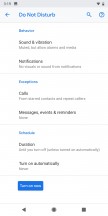
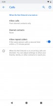
As long as we are on the subject of settings, Google has finally included a separate vibration toggle for calls.
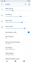
Sound and vibration settings
And the USB mode selector is more powerful than ever, allowing you to independently choose which data transfer mode you want, if any and whether or not you would like to charge your battery.
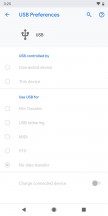
USB mode selector
Smart Adaptive brightness
Google isn't terribly descriptive as to what, exactly, is going on behind the scenes, the adaptive brightness in Android 9 is now smarter.
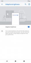
Adaptive brightness
The automatic level adjustment and tuning now, apparently, takes into account ambient light temperature, as well as intensity and even your current activities. It's a feature we've seen within the Android realm in the past and one deemed handy enough to be adopted by AOSP. Neat!
New volume controls and audio switcher
One of the arguably more sensible UI re-arrangement choices Google implemented in Android 9 has to be the new position for the volume controls. The new, extra-tall, phone display trend has brought about, among other things, a lot of extra thumb-stretching. The traditional spot, for the volume slider, near the top of the UI, is thus becoming particularly hard to reach.
Aiming to address that, Google moved the whole thing to the right-hand side. It definitely makes sense, since your thumb is already near that area. While pressing the volume buttons. If you are holding the phone with your right hand, that is. We would really like to see the option to have it pop-up on the left side of the screen, instead.
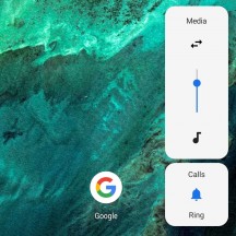
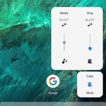
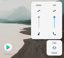
New volume controls
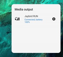
Another interesting addition is the Audio Switcher. It is the audio mixer, as seen on a Windows PC, allowing you to adjust the volume of different devices independently. Also, the little arrows are used to select active output devices. This could be great for managing multiple Bluetooth audio devices. Especially since Android Pie can handle a maximum of five at a time, whereas Oreo is only capable of maintaining two audio channels - one for media and one for calls. You can easily have a simultaneous cast with Android P, although it's definitely going to depend on the capabilities of the device's Bluetooth radio.
Volume controls
Now, it should be noted that just like with the original public beta, we still had trouble getting these feature operational on the Pixel 2 XL. It required poking around in the developer options and some trial and error since certain Bluetooth audio devices simply wouldn't cooperate with the feature for some reason. So, it seems, Google hasn't really made any visible progress as far as the Audio Switcher in concerned, since the first public beta ROM.
New power menu
Just like the volume controls, the power menu is moved to the right-hand side of the UI. The pair is also visually similar, rocking a rounder design. Plus, there is a new screenshot button at the bottom.
Power menu
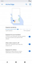
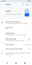
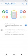
Adaptive Battery
Google's new AI-powered battery manager is already live and working its magic in the latest AOSP build and has actually been doing so since the first public beta. The concept is simple enough - treat apps differently, based on the frequency of use and the likelihood of the user, triggering a certain feature. Then, allocate various resources, like CPU and memory accordingly.
This is achieved by running advanced machine learning models, locally, on the phone itself. It seems like a natural extension of the whole Predicted apps concept, Google has been tinkering with for some time now. As for actual benefits, more real-world testing is required.
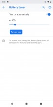
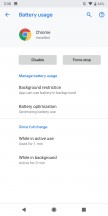
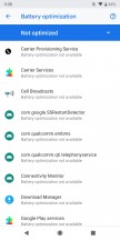
Battery manager • Adaptive battery • Battery saver • Battery usage • Battery optimization
The traditional battery saver mode is a bit more flexible in Android 9, as well. You can now customize the battery percent it automatically triggers at within a pretty generous margin, going all the way from 5% to 75% remaining battery charge.
Promised Android Pie features, we are still waiting on
Back at Google I/O 2018, they teased a few other interesting new features coming to Android 9. We had really hoped to see at least some of these in the first official Pie release, but, sadly, that's not exactly the case.
That being said, however, Google has already launched a beta for the Android Wellness dashboard.
Android Wellness package, Dashboard, App Timer and Wind Down
Google devoted quite a bit of stage time to its new "Wellness" package and initiative at the last I/O, and the whole thing does sound generally interesting. There are, of course, the unfortunate implications of a total lack of self-control in modern smartphone users. But, that's a whole other discussion in itself.
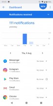
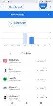
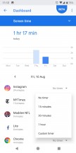
In case you forgot or missed the announcement, there are three main parts to the Android Wellness package. The Dashboard is a centralized location, where all your statistical usage date gets collected and cataloged. It reports back usage numbers, like minutes spent on apps, notification counts and even screen unlocks to the user. While this might sound like a frightening amount of telemetric data that internet giant plans on gathering up, if you visit https://myactivity.google.com, you might be surprised to find that most of it is already there.
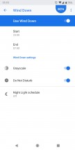
The App Timer is basically a self-imposed time limit on a per-app level. Once your daily quota is up, Android will grey-out the app in question and nag you if you try to open it anyway. Then there is Wind Down - a system that promises to help users end the day in a more relaxed manner.
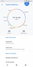
Wellbeing center beta
The beta we mentioned is actually de-coupled from the actual Android 9 beta ROM branch. If you have a Pixel device, running Android 9 (official or beta), you can head over to https://www.android.com/versions/pie-9-0/digital-wellbeing-beta/ and sign up to get beta access. After that, you should see "Digital Wellbeing" appear in your phone's setting menu.
Most of the features, discussed on stage, at Google I/O 2018 seem to already be present and functioning. So, it appears, Google is only working out some final kinks.
App Actions
Unlike, the Wellness package, you, unfortunately, can't experience app actions quite yet. As of writing this review, the Google developer portal has the following notice up for Actions : "Developer preview coming soon!".
As a quick recap, the App Actions API will let developers expose shortcuts for certain functions from within their apps to the OS itself. For instance, the text selection menu could house shortcut to search for the currently selected string within a given app, alongside the typical text manipulation features.
App shortcuts suggested interface
The most prominent spot for these new shortcuts, however, will likely be a small strip, underneath the suggested apps row, in the app drawer.
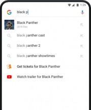
Slices
Last, but not least, the new Slices UI component are also notably absent from the first Android Pi official build. However, unlike App Actions, this area is already open to developers, so, prototypes might already be in the wild. Just not anywhere regular users can experience them, as of yet.
As per the current specification, slices are custom, interactive intefraces, meant to be surfaced by the OS, within the Google Search app and likely the Google Assistant. It is yet another evolution of the deep-linking model. It takes things to a whole new level, promising developers a way to implement segments of their app interfaces and activities so that Android OS can bring them up seamlessly when the need arises.
Reader comments
- JhonLabs8
- 08 Oct 2019
- I@a
Even if i aleady turned off my sim they can call or text me. Please fix this. Thank you so much. Samsung j7 pro user. Have a great day.
- Nope nope
- 12 Mar 2019
- IbF
Can't even move files between folders within the same storage. For example, files can only be moved/copy from internal memory to SD card or vice versa. It can't be done within internal storage or SD card by itself.