Android P public beta first-look review
New features and changes rolling out today
Some of the changes in the Android P public beta are definitely more subtle than others and many are hidden away out of sight or under the hood. We'll kick things off with some of the more obvious changes that users should expect and prepare for. Like, a brand new gesture-based navigation scheme, which is making a debut with Android P.
Gesture navigation
Without getting too much into the ongoing debate about the WebOS/iOS origins of the new way of navigating the UI, we will just say the similarities are clearly there and we'll leave it at that.
Also, we want to stress that the classic navigation style is still available as an option, both in AOSP, as well as for any third-party ROM and UI developers to use at will.
Basically, what the new control scheme boils down to is a new central navigation oval control, in place of the home button. Tapping on it just does that - take you to the home screen. Long pressing it triggers the Google Assistant, so nothing new so far.
What's gone is the "menu button" or task switcher/recent apps button, as it has come to be known. To replace that you swipe up from the navigation area, or even slightly above it to bring up the revamped recent apps interface.
A second swipe up, or alternatively, one longer/wider swipe to begin with, takes you to the app drawer. While this is also a familiar gesture for current AOSP users, having two distinct actions mapped to the same gesture is where our first beef with Android P lies. Even though it's easy enough to get accustomed to, it's not really a good idea. An observation only furthered by the fact that the relative length/distance of the two swipes was different on the beta we installed on the Oppo R15 Pro, effectively throwing off our muscle memory. Even if that's a fluke, you still need to try out the new navigation for yourself and then make up your mind accordingly.
Another issue we have with Google's implementation is the back button. Yes, even though everything else seems to be done through gestures in the new mode, there is still a back button that pops up and stays on the left side of the navigation bar on every interface, besides the home screen. We understand that implementing a fluent side-swipe gesture, iOS-style, would be really hard with the current state and massive control variety within the Android app ecosystem. Still, it makes the whole gesture effort come off as kind of unfinished or rough around the edges.

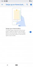


Classic navigation • Navigation style selector • New gesture controls
As the very least, Google could have included a left swipe back gesture on the navigation bar itself. Especially since there is a right swipe gesture, which either scrolls through the recent apps, or, when done quickly, toggles between the last two active ones.
Restyled recent apps interface
The Recent app's interface has a slightly tweaked UI. It's nothing really major. The horizontal layout is practically the same. There is still no button to swipe away all apps. That has to be done one by one.
Near the bottom, a Predicted apps row tries to guess what your next task will be and arrange itself accordingly. Google claims that thanks to machine learning, the prediction has increased by 60% for this custom UI component, which premiered with Android Oreo and also has a dedicated space within the app drawer.
Improved text selection interface
One odd little feature in the Recent app's interface is the ability to select text within the app windows, without making them active. No other UI interaction can be done here, though.


Recent apps interface • Text selection
Speaking of the text selection tool, it now houses more options be default and is no longer in all caps. Plus, Android P also brings about a better spot zoom effect, while selecting text.
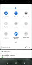
Quick toggles and notification shade
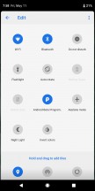
The Vanilla Android quick toggles have gotten a new coat of paint as well. These are visually better defined now. Plus, some have subtle added functionality, like the Night light switch, that has a little text label, indicated when it is due to turn on.
But, oddly enough, there are some missing features here as well, compared to previous AOSP Oreo builds. Most notably, the expandable small options menu, traditionally appended to certain toggles, like Wi-Fi and Bluetooth is gone. Hopefully, that's a quirk of the current beta build, since, with this arrangement, there is no way to quickly switch between Wi-Fi access points or Bluetooth devices from here. Thankfully, long pressing these toggles still takes you straight to the relevant settings menu.
On a more positive note, the Wi-Fi settings menu now has the option to mark an access point as a metered connection. Great for those cases when we're tethering to a device with a data cap.
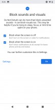
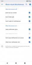
There's another notable downgrade as well. Do not disturb mode is now a simple toggle. Gone are the old "Total silence," "Alarms only," and "Priority only" modes. We do appreciate Google's attempt to simplify things a bit, but that just seems like taking features away from the user.
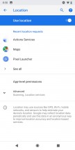
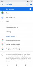
Speaking of which, we find Google's decision to "simplify" the location mode settings equally, if not more troubling. The traditional "Battery saver" mode is gone in this public beta Android P build. You only have the equivalent of High accuracy, GPS-only, and Location off. The Battery-saving mode is gone.
Battery saver was great. It was the only way to let your device and its app have some sense of location, based on network cells and Wi-Fi (actually pretty accurate in dense cities), all the while, keeping the battery-hungry GPS radio off. This move might have something to do with a set of newly-imposed restriction towards background apps in Android P, which we'll touch upon later. Regardless, we really hope that Battery Saver isn't gone for good or at least that the Location mode will serve as more of a hybrid mode and not have the GPS always on.
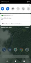
As far as changes to notifications go, there are a few. For one, everything seems to be a bit rounder now, if that makes any sense. It appears to be the new general direction Google is taking its signature Material design. It can be seen in other UI elements as well, like the search bar within the settings menu.
Also, Google has made it easier to get rid of some persistent notifications, like the dreaded "App is running in background". The OS promises to be more in-tune with your preferences towards nagging interruptions in general. In Android, if you swipe away a particular notification type enough times, a helpful prompt will pop up, asking if you wish to mute the particular notification channel.
Starting with Android P, notification will be getting progressively more interactive as well. For instance, developers now have access to a new "MessagingStyle" notification option that lets IM apps include things like inline photos, stickers, and suggestions for smart replies, right in the notification.
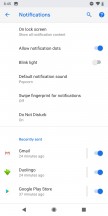
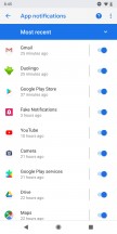
And another thing, the Notifications menu in settings now has a "Recently sent" section. It gives you a list of the last few apps that sent out notifications, as well as a quick toggle to silence them, as per your taste.
More colourful settings menu with a few new options
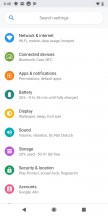
Speaking of the settings menu, it has a dash of color added to it in Android P. The main page now was category icons in all colors of the rainbow, definitely making them easier to visually tell apart. It really reminds us of Samsung's TouchWiz UI or the Asus ZenUI, from back in the Holo design language days and we kind of like it. The change is only skin-deep, with all the inner menus still spelled out in black and grey.
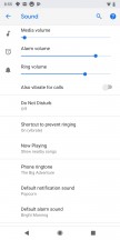
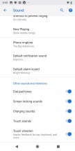
As long as we are on the subject of settings, Google has finally included a separate vibration toggle for calls.
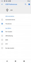
And the USB mode selector is more powerful than ever, allowing you to independently choose which data transfer mode you want, if any and whether or not you would like to charge your battery.
Smart Adaptive brightness
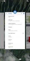
Brightness controls are changed-up a bit in Android P as well. Visually, the slider follows the new Material design tweaks and is now rounded all around.
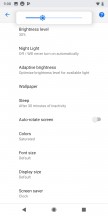
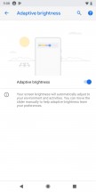
Brightness slider • Adaptive brightness
More importantly, however, the Adaptive brightness feature now comes with automatic level adjustment and tuning, based on environmental conditions (mostly light) and your current activities. It's a feature we've seen within the Android realm in the past and apparently one deemed handy enough to be adopted by AOSP. Neat!
New volume controls and audio switcher
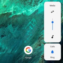
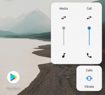
Just like the brightness slider, the volume control has a fresh new look. Again, you probably guessed it - rounded corners on a white background. However, the changes extend way further than that. For one, instead of popping up near the top of the UI, horizontally, the slider now appears on the right-hand side, vertically.
It sits right next to the physical volume, making one-handed operation a lot easier. In fact, just trying the new layout made us realize how bad the traditional approach has always been. It's unclear whether the position of the widget will eventually stick to the volume rockers on other devices as well. It doesn't do so on the Oppo R15 Pro, we flashed at the office, nor are there any manual position adjustment options. However, that might change in future builds, especially ones tailored by manufacturers.
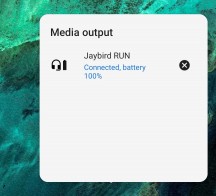
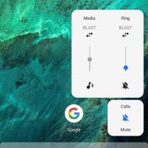
Another interesting addition is the Audio Switcher. Currently, the option seems to be kind of buggy, even requiring some tinkering in a hidden developer menu to enable, but we did manage to get it working long enough to see it in action. It is basically the audio mixer, as seen on a Windows PC, allowing you to independently adjust the volume of different devices. Also, the little arrows are used to select active output devices.
This could potentially work well with another hidden ability, we stumbled upon in the developer menus - a maximum simultaneous Bluetooth device connection cap. It goes all the way up to 5, whereas Oreo is only capable of maintaining two audio channels - one for media and one for calls. You can easily have simultaneous cast with Android P, although it's definitely going to depend on the capabilities of the device's Bluetooth radio.
New power menu
The power menu has the same vertical, rounded layout, like the volume slider. Plus, a new screenshot button at the bottom.
Adaptive Battery
An AI-infused battery manager is an interesting concept, for sure. To be precise, the actual magic happens thanks to advanced machine learning models, executed on the phone itself. The idea is simple enough - treat apps differently, based on the frequency of use and the likelihood of the user, triggering a certain feature. Then, allocate various resources, like CPU and memory accordingly.
It seems like a natural extension of the whole Predicted apps concept, Google has been tinkering with for some time now. As for actual benefits, more real-world testing is required. As a side note, the Battery Saver is more flexible than ever and can be set to trigger automatically from anywhere between 5% and 75% battery level.
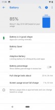

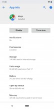
Battery saver • Battery saver • Per-app battery usage
Oddly enough, however, despite all these battery improvements, Android P seems to be missing the tried and true per-app battery usage breakdown, within the battery menu. You can still find the number within the app info interface.
Reader comments
- Kiyasuriin
- 22 May 2018
- 6qW
Good question. A few suggestions show a few options: 1. a second cycle of A-Z and over and over again. 2, It'll begin a computational AA, AB, AC. ETC. 3. It'll stop using letters altogether. relying on numbers only.
- gringo
- 19 May 2018
- rX{
wich android will come after android Z ?????????????
- Anonymous
- 18 May 2018
- HLw
BB10 OS had all these gestures in 2014 already.
