Android 7.0 Nougat review: Something to look forward to
Something to look forward to

Notifications
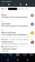
Undoubtedly one of the headline features of Android since its inception, the notification area has been revamped in Nougat. Not so much that you won't recognize it, but enough that it will obviously be different from the get-go. There are many new features inside notifications, which all work toward basically requiring you to jump inside apps as rarely as possible. This is meant to encourage a more fluent workflow - instead of tapping on a new notification to go into the corresponding app and then taking some action there, you can do a lot of things straight within the notification itself. That's the theory, and it works well enough in apps that support the new features. Hopefully, third party developers will be quick to update every app that can take advantage of the new functionality.
Bundled notifications are just that what they seem. Let's take Gmail as an example. Instead of showing you one separate notification for every email you receive, you'll first see only one notification containing all of them. That's hardly new, but what follows is. See, in the aforementioned case of getting many emails, you can 'unbundle' each individual notification from the stack and then act on it - delete the email or reply to it, for example. And when you expand a notification you can now see a lot more text than before, which will give you a much better idea about the content of each of those emails.


Bundled notifications • Semi-unbundled • Unbundled notification • More than one can be unbundled at the same time
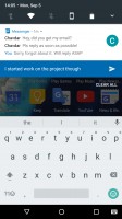
All of the above ties in nicely with what Google calls Notification Direct Reply. Just hit Reply on any expanded notification, and you can instantly compose a reply right there, in the notification shade - no need to load the full app. For chat apps the intended behavior here is to see every message you get in its entirety. What's more, once you reply your messages go into the notification's thread, so conceivably you might find yourself looking at any such app's UI a lot less than before. This feature has been spotted before in certain apps, but now it's part of the operating system so it's a lot easier for developers to add. In case you're wondering, Gmail doesn't yet have this working, and neither do most other apps.


Direct Reply lets you continue the conversation inside the notification
You can choose to show notifications silently or block all notifications on a per app basis. You'll also find that notifications have a new look now and they extend, horizontally, all the way to the edges of the screen (on phones) or of the notification area (on tablets). What's more, they're vertically stacked too, and don't appear as separate cards. All of this might make you miss the old design, at least at first.
Quick Settings
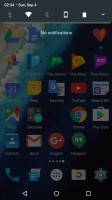
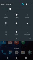
Traditionally, to get to the Quick Settings pane you needed to pull down the notification shade twice - the first pull would give you the view of your notifications, while the second one took you to see the Quick Settings tiles. This is still the case in Android 7.0, but with one very important modification. There's now a row of tiles visible above the list of notifications. This row is thus there on the first pull down of the notification shade, and the icons in it are all actionable. Such solutions have been employed in third-party Android UI skins for years, and now this is finally part of the stock experience.
Quick Settings editing made its debut in Marshmallow, but the option to rearrange the tiles was hidden in the System UI Tuner menu which needed a special trick for activation. In Nougat, Quick Settings can be edited easily, with no additional trickery required. When you do rearrange your tiles, keep in mind that the first five are those that show up in smaller form above the notification list.


Quick Settings: New small tiles above notifications • Edit button for easy re-ordering
A rather annoying thing here is that if you swipe down from the top on the lock screen, you might expect to see those five mini-tiles, since this is what happens everywhere else in the OS. But instead, you're presented with the full Quick Settings pane. Anyway, this area has horizontally-swipeable pages now because developers have access to an API through which their apps can create new tiles.
Reader comments
- karanbadsiwal
- 17 Feb 2017
- tT1
when will Nougat update hit the Xperia M5 dual.. i am waiting for this very badly..
- AnonD-453287
- 09 Feb 2017
- teu
When will Sri Lanka get nougat update? Its almost mid feb. Waiting badly.
- Jimi.a8
- 05 Feb 2017
- 8q2
I need update android 7 in iran country az soon