Apple iOS 7 beta review: Evening the odds
Evening the odds
This article is outdated. We have already published a full review.
Flat user interface with Control Center
The six years old iOS user interface is now gone for good. Lots of people expected Apple to revamp the UI with the iOS 5 but it didn't happen. The iOS 6 also didn't turn out to be the revamp many were hoping for. This time Apple knew it had no choice if it wanted to stay relevant at the top of the smartphone game.
John Ive personally monitored the redesign of the flattened iOS and made sure it still carried Apple's character. iOS is the last major platform to abandon skeuomorphism and go for a flat look, but it certainly wanted to make the transition its own way, rather than simply copy the competition. And the great news is the UI changes didn't come at the cost of new features. We still got connectivity toggles, file sharing, automatic app updates, improved multitasking with cooler interface, live wallpapers, among others.
Before we continue here is a quick video demonstration of the new iOS 7.
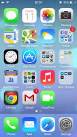
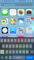
iOS 7 looks a lot different to its predecessor, but its logic of operation is mostly the same. All of your apps are on the homescreen, folders are available and there is the familiar dock that can take up to four shortcuts.
Apple iOS 7
All system icons are different though, the clock now has an animated icon showing the current time, the system fonts have been altered, there are lots of semi-transparent elements and new gestures.
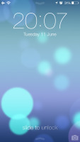
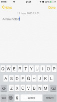
Let's start from the beginning - the lockscreen. It's totally different and yet it works in a very similar way. The slide to unlock bar with virtual guide is now gone and you can swipe anywhere on the screen to unlock your iDevice. The text is somewhat illogically placed right above the tiny arrow for the control center which points up, but you actually still need to slide to the right to access the homescreen. We would have preferred swipe to left gesture to be also working, but that's not the case.
The lockscreen also has the camera shortcut at the bottom, you can swipe up from there for quick access to the camera app. Double tap on the Home key will bring the multimedia controls as usual. Lockscreen notifications are available as well.


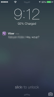
The lockscreen works as before
You can notice two transparent arrows at the top and the bottom of the lockscreen. Swiping from the top will bring the Notification Center, while swiping from the bottom will pop up the new Control Center.

The Notification and Control Centers are available on the lockscreen
Unlocking the lockscreen brings you the revamped homescreen. You can notice the Spotlight pane is now gone. Don't you worry, it's not missing, it just activated with a new gesture - make a pull down gesture anywhere on the homescreen and Spotlight search will appear above it.
The Spotlight is now hidden but has a dedicated gesture
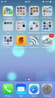
Folders are available as usual, but there is no longer limitation how many apps you can put inside them. Pages are available in the folders, each page can pack up to nine apps, but there is no limitations for the page count. And you can finally put the Newsstand in a folder! Hallelujah!
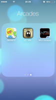
An iOS 7 folder
Opening and closing folders are now accompanied by cool looking new animations. Those do take a bit too long, though, and might become irritating once you are past their wow phase. We are hoping Apple shortens them a bit in the final version or at least give us the option to switch them off. A cool bit is the folder icons and the folders themselves are semi-transparent and their backgrounds adapt to the background's prevailing color.
You should have already noticed the semi-transparent dock, folders, keyboard and Control Center from the screenshots. The Notification and Control Center colors are also adaptive, just like the folders, and they'll change depending on the background. So they might be blue-ish on the homescreen, but light gray in the web browser, or dark gray in the settings, or green in the gallery, etc.
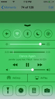

The semi-transparent Control Center and Notification Center in different colors
The keyboard is less transparent and has only two themes - very light gray and very dark gray. Of course, they also change depending on whether your keyboard has popped up on top of a light or a dark background. Beside the new theme and font of its letters, the iOS keyboard is unchanged, which is not a bad thing as it's certainly one of the most comfortable around.
The iOS 7 keyboard
The changes don't end with those transparent and adaptive elements. Opening an app shows you a zoom in animation over the app icon, which is pretty cool.
Moving on to the parallax effect, which is visible throughout iOS 7. As is to be expected, Apple designed the new iOS on independent layers - background, homescreen icons, icon badges, app pop ups. The iPhone then uses its accelerometer and gyroscope to move layers independently and create an illusion of depth. The movement isn't too big so it's not irritating. In fact you might not even notice it if you are not looking for it, but it's there and it looks really awesome once you start moving a bit your device.
The parallax is not only available on the homescreen. You can see it in folders and on the pop ups that ask you for passwords or bring you some notifications. Those pop ups by the way are also translucent and adapt their background color in addition to the depth effect.
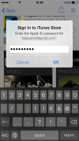
A system pop-up
Apple iOS 7 also brings live wallpapers. You can find them at the Dynamic section in Wallpaper Settings. Currently there are only two live wallpapers, but we expect more to become available in the AppStore as soon as iOS 7 becomes available this fall.
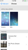
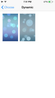
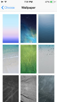
Wallpaper settings • Dynamic wallpapers • Still wallpapers
You might have noticed from all those shots that Apple has ditched the cellular coverage bars and replaced them with five dots. The battery also got a new icon.
Three and five dots of cellular coverage and the new battery icon
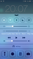
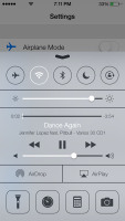
Now let's talk about the elephant in the room that is the Control Center. Apple has decided not to follow the competition and put the connectivity toggles in the notification area. Instead it has placed them into a brand new Control Center that is brought up to front with a swipe from the bottom of the screen.
The Control Center
It has five non-customizable rows with different shortcuts. The top row has five toggles - Airplane, Wi-Fi, Bluetooth, DND mode and Rotation Lock. The second row has the brightness scrubber. Next come the multimedia controls including a volume bar. The fourth row has AirDrop and AirPlay shortcuts. Finally, at the bottom of the Control Center there are four shortcuts - one that turns on/off the LED flash to serve as a flashlight and three app shortcuts - Clock, Calculator and Camera.
We find the volume and media scrubbers rather needless, but nothing in the Control Center is customizable for now. Still it's a great thing to have and kudos to Apple for finally providing it.
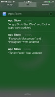
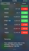
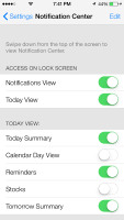
The Notification Center has been redesigned as well. It now has three tabs - Today, All and Missed. The Today tab has the date, today summery (all of today's events), calendar day view (grid with hours and events), reminders (lists your reminders for today), stocks and tomorrow summary (the number of events you have for tomorrow).
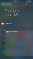
Today tab • Settings
The Today's tab is customizable, you can disable its elements one by one - everything but the date displayed at the top can be removed so it doesn't get in the way. You can even disable the Today tab altogether in the Notification Center for the lockscreen.
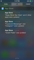
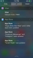
The All tab is basically the notification center of iOS 6 but lacks weather, stocks and calendar events. The first two are now part of the Today tab, while the weather is gone for good. You can disable the All tab for the lockscreen as well (just turn off Notifications View). If both Notifications (All) and Today tabs are disabled, the whole Notification Center won't be accessible from the lockscreen.

The All tab • The Missed tab
The Missed tab holds the missed emails, messages and calls, while your iDevice was locked. Those notifications are still available in the All tab.
According to Apple iOS 7 offers multi-tasking for all apps. Previously the true multi-tasking was reserved only for navigation apps, the rest had to go in suspend mode.
Now, this multi-tasking for all apps will surely drain the battery faster than Apple would have liked, so there is a catch. Yes, all apps will work in background, but the iOS will learn which one of them you use most often and when.
Let's say you open the Facebook app every morning soon after you wake up and don't use it the rest of the day. The iOS will soon learn that and will optimize the app to work according to your schedule until you change it. This means most of the day and night the app will still be in suspend mode (push notifications will work of course), but the iOS will run Facebook shortly before your alarm goes on and load all the content. That way when you open it, your news feed will be already updated.
We noticed the apps also update in background when push notifications come in. This is a part of what Apple calls opportunistic updates - the iPhone waits until a data connection is in use and starts the updates then, so it doesn't need to activate the connection on another ocassion and waste your battery juice.
We haven't spent enough time with iOS to give a proper judgment on how well the new multitasking works, but once we do we'll update this article and let you know.
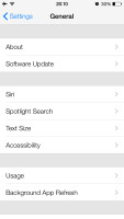
All apps that use Cellular/Wi-Fi connection and can work in background are listed at Settings -> General -> Background App refresh.
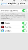
Background App refresh
The multi-tasking interface is invoked with double tap on the Home key. It looks a lot like the webOS cards of old and, more recently, the HTC Sense Task switcher - all apps are presented with cards that you can swipe up to close. All cards have their app icon below the card so you can easily recognize the app.
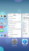
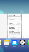
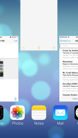
Multitasking in action
The multitasking UI works in both portrait and landscape mode, but you cannot see more than three cards at a time. It's one of the limitation of the card interface and we suspect this is why HTC went for a different task switcher on the One, but here's hoping that Apple will at least fix the landscape mode until the fall release comes.
The iOS 7 Settings menu has the same layout as in previous version but has also been updated with the new flat and borderless look.
Besides the Background App Refresh, the iOS 7 offers even better control over the apps the use mobile data.The Cellular tab offers detailed cellular usage by apps and services and you can restrict apps and services to use cellular data.

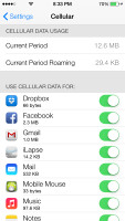
Settings • Cellular Data settings
Another thing worth mentioning is Apple has added Vimeo and Flickr integration in addition to Twitter and Facebook. Once you enter your account details in settings you can upload your photos straight to your Flickr gallery, while your videos can be sent to your Vimeo profile. You just need to hit the share key on a picture or a video and use the dedicated Flickr/Vimeo icon.
Sharing on Flickr and Vimeo is easy
Sadly, the integration of third party social services is still pretty limited and you won't be able to upload stuff to social networks and service outside of the officially Apple-approved ones from here.
The final major change about the user interface is the Back gesture available in all iOS 7 default apps (we guess developers will be able to extend the support to third-party apps after the launch). Whether you are in settings, App Store, Messages, Notes, Reminders, Safari, etc. you can swipe from the right side of the screen and you'll go a step back. Let's say you are in Settings -> General -> About, a swipe from the right will take you back to General and another swipe will give you the root directory of the Settings menu.
Reader comments
- Anonymous
- 17 Nov 2016
- bak
Just find new iphone. Black slate
- Anonymous
- 17 Nov 2016
- bak
I do. Know my. Iphone
- Anonymous
- 17 Nov 2016
- bak
No problem