Apple iPad Pro review: Slate of the art
Slate of the art
Mutli-window is great on the big screen
The Apple iPad Pro runs on iOS 9.1, the latest version of Apple's OS for mobile devices. It's the largest and most powerful iOS family member to date, and we don't see that changing any time soon.
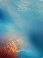
The lockscreen brings no surprises. You swipe right (and only right) to unlock, and there's also a camera shortcut, which bypasses the unlocking process. Once you're done with the picture-taking business though, you can't access the interface, without properly unlocking, so you're still safe. Lockscreen notifications are available as well.
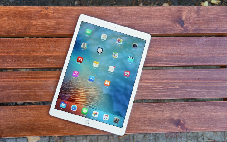
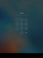
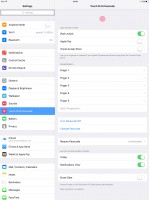
You can passcode-protect the lockscreen and also set up finger-lock thanks to Touch ID. The Touch ID sensor offers 360-degree readability translating into effortless scanning of your fingerprint. That's good, because you'll be handling the giant tablet in all sorts of orientations, and TouchID-ing will work in every direction. You can commit up to five fingerprint samples, and you're likely to use up most of those for yourself, so that you don't have to think which way you're holding the tablet.
For when your fingers are unreadable, you have the passcode to access your device. Hence, enabling passcode is a mandatory requirement in order to use Touch ID.
The iPad Pro doesn't have NFC and it can't be used for Apple Pay at merchant locations, not that its bulk really allows it. However, you'll still be able to use Apple Pay for in-app purchases.
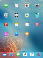
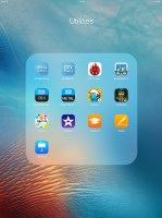
This is an iPad so all of your apps are on the homescreen. You can, of course, group them in folders and there is the familiar dock that can take up to six permanently visible shortcuts. Pages are available in the folders, each page can pack up to sixteen apps and there is no limit on the page count.
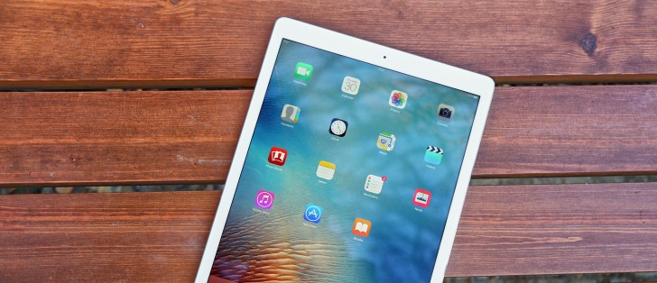
Overall, the huge screen estate feels squandered. Icons are few and far between, even if their size looks about right - the 4x5 grid is downright ridiculous. The dock looks like it can handle a few more apps in landscape, but in portrait would get cluttered, so 6 is good.
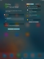
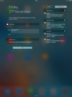
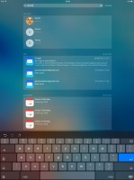
Swiping from the top down will display the Notifications center. It has two panes, the left one replaces the Today tab on previous iPads and has a large date and calendar events. The right pane has two tabs, one for widgets, the other - for the actual notifications. The selection of widgets is decidedly limited, though, and depends on the applications you have installed.
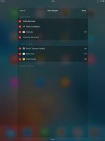
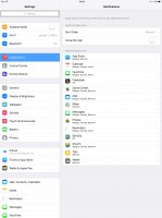
As usual, you can choose which apps you want to show up in the pull-down Notifications and in what order. The Today tab is customizable, and you can disable its elements one by one - everything but the date displayed at the top can be removed so it doesn't get in the way. You can even disable the Today tab altogether in the Notification Center for the lockscreen.
The second tab is reserved for notifications only. Other than that, the handling of notifications hasn't changed a bit. You can opt to disable a notification, set it to be a banner, which will shortly pop up over the status bar or an alert showing up at the center of the screen.
There are also options to disable badges on app icons or disable lockscreen notifications.
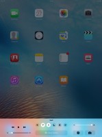
Control center is the same as on regular iPads - with controls for music, a volume slider, a brightness slider, a camera shortcut, a timer shortcut, AirDrop menu and six toggles for Airplane mode, Wi-Fi, Bluetooth, Do Not Disturb, Silent and Rotation lock.
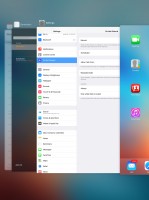
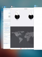
The task-switcher interface is evoked with a double press on the Home key. All apps are presented with cards, which are nothing short of huge but can easily be swiped up to close. You wouldn't expect to see a Kill all button, but we'll say it - there isn't one.
The parallax effect is present on the homescreen. Apple designed iOS on independent layers - background, homescreen icons, icon badges, and then app pop-ups. The iPad Pro then uses its accelerometer and gyroscope to move layers independently and create an illusion of depth. The movement is very subtle on smaller screens, but pretty visible on the 12.9-inch Pro. In case you don't like the parallax effect you can turn it off from an unlikely setting item - you will find it in Accessibility settings -> Reduce Motion.
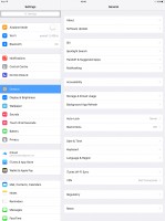
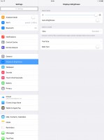
The Settings menu has the same layout as in previous iPad versions - it's a split screen list of settings and is pretty neat to get around.
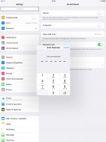
Do Not Disturb mode is available on the iPad Pro too. It gives users further control over notifications, or rather their suppression. If turned on, it will mute incoming FaceTime calls or app alerts. You can allow FaceTime calls from your favorite contacts and have the option to set a specific time interval in which you won't get any notifications.
There's a dedicated toggle to activate the DND feature on demand and it can be customized in the Notifications submenu. When Do Not Disturb is on, a crescent icon appears next to the clock in the status bar.
Since iOS 7 Apple ushered in its take on true background multitasking, aptly called Background App Refresh. The way it works is all apps will work in the background, but iOS will learn which one of them you use most often and when and have their content refreshed with priority or around the time of day you usually check them out.
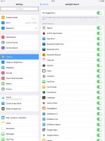
Apps also update in the background when push notifications come in. All apps that use Cellular/Wi-Fi connection and can work in the background are listed under Settings -> General -> Background App refresh.
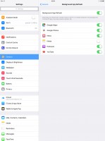
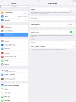
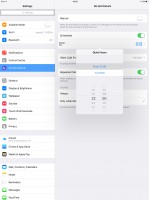
Background app refresh • DND mode
The four/five-finger multi-tasking gestures are also available on the iPad Pro. You can switch between the active apps using four (or five)-finger swipes. A similar swipe to the top will bring you the task switcher. Finally, you can use four (or five as it feels more natural) finger pinch zoom out. It will bring you the homescreen, while the app will go in background.
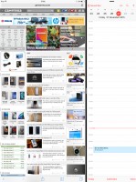
All this is mostly unchanged from previous iterations, but a feature introduced with iOS 9.0 shines on the iPad Pro. Split-screen multitasking is essential on such a large display, and thanks to the powerful chipset and 4GB of RAM works as fluid as ever.
It goes like this. First, you need to have an app opened fullscreen - you can't start from the homescreen. So, say you're browsing in Safari, but want to take a quick look at your calendar events.
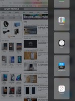
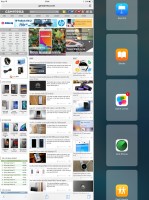
An inward swipe from the right edge first brings up an overlay pane with the available apps, Safari gets grayed out in the background. You tap on calendar and it fills the overlay. The right pane has a handle on the left, tap that and Safari comes back up, the two windows now equally lit up.
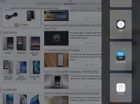
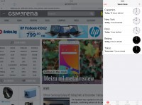
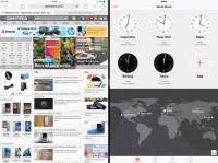
Split-screen view in landscape
This secondary app that you have on the right can be stretched to take up to half the screen, but that's it - you can't make it the dominant one and squish the original app (in this case Safari) further to the left. You also can't swap the two apps, should you decide that the Calendar deserves more attention - you need to hit home and launch it from the homescreen. Also, for whatever reason, you can't have two instances of the same app side by side (mostly applicable to the browser).
Overall, the feature is nice and finally allows to do two concurrent tasks simultaneously, and for a while there we didn't think we'd see an iOS device do that.
We would certainly appreciate it if the feature loses its one-sided nature and can be accessed from either edge of the screen. Swapping the two apps is a no-brainer for a future update, too. It's refreshing to see strides being taken in making productivity more than a buzz word used in marketing material.
Reader comments
- Bro
- 30 Jan 2023
- sXy
To all of the weirdos out there who think this ipad is still good - its rubbish for multitasking and therefore bad for working and gaming. Good for people who just surf the web tho. Ps info on the specs page is wrong - my one is running iPadOS 1...
- AnonD-453339
- 28 Aug 2016
- tZk
It pen was incredible good just like the real pen , nice job apple i hope there are ipad pro 2 come out
- Faisal shafi
- 22 Apr 2016
- uWG
Listen pls all non Apple users do not compare Apple wth shamesung or other devices apple never compare wth u all okkkkkk u all r best now get lostttt and be remember simple if u have iPhone u have an iPhone if u don't have iPhone u don't have an iPho...
