Apple iPhone 14 Pro Max review
Design, build quality, handling
So the notch turned into a pill, and there's now a purple color option - is that really all they did for the iPhone 14 Pro and Pro Max? In a way, the answer is yes. But that's also missing the point.
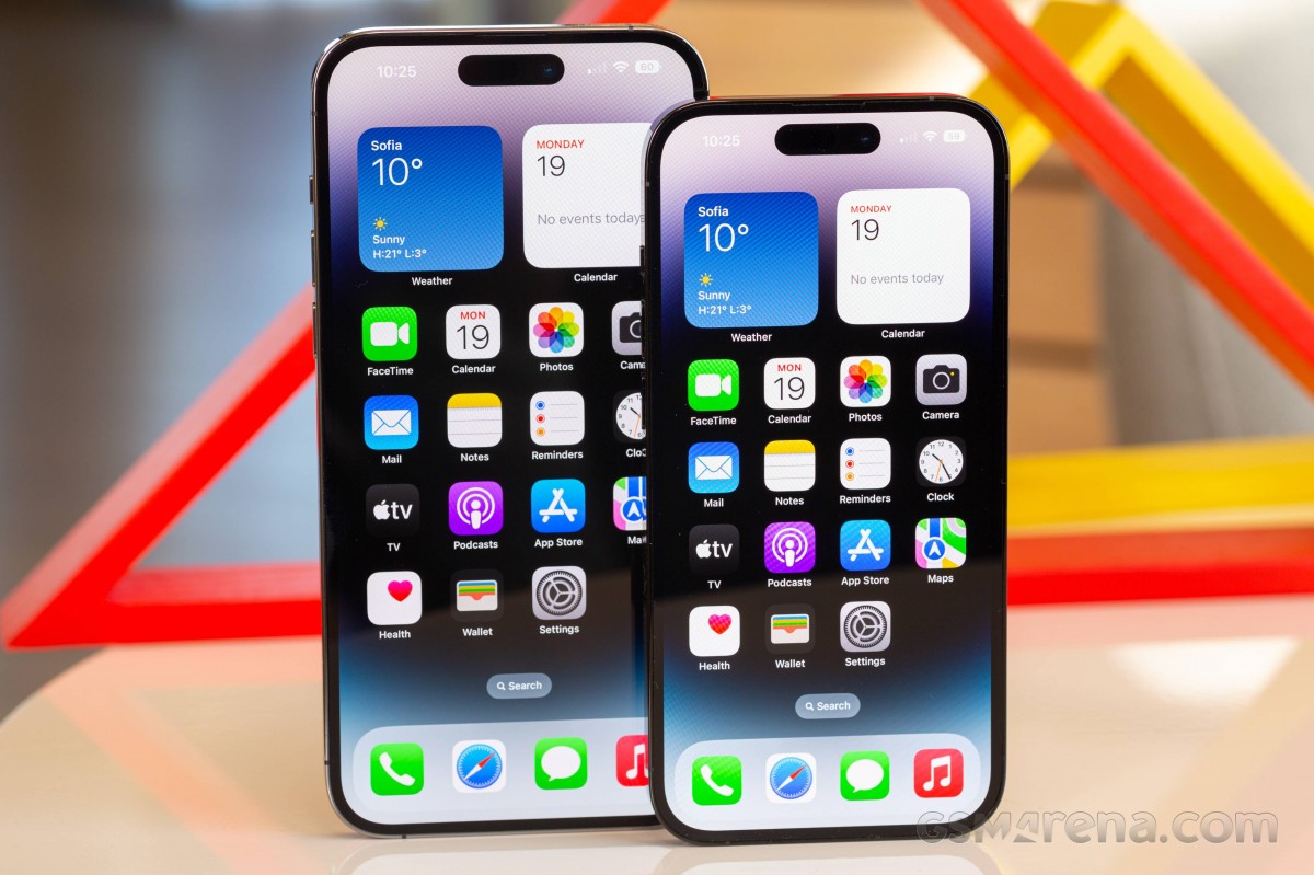 iPhone 14 Pro Max (left) and iPhone 14 Pro
For one, the iPhone industrial design has been an iterative evolutional process for several years now - depending on how you look at it, since at least the 12, the 11, or maybe even the X. Major disruptions haven't been Apple's thing lately and you'd have been wrong to expect one, is what we're saying. And then comes the fact that there's not a lot to fix about the iPhone's build or styling.
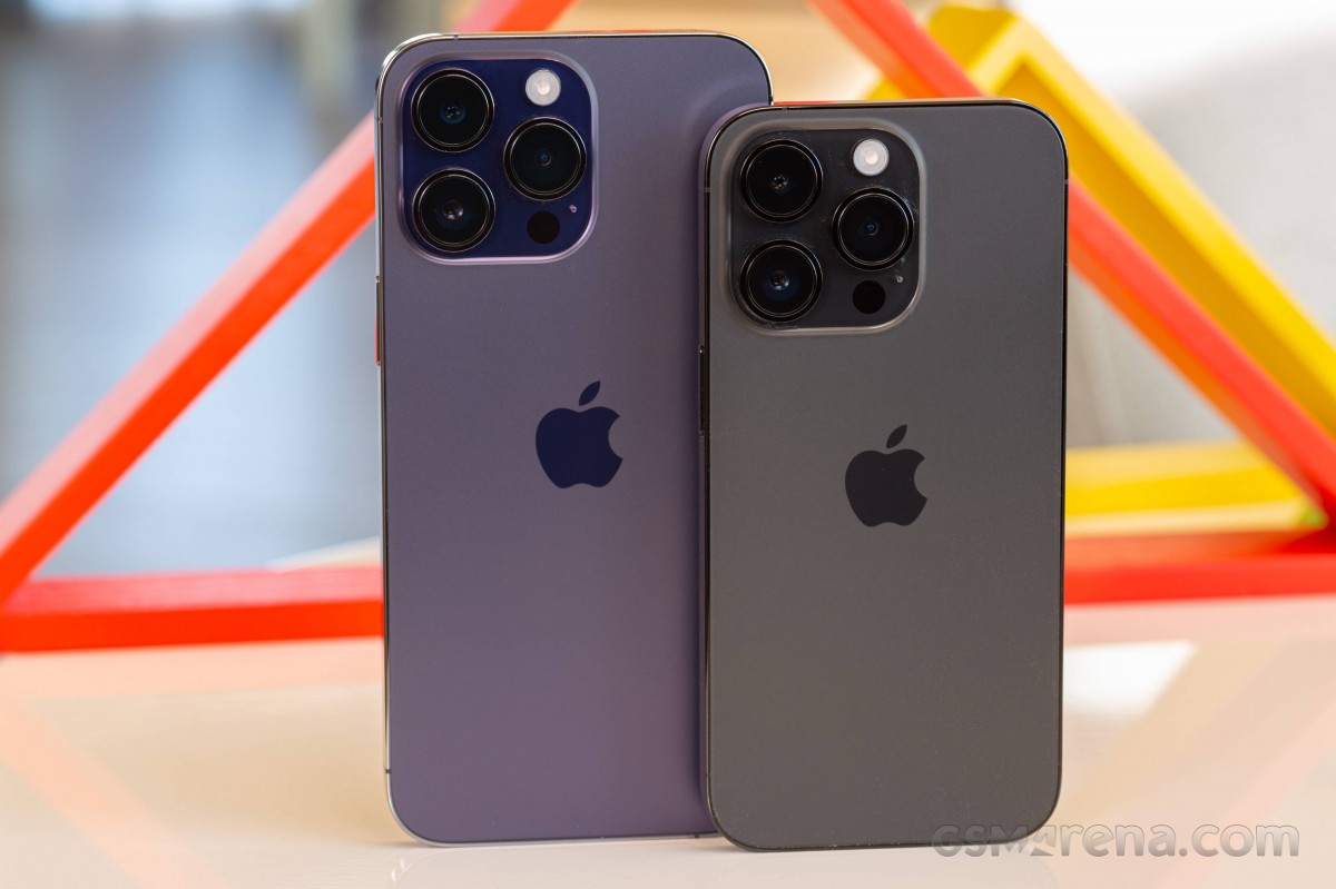 iPhone 14 Pro Max (left) and iPhone 14 Pro
What did need fixing got addressed, which is how we got from the notch to the pill. Apple's Face ID display cutout has been an easy target for mockery since its very inception on the iPhone X, and people who write reviews for a living have criticized it time and time again. We've even been told that regular people feel the same way, too, though the sales numbers don't indicate it's a deal-breaking offense.
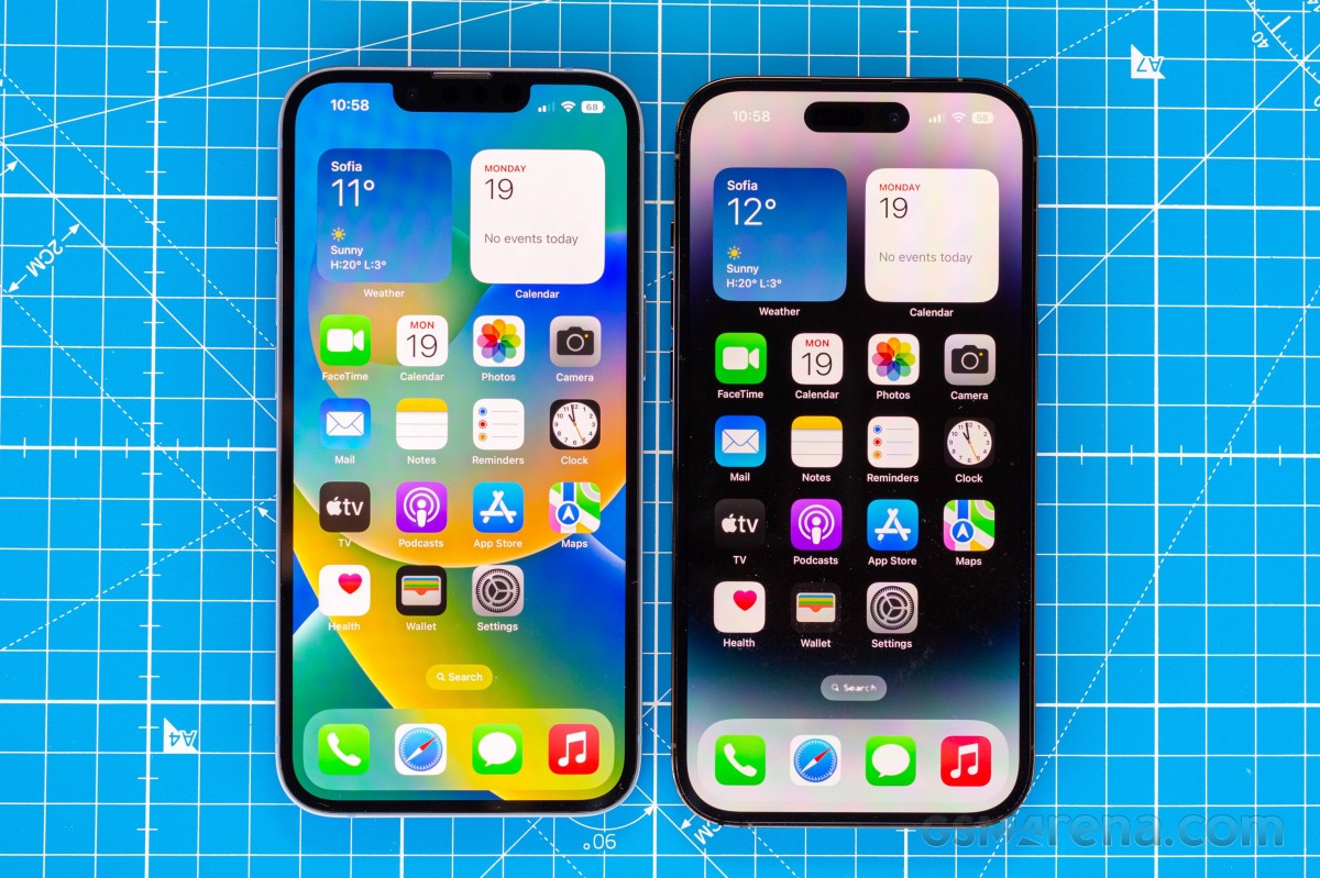 iPhone 13 Pro (left) and iPhone 14 Pro
There's been ongoing speculation about which year the notch will disappear and what the technological advancement must be to replace it (cough, under-display fingerprint readers, cough), or what otherwise unrelated event could trigger its demise. The reality is that this is the 6th generation of iPhone to have Face ID, and no such thing has happened yet. But there have been tweaks.
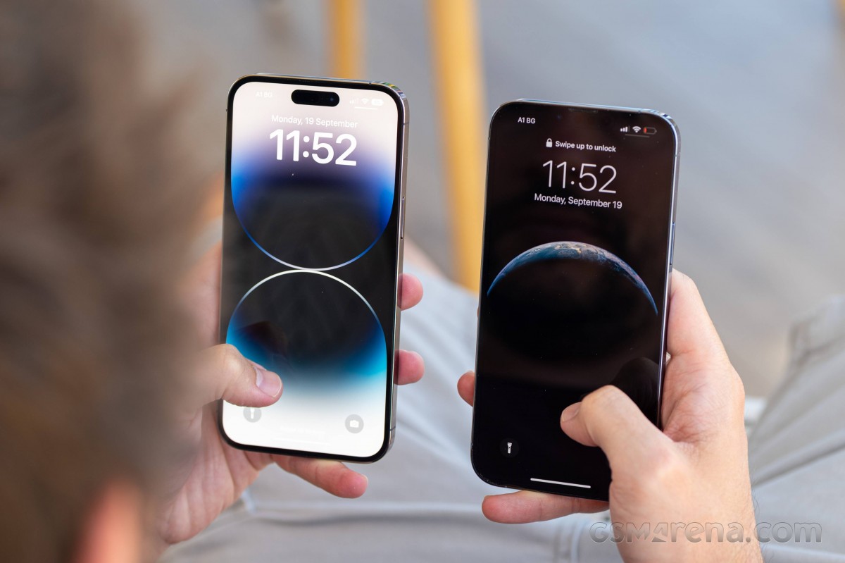 iPhone 14 Pro Max (left) and iPhone 13 Pro Max
And it's precisely in the tweaks category that we'll file this year's development. The ever-shrinking Face ID bits have been packed even more tightly together for the iPhone 14 Pro and Pro Max - Apple says the True Depth camera system (the Face ID and front-facing camera combined) are 31% smaller than before. They have also broken off from the border 'mainland' and have turned into a "Dynamic Island', leaving a small strait of pixels above it.
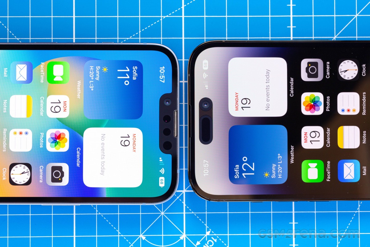 iPhone 13 Pro (left) and iPhone 14 Pro
The 'dynamic' part really comes from the iOS implementation of what is a very static cutout in the panel - and it's an ingenious way of turning an inherent flaw into a feature that even makes sense. Of course, masking a hardware deficiency that doesn't strictly necessarily absolutely have to be there with a software fix does read like the second best option in the first place, but we'll accept baby steps.
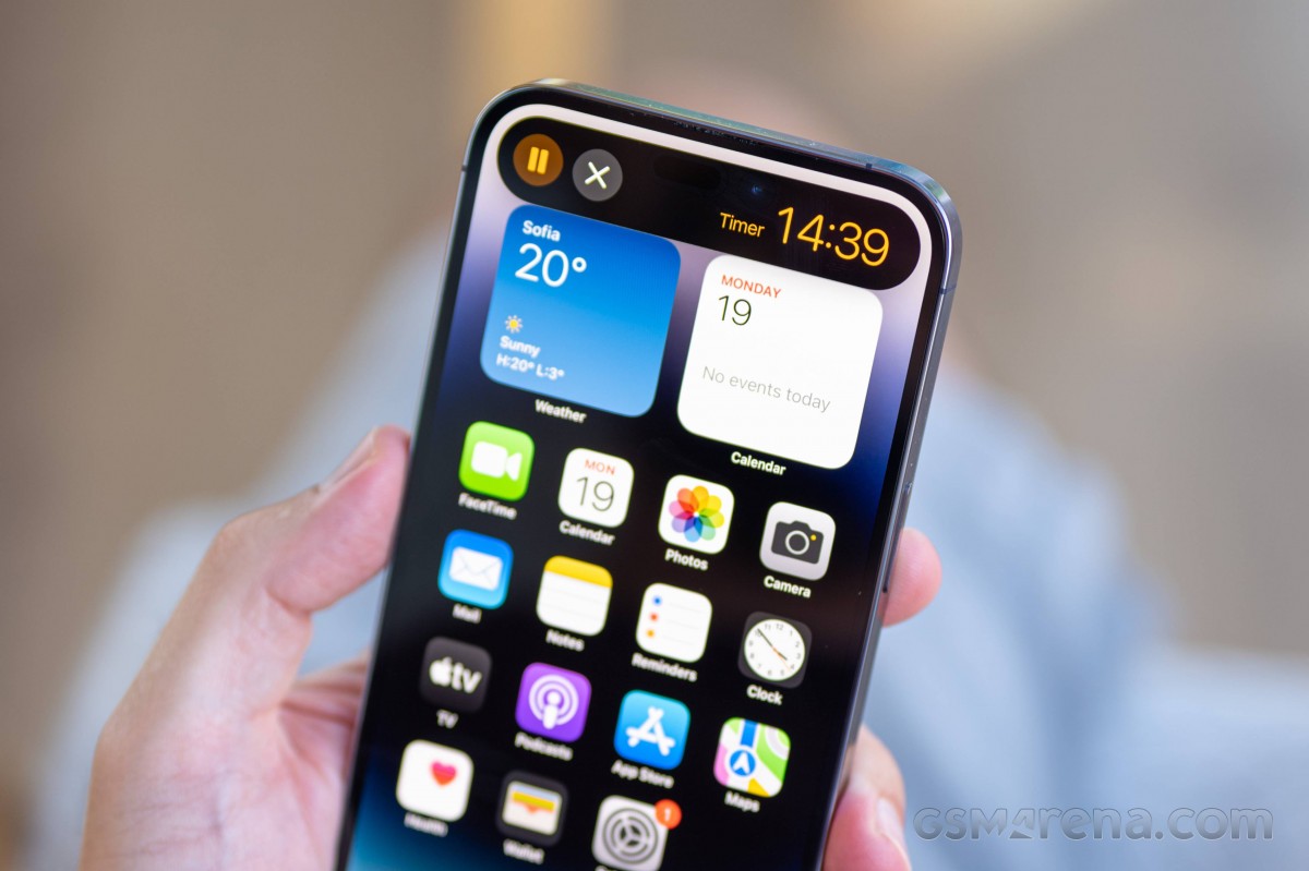 Dynamic island on the iPhone 14 Pro Max
We do keep saying 'cutout', singular, but in fact, it's two cutouts - one is for the selfie camera, and another one for the Face ID components are. There are functional pixels in between the two holes in the display, but they're lit up very rarely - just for the occasional mic or camera indicator.
And while iOS will try and present the two cutouts as a single island, under the right light, you'll be able to see through its deception. Some folks on the internet have tried to make an overly big deal of the different shades of black you can see there, but we think you'll just notice it once and simply move on.
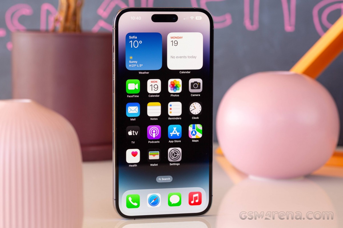 The pill on the iPhone 14 Pro Max
Another point worth mentioning is that while the pill is indeed smaller in terms of the directly occupied area, the fact that it sits further down into the display means it tends to make more of the screen less usable. That strip above it can't really serve any purpose, and the 'effective' horns on the two sides of the cutout are, in practice, taller than they were with the notch of yesteryear. Then there's very widescreen video content to worry about.
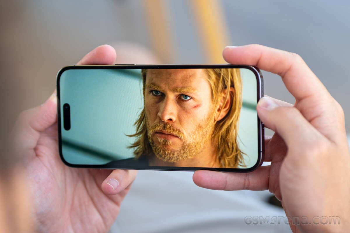 The pill can get in the way occasionally
Let's just mention in passing here that for the purposes of authentication, Face ID works as fast and as accurately as it has for the past couple of years. The option to set up a masked appearance is also baked in.
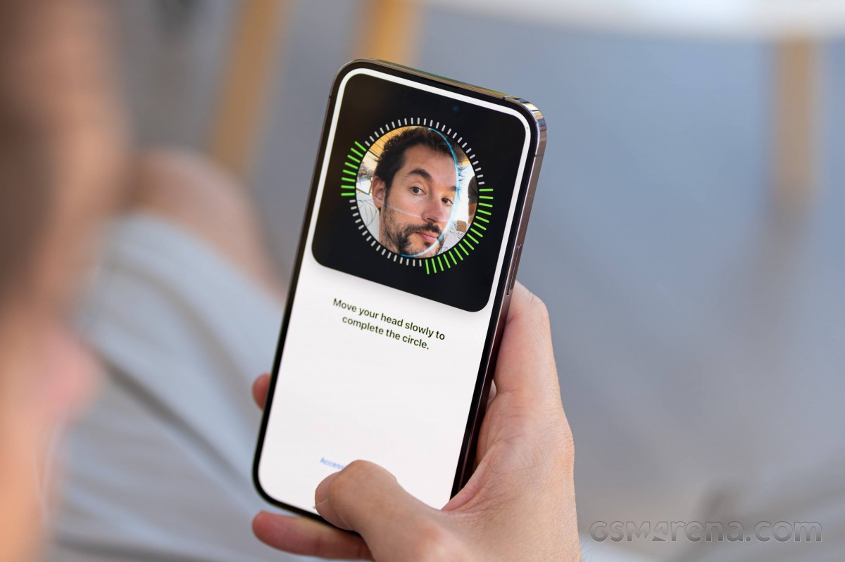 Enrolling a face for Face ID on the iPhone 14 Pro Max
What the pill does for the user experience is a topic we'll cover in a bit more detail in the software section of this review.
However, there is a very hardware aspect to the dynamic island software functionality. It stems from the fact that the island area is actionable - meaning you'll be touching around your selfie camera and Face ID components, and by extension, you'll be touching the glass over the very selfie camera and Face ID components, inevitably introducing smudges and dirt. Over years of reviewing, we've developed an almost compulsive habit of wiping cameras before taking pictures, island or no island, so in our world, that's less of an issue, but it could take a few ruined selfies for you to get there.
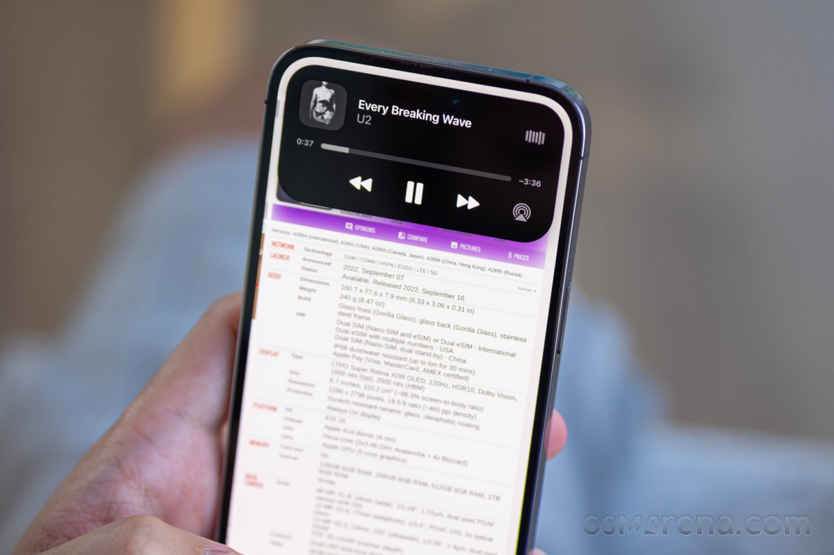 Dynamic island on the iPhone 14 Pro Max
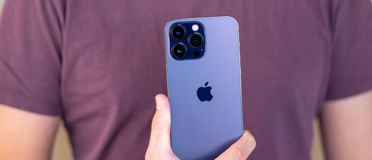
Then there's the new color - there needs to be a new color every year for those that want to make it obvious they have the new iPhone. The 2022 hero colorway goes by Deep Purple, and you can see it on our 14 Pro Max - pictured here next to last year's unique option, Sierra Blue.
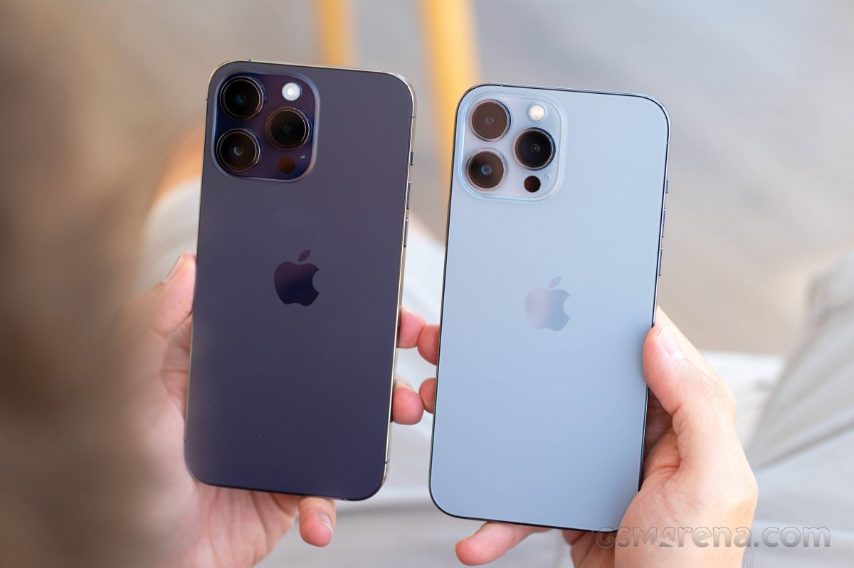 iPhone 14 Pro Max in Deep Purple (left) and Sierra Blue iPhone 13 Pro Max
Technically, the 'black' variant is also different this time around - Space Black replaces the Graphite of years past. We don't have an iPhone 13 Pro in that colorway for immediate comparisons, but while you'll casually call either one simply 'black', the 2022 version is blacker.
The Gold and Silver options remain as before.
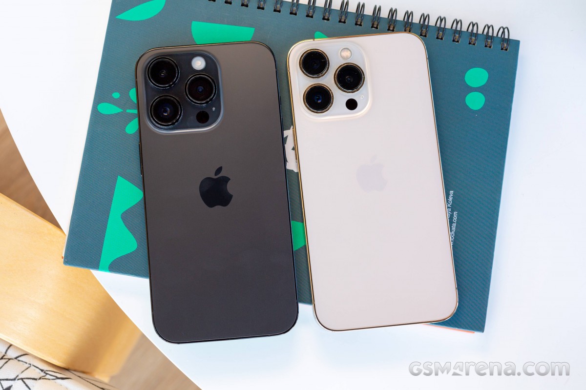 iPhone 14 Pro in Space Black (left) and Gold iPhone 13 Pro
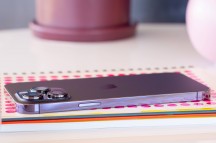
Regardless of colorway, the iPhone 14 Pros have the same finishes on the surfaces you touch and see, and those are different from non-Pro iPhones. The flat stainless steel frame is tough - the iPhone 13 Pro units in circulation around the office are still pristine a year later. It's also pretty, but the high-gloss polish means it gets covered in smudges the moment it comes into contact with skin - wiping it clean is easy, keeping it clean - impossible.
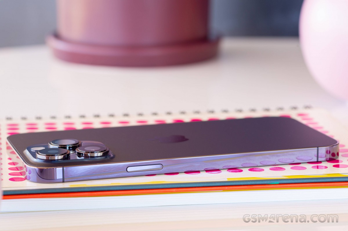 iPhone 14 Pro Max
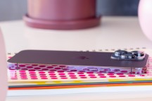
While still focused on the frame, let's do a quick tour, even though nothing's really changed. The power button is on the right and is equally easy for operation with a left index finger or a right thumb thanks to both its placement and generous size - and yes, that applies to both the Pro and Pro Max.
On the opposite side are the volume buttons, and those two are larger than on most any other phone. All three buttons have a reassuring click action - not that you'd expect otherwise from an iPhone.
Also on the left is the mute switch, a staple of iPhone alert handling. In addition to that, our European units have SIM card slots on this side, and the tray takes a single nano SIM. US units don't have the SIM tray though the slot space inside remains unused - as should be expected, doing different internal designs between markets seems illogical.
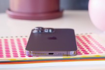
Down on the bottom of the iPhones, you'll find the Lightning port, flanked by dotted cutouts for the bottom speaker and the primary mic.
You'll note that we made sure to present the frame in its best light for these shots, which wasn't a trivial task. The iPhone 14's satin-finished frame, in contrast, practically doesn't hold fingerprints. It can be argued that it's not as premium, being aluminum like them mainstream Androids.
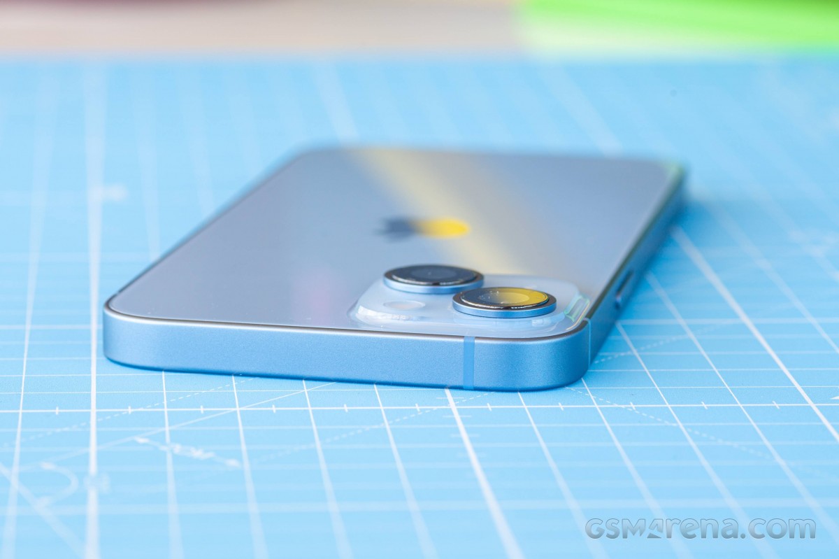 iPhone 14
Then again, the non-Pro's glossy back suffers from a severe case of smudge accumulation. Conversely, the matte frosted treatment of the Pros only leaves the mirror-like Apple logo as the lone fingerprint magnet. Admittedly, that panel is among the more slippery ones you can get - as is the usual trade-off.
All things considered, you're likely to be slapping a case on your iPhone, Pro or non-Pro, and none of this is going to matter.
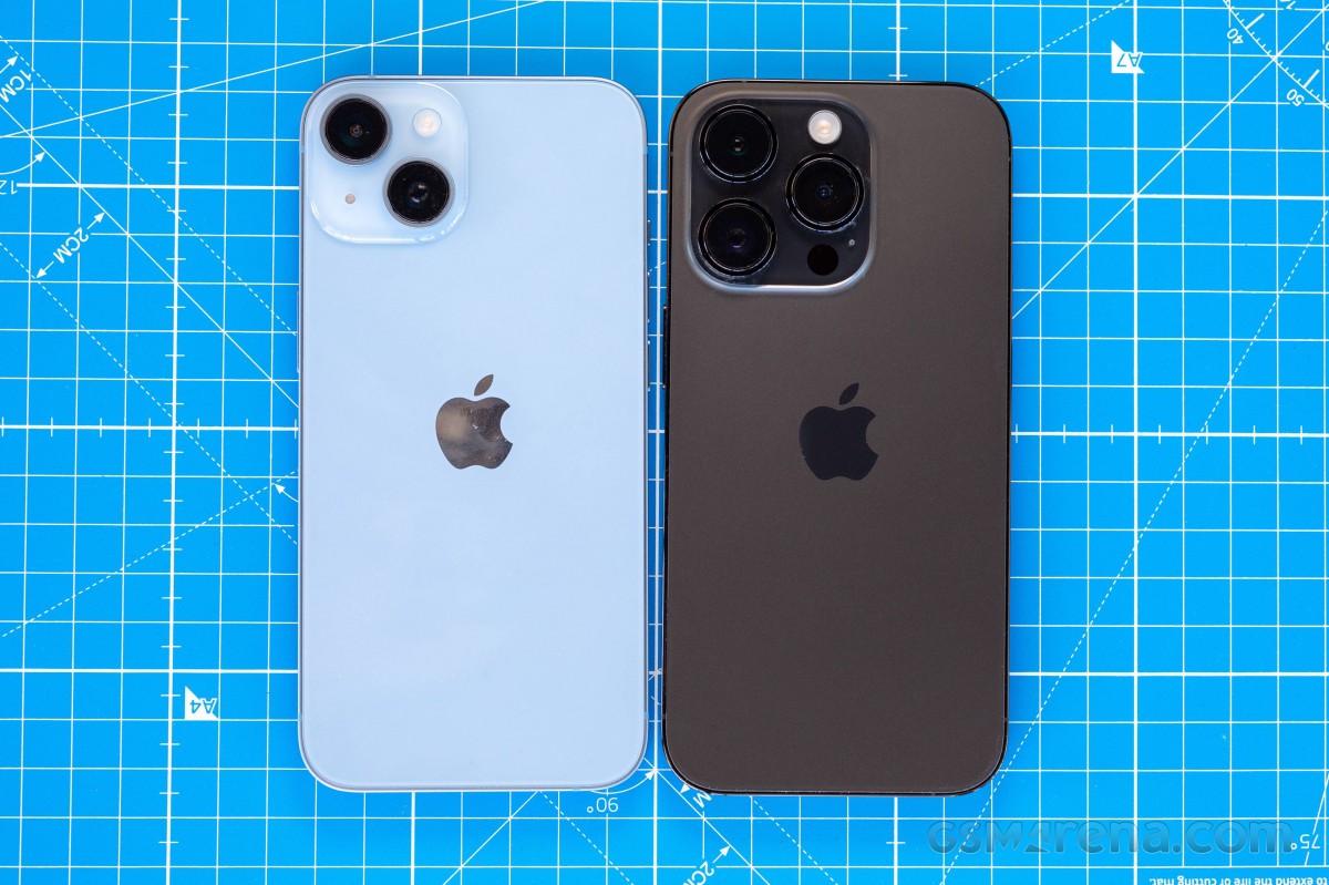 iPhone 14 (left) and iPhone 14 Pro
Not that the iPhones aren't durable all on their own, of course. The 14s have Ceramic Shield covering the screen but not the back. Made by Corning, the specialty toughened glass remains 'tougher than any smartphone glass' if you're to believe Apple. Just how much better (if, indeed, at all) it is than the Gorilla Glass-branded alternative found on non-iPhones is not for mere mortals to know.
As is the norm with Apple's handsets, the 14 series get an IP68 rating. But while your garden variety IP68 means water resistance for up to 30 minutes under 1.5m of water, the iPhones up that to 6m - we like the extra peace of mind. Having said that, the ingress protection deteriorates with use over time, and deliberately dunking your phone in water is never a good idea, not to mention salt water is always bad for your phone, IP-rated or otherwise.
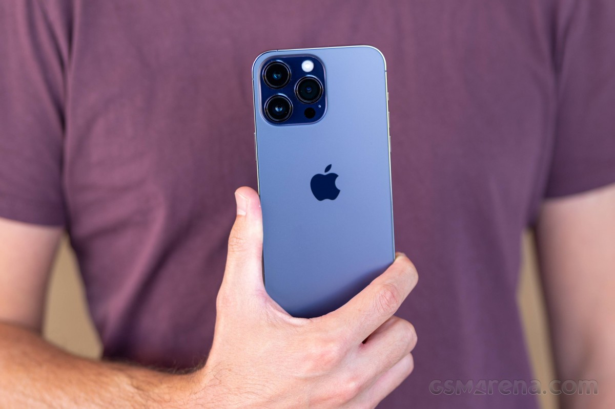 Ceramic Shield-ed IP68-rated iPhone 14 Pro
Looking at the iPhone 14 Pro Max's back, you may have noticed that the camera assembly has grown further in footprint from what was already quite a sizeable island last year. On the smaller-size 14 Pro, in particular, it looks almost like a caricature of a smartphone camera. It's more... sensible looking on the Max.
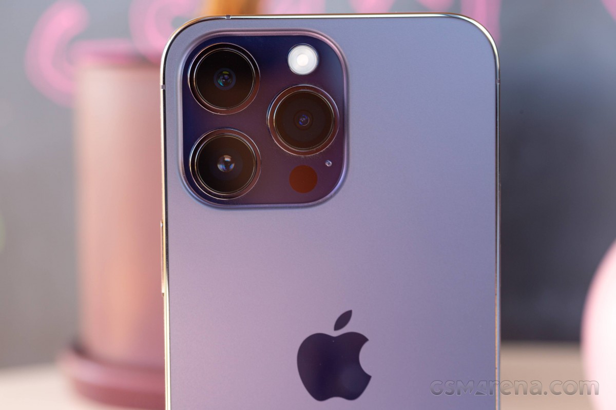 iPhone 14 Pro Max
Not only has it taken up more area on the back, but the three rings now stick out that extra bit further. Nice camera modules do take up space, and the new 48MP unit has mandated the added height, with the rest just extended to match. Naturally, the space between the camera rings will get filled with grime and pocket lint, and it's not like it's terribly easy to clean either.
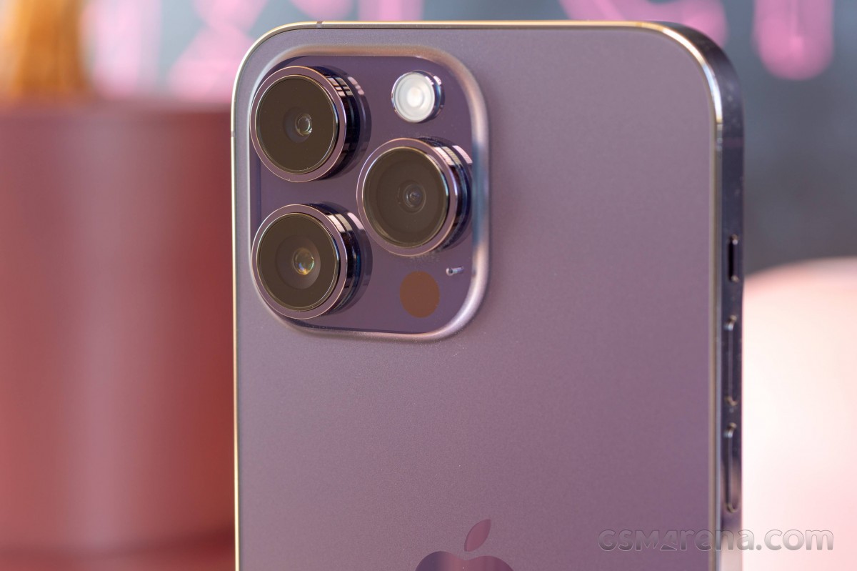 iPhone 14 Pro Max
If you plan to use your iPhone 14 Pro without a case, you'd better not be one to frequently type on your phone when it's resting on a table. The protruding camera assembly means that hitting the keys on the right side of the keyboard with any amount of zeal will result in the much-dreaded wobbling. Is it about time we stopped pointing that out? Does anyone even care about it? Has anyone ever?
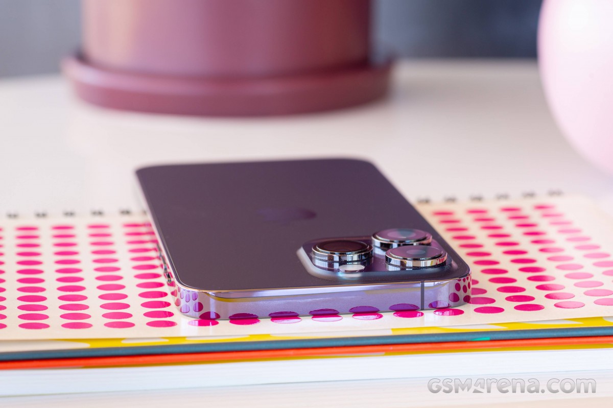 iPhone 14 Pro Max
Even though there are minute differences in the dimensions, both new iPhone Pros feel essentially identical to last year's models. The Pro Max has the size and heft to back up its price tag (well, not necessarily against other phones, but compared to the 14 Pro at least). Tipping the scales at the same 240g as last year's model, the Max can very well justify its name - short of big foldables, we can't think of anything heavier.
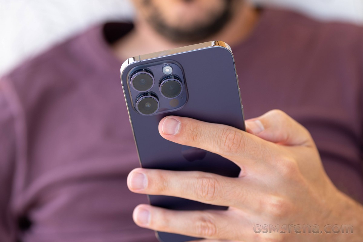 iPhone 14 Pro Max in the hand
Much like the smaller model, however, that's mostly a matter of density rather than sheer size - bigger competitors do exist. The most obvious one, the Galaxy S22 Ultra is some 2.6mm taller and a full mil thicker than the 14 Pro Max's 160.7x77.6x7.9mm, the width being the same between the two. That said, the 14 Pro Max is undeniably a huge handset and should be approached like one - with both hands and with deep pockets (in more than one way, sadly).
 iPhone 14 Pro Max in the hand
Reader comments
- Anonymous
- 12 Apr 2025
- NuU
But is the 14 pro max any good in 2025
- Soh
- 27 Jan 2025
- DIj
14 promax.i had it after that i bought 15 andnow I'm going to buy 14 pro max again. Iphone 15 hangs alot and get hot
- Anonymous
- 26 Jan 2025
- Hkt
I am talking about using both phones. Pro is better. On paper, 14 Pro Max camera megapixel is slightly higher than the 15. But in reality, if you look at the camera department of the two phones, you won't find any difference in quality. The ...
