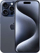
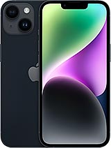
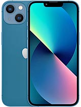
Apple iPhone 15 review
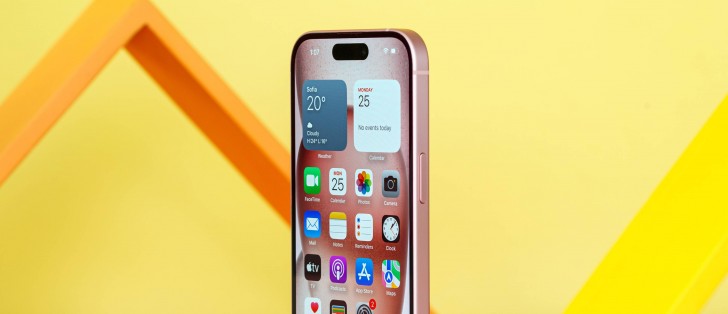
Apple iOS 17
All new iPhones come with Apple's iOS 17 out of the box. The new iOS version is probably the most insignificant update ever, no matter what Apple may try to sell you. It brings a new Standby mode, highly customizable Contact Posters, Password sharing with friends, offline maps in Maps, updated Messages with automatic SMS code deletion, interactive widgets, among others.
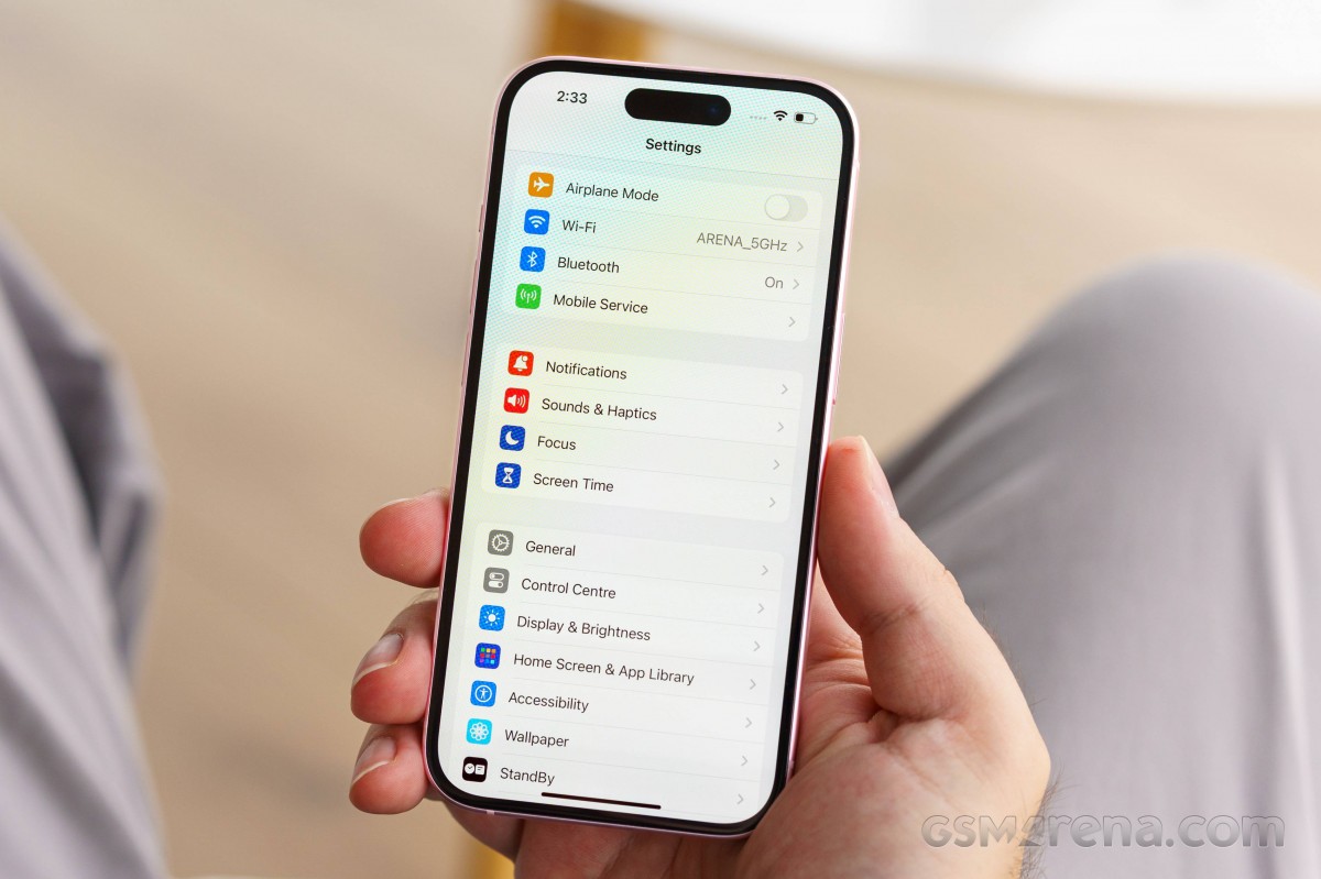
Let's take a closer look at the iPhone 15's iOS 17 now. Naturally, it is almost identical to that of the Pro models, but there are some differences for once. Notably, the Pro models have the new Action key instead of the traditional alert slider, which necessitated a new customization interface.
The interface is still based on homescreens populated with apps and widgets, App Library for your less important apps, and Notification and Control Centers.
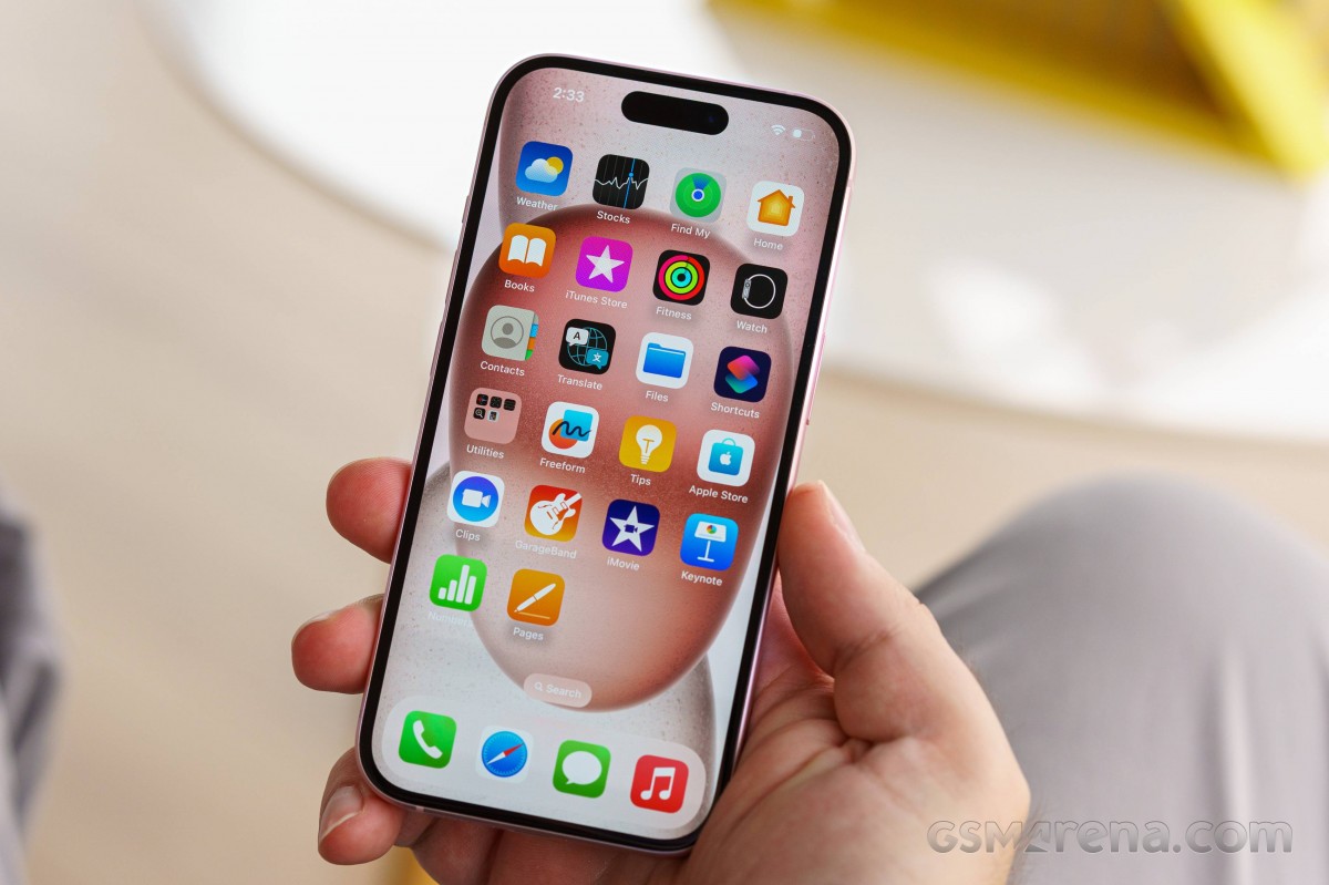
The lockscreen on iOS 17 follows a familiar logic - it's one with the Notification Center and houses your notifications (privacy options are available), plus shortcuts for the torch and the camera.
Don't bother looking for an always-on display option on the vanilla iPhone 15, though. While it does have an OLED display, it can't toggle its refresh rate down to 1Hz like the Pro models can. Apple apparently deemed always-on display at 60Hz too wasteful towards the battery. Hence, in typical Apple fashion, you don't even get the option to decide for yourself.
At least the new optional Standby mode is present on the vanilla iPhone 15. It activates during charging when the phone is put into landscape orientation. It is sort of a landscape Always-on with a bigger clock and calendar. It can show notifications, too. There is also a Night version with red colors.
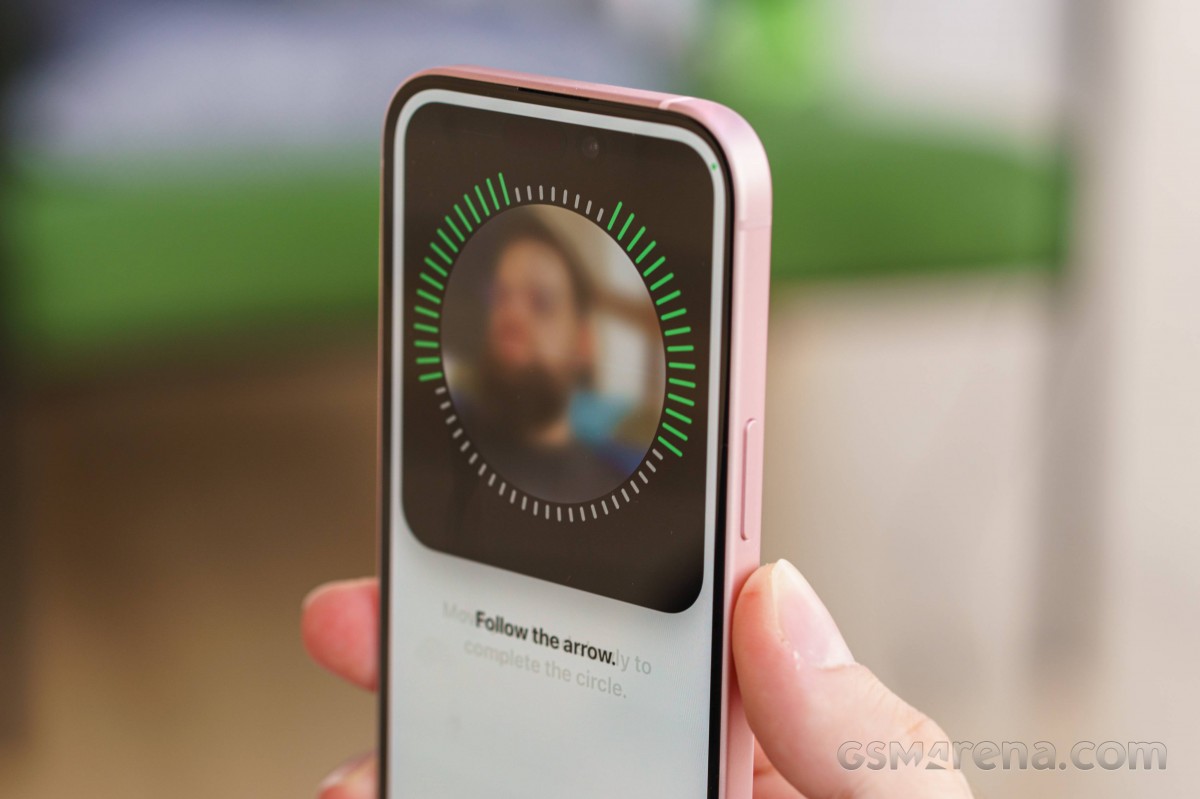
You can get past the lockscreen via Face ID or PIN if you've opted for secure unlock.
You can customize your lockscreen by picking from some cool wallpapers and adding a row of widgets (up to four). There can't be more than one row of widgets. The neat thing is that you can build a couple of different lockscreens and switch them on the go (tap and hold, then swipe). This way, you can easily change the look of the homescreen/notification center depending on your mood or work.
You can also pair your homescreen look with the lockscreen and change both in one go.
Your apps usually populate the homescreen(s) and widgets. There are two specific screens - the leftmost is the Today page, while the rightmost page - App Library.
You can hide specific homescreens - you may have a page that's full of games and hide it when at work or hide a page of work/school apps when on vacation. You can't opt out of Today and App Library, though.


Lockscreen • Homescreen • Today • App Library • Hide homescreens • Task switcher
The Focus functionality is here to stay - you can assign a Focus mode on each lockscreen preset you create. And in addition to all other ways of switching between Focuses, now switching between lockscreens also changes the Focus mode.
There are different Focus modes like Work, Personal, Driving, Gaming, Do Not Disturb, among others, highly customizable at that. And you can create and automate your own, of course.
Widgets can be placed on any of the homescreens and the Today page and coexist with app icons. There are three widget sizes supported by iOS - 2x2, 4x2, and 4x4. You can stack widgets of the same size on top of one another, and, optionally, they can rotate automatically.


Widgets • Widgets • Widgets • Stacked Widgets
The widgets are now interactive - you can tap on some of them and change things without going into the app. For example, if you have a Home widget, you can turn on/off devices straight from the widget.
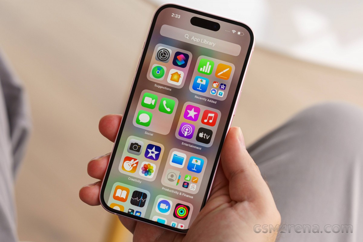
The App Library is an app drawer, which is always your rightmost homescreen pane. Apps are added automatically to the App Library upon installation. The sorting is also an automatic process, and you can't edit the categories or move apps in different categories. The app sorting depends on the App Store tags the developer has used upon uploading the apps.
The Today page is still alive. You can put the same widgets and stacks you can on your homescreens. Here, you can also use the old third-party widgets that haven't been optimized yet for newer iOS versions. The old widgets come right after the new ones, should you choose to use some new ones. It's a pity this Today page cannot be disabled, as we found it mostly useless.
The Notification Center is summoned with a swipe from the left side of the Dynamic Island. The pane was unified with the lockscreen in iOS 11, and that's why you can have different wallpapers on your homescreen and notification center.
The Control Center, which has customizable and (some) expandable toggles, is called with a swipe from the right side of the Dynamic Island. You can use a haptic touch to access additional controls. And the battery percentage is also here.


Today • Today settings • Notification Center • Notifications • Control Center
The Task Switcher hasn't seen any updates - you see app cards and swipe them for closure. You can also swipe on the gesture line for quick switching between apps.
The Dynamic Island allows for more convenient multitasking. Apple calls this the i-shaped cutout and its animations and convenience features. For all intents and purposes, Dynamic Island is a pill-shaped notch as Apple has blackened the middle part for aesthetic purposes. There, you will see the mic and camera indicators and nothing else.
The animations around the island always use a black background. There are three Island modes. Standard form - inactive island or just accommodating camera/mic indicators.
The active form is a longer pill-shaped notch with info on the left and right sides for certain events, alerts, and notifications. This long pill can also split into an i-shaped one if you launch another compatible app that can be minimized here, like the Timer.
A third form expands into a pop-up balloon - this can be invoked by a tap and hold on the small animation. A tap will open the respective app instead, though. We think these gestures should have been inversed or at least configurable, but as usual - Apple knows best.


Indicators • Dynamic Island • Dynamic Island expansion • Dynamic Island
The Dynamic Island incorporates different things - starting with the Face ID animation, charging animation, music info (Music, Spotify, Amazon, YouTube, Soundcloud), call info (Phone, WhatsApp, Skype, Instagram, Google), timers, etc. If you activate a second app that needs to use the Dynamic Island, you get a sweet animation that shortens the island and adds a small icon on the left side.
The supported system alerts include calls, AirPods and Watch connections, Battery and Charging, Focus changes, AirDrop, Face ID, AirPlay, NFC events, SIM alerts, and Silencer on/off.
Let's mention some of the new features.
FaceTime now supports leaving audio and video messages for when you're calling someone and they aren't available.
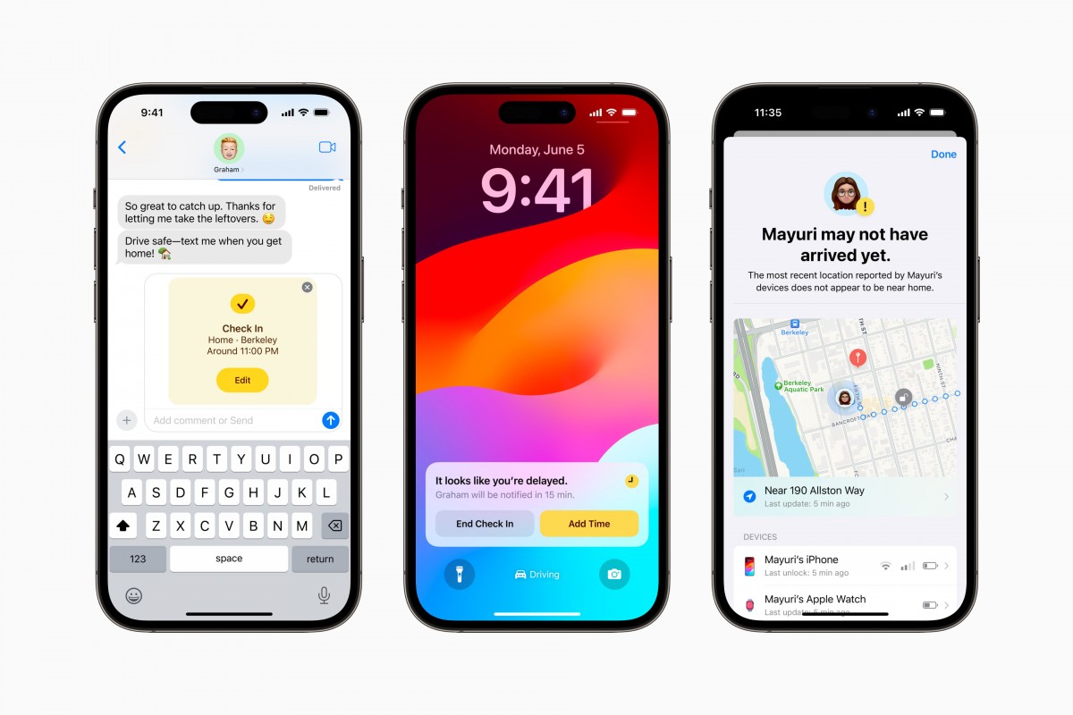
Messages now has a Check-In feature. It takes over the chore of checking in with family members when you are traveling. It works like this: once you've initiated a Check-In, a friend or family member will be automatically notified when you've arrived at your destination. If you're not making progress toward the destination, the selected contact will get your device's location, battery level, and cell service status.
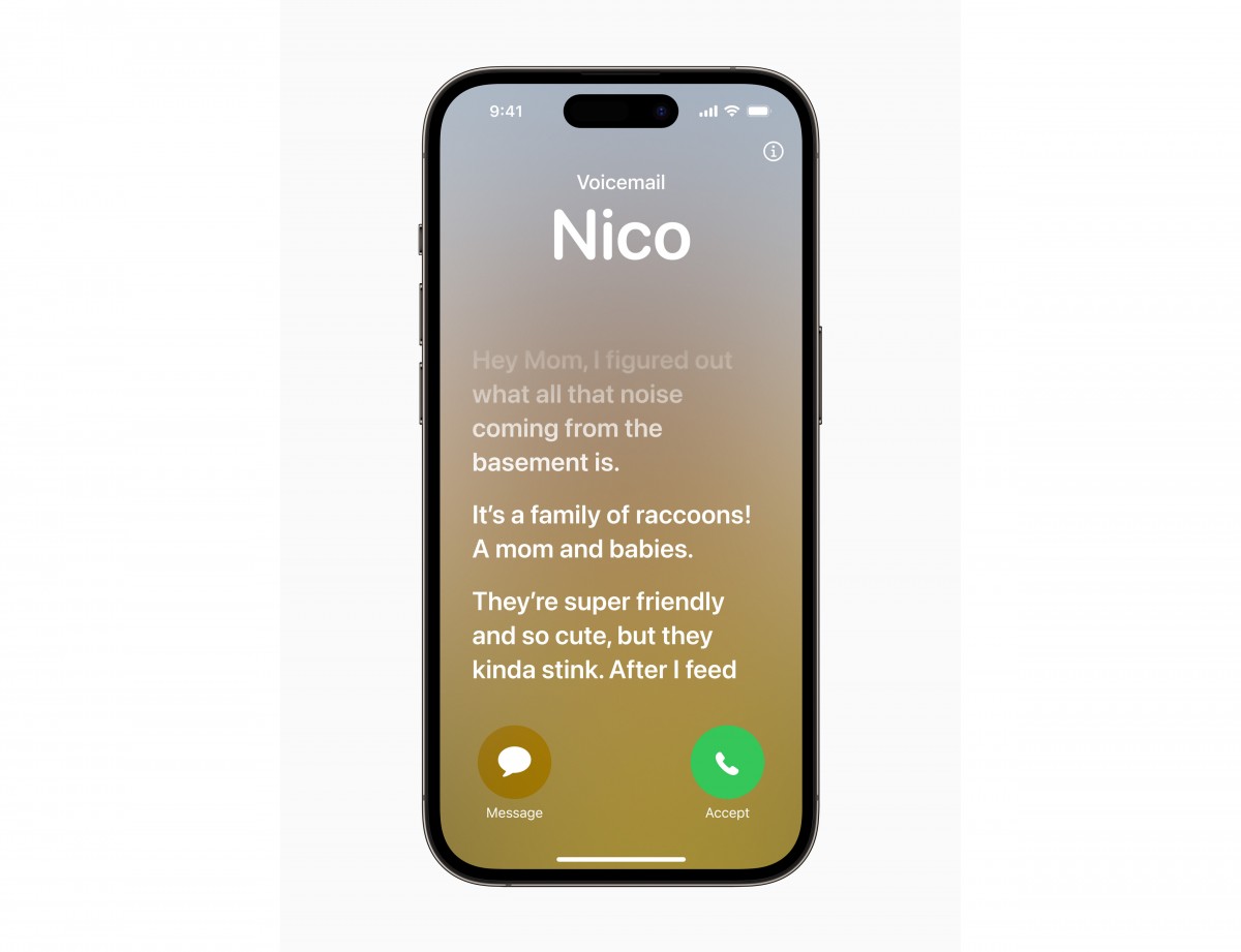
Live Voicemail is an interesting new feature. Now, you don't have to pick up when a number you don't recognize is calling - the phone will do that for you and will display the live scrolling text of what the person calling is saying, so you can easily decide if it's worth talking to them. Calls identified as spam by carriers won't appear as Live Voicemail and will instead be instantly declined. The transcription is handled entirely on-device.
There is a new customizable call screen, which Apple calls Contact Posters. You can change how they appear and choose beautiful treatments for photos or Memoji, adding "eye-catching typography" and font colors. These work in third-party apps as well, and they're also used when you want to share contact details with someone through a new feature called NameDrop - it's as easy as tapping your phones together (or an iPhone and an Apple Watch), and the contact cards are swapped.
The multimedia is handled by Apple's default apps - Photos, Music, TV.
The Photos app's library has four different views - Years, Months, Days, and All Photos. As usual, AI-powered search options and powerful photo and video edit modes are available. Visual Lookup is here to stay - you can smart crop an object or copy text from any photo.
The TV app is part of iOS 17, and it is your default video player for locally stored movies and shows you've added via iTunes. This is also the digital store for movies and TV shows, and it is also the place where you find the Apple TV+ streaming service. It's a bit overwhelming, but you get used to it eventually.
Music is the default player, and it relies heavily on Apple Music streaming service. But even if you decide not to use the streaming service, it can still do an excellent job if you have a few minutes to add your songs via iTunes.


Photos • Photos • Photos • TV • Music
Books are here for your documents, PDFs, and eBooks. Stocks and News are onboard. Safari is your default web browser, now upgraded with Face ID for the Private tabs, and Apple Maps is your default map client, which now supports offline maps.


Books • Books • Safari • Safari • Maps
All recent iPhone models support Emergency SOS via satellite (iPhone 14 and 15 series). This service is text-only and will be used primarily for emergencies, but it does support two-way communication, so you will be notified when rescue is on the way. The Find My app will also be able to share your location with friends so that they can keep an eye on you.
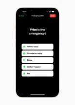
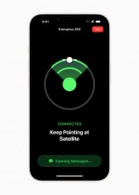
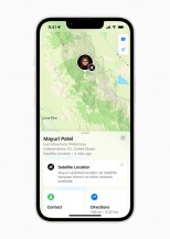
The new satellite messaging service • An emergency questionnaire • Find My reports location over satellite
You can compose custom messages to explain your situation, but when speed is life-saving, several specially prepared questions will let you send out a detailed SOS in just a few taps. The new feature added for this year is Vehicle emergency satellite services. It will initially require an active roadside assistance subscription with AAA in the US.
In locations with a clear view of the sky, a message can be transmitted in about 15 seconds, but if there are trees overhead, it may take a couple of minutes. iPhone buyers will be getting two years of free satellite services, after which a fee of some kind will be incurred for the feature. You should also check the feature availability within your country.
Crash Detection is also available on all iPhone 15 models, thanks to a new accelerometer that can detect up to 256G. If such an emergency occurs, the phone will automatically contact emergency services. This is a setting within the Emergency SOS menu called Call After Serious Crash. You can either turn it on or off; there are no other settings.
Synthetic benchmarks
The vanilla iPhone 15 uses the same chip as last year's iPhone 14 Pro models - the Apple A16 Bionic. So, you are not getting the latest Apple A17 Pro (3 nm) from the 15 Pro models, but that might actually be a blessing in disguise since that chipset has been the subject of an overheating controversy since its release. The A16 Bionic tends to run a bit hot and throttle in its own right as well, but we'll get to that.
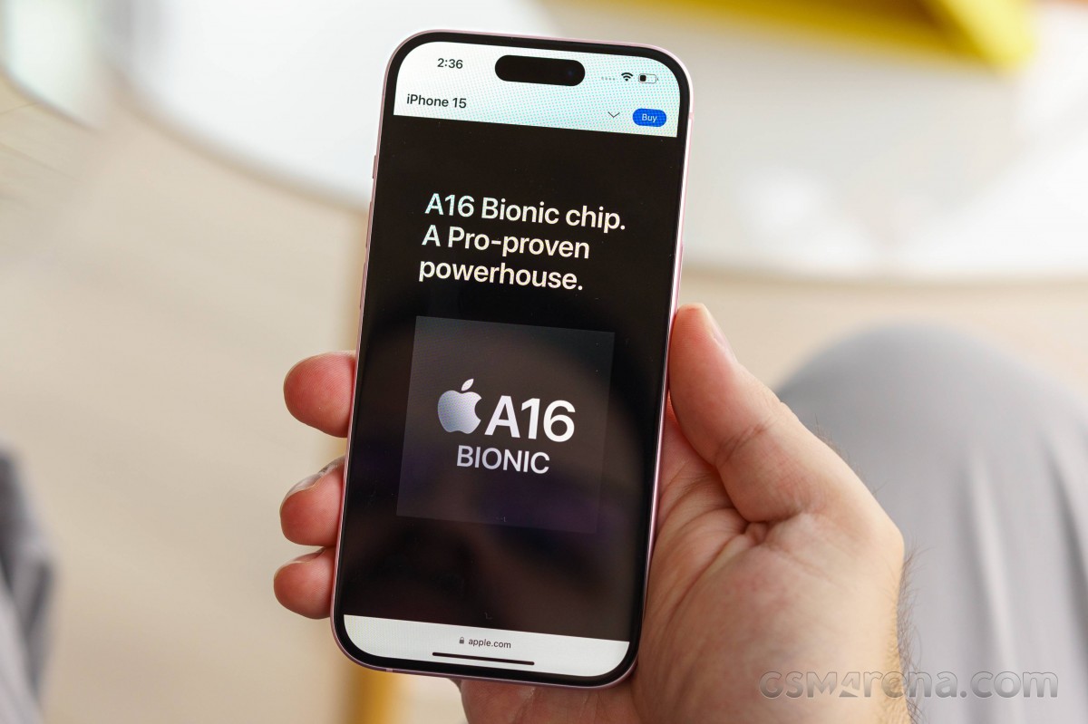
On a more positive note, the new 4nm A16 Bionic should offer a nice little bump in performance over the 5nm A15 Bionic in the iPhone 14. The A16 Bionic introduced on iPhone 14 Pro with a 5-core GPU has 50% more bandwidth than the A15 Bionic. Its CPU has two faster performance cores that use 20% less power than the A15 Bionic.
In terms of actual hardware configuration, the A16 Bionic has a Hexa-core (2x3.46 GHz Everest + 4x2.02 GHz Sawtooth) CPU setup and a 5-core Apple GPU.
This year, the iPhone 15 comes with 6GB of LPDDR5 RAM (compared to 8GB on the Pro models) and base storage is still set at 128GB (the Pro models come with a base of 256GB). In terms of storage options, you can get the vanilla iPhone 15 in 128GB, 256GB or 512GB of NVMe storage. Our review unit is the base 128GB one.
On to some benchmarks! Let's kick things off with GeekBench and some CPU runs. It comes as no surprise that Apple's chips are at the top of the CPU food chain. This has been the case for years now, and the rest of the ARM realm doesn't seem to be catching up effectively.
Even though it is a year old now, the A16 Bionic is still on top of the CPU charts, only outpaced by the new Apple A17 Pro inside the iPhone 15 Pro models.
AnTuTu is a much more compound benchmark that also includes GPU runs and memory tests, to name just a few. The iPhone 15 holds its own well in AnTuTu testing, scoring about on par with some Snapdragon Gen 2 devices.
Looking at 3DMark and its graphical testing, we start to get a hint of why the iPhone 15 and A16 Bionic might be lagging behind Snapdragon 8 Gen 2 devices a bit - a bit of GPU disparity. Generally, the Adreno 740 inside the Snapdragon seems to be a bit more powerful than Apple's 5-core GPU in the A16 Bionic.
The new 6-core GPU inside the Apple A17 Pro and the iPhone 15 Pro models is pretty much on par with the Snapdragon 8 Gen 2 in graphical performance.
We would love to show you some GFXBench scores as well, but unfortunately, the app seems to be misbehaving on the new iPhone 15, likely due to some incompatibility issues with iOS 17. To be frank, the iOS version of GFXBench hasn't been updated in a while, to begin with, so this comes as no surprise. But currently, the app can't provide consistent results.
The iPhone 15 thermal-throttles quite aggressively in graphics-intensive tasks. From what we managed to measure, it can lose up to half of its GPU performance under prolonged loads.
CPU throttling was actually quite negligible in our CPU throttling test.
We also tried to game on the iPhone 15 and went through more than an hour of Genshin Impact without really noticing any of the performance loss that was inevitably happening behind the scenes.
On another positive note, even after prolonged stress testing, the iPhone 15 never got uncomfortably hot to hold. Warm, for sure, but never uncomfortably so.
Although it is rocking last year's chipset, the iPhone 15 is definitely not strapped for power. It basically chews through anything and everything you throw at it. And it should come as no surprise that in typical Apple fashion, the UI runs extremely well and is perfectly fluid with some of the quickest, smoothest and most responsive animations and response times on any modern smartphone.
Reader comments
- GGWP1987
- 10 Mar 2025
- KLS
Just switched from android xiaomi note 9 pro into iphone 15. I must say that iphone is: 1. Weight around 170 gram on iphone 15 is game changer compare with my old phone xiaomi note 9 pro (205 Gram). 2. The design of iphone 15 is very premium, ...
- Mukesh kumar yadav
- 26 Nov 2024
- YP6
You take a Apple iPhone 15 promax
- Zekesiris
- 04 Jul 2024
- vx6
Yes it does have in the Settings > Music. The best one for me since my iP11, iP13 Mini, and iP14 days is "Late Night" option. I recently found an article as to why there is a glitch-like moment upon switching to the Late Night option lik...


