Apple iPhone 6 Plus review: Following the curve
Following the curve
Apple iPhone 6 Plus optimizes the iOS 8 UI for landscape view
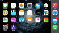
The Apple iPhone 6 Plus, just like the iPhone6, runs buttery smooth with iOS 8. Apple knew the bigger screen would require some additional touches on the iOS and that's why the company has redesigned some of its core apps for landscape use. The entire Spring Board is rotatable, while the Safari web browser, the Mail client, the Messages app, the Calendar, Notes, Stocks, even the Settings menu - they all have been given new layouts in order to utilize better the bigger display estate.
Before we continue, here is a quick video demonstration of the new iOS 8 running on an iPhone 6 Plus:
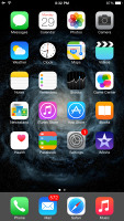
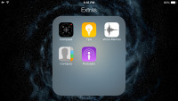
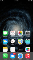
Apple iOS 8 looks the same as its predecessor. All of your apps are on the homescreen, folders are available and there is the familiar dock that can take up to four shortcuts. System icons, color themes and transparency - everything is like we left it in iOS 7.
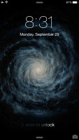
The lockscreen hasn't changed either - there is a camera shortcut, playback controls are available too if the Music app is active. If you think the lockscreen could use some shortcuts or widgets, your only hope is for Apple to open up the lockscreen to developers too - but that's not on the cards on this release.
There are three different unlock methods for you to choose from. TouchID (via your fingerprint), but there's also the classic 4-digit passcode. If that's too insecure for your taste, you can also opt for a custom passcode. This will bring you a text field where you can enter a virtually limitless security combination.
The iPhone 6 Plus introduces a rotatable homescreen for the first time in iOS. It works pretty much as expected, though it's nice to see Apple finally decided to make this happen.
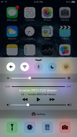
The Control Center that's pulled up from the bottom of the screen, has been slightly redesigned though it keeps the same layout of toggles, shortcuts and media controls.
The Notification Center has changed a bit more sine iOS 7. The All and Missed tabs are now gone, replaced by a unified Notification tab. The Today section has been improved and you can jump to its editing options from the bottom of the page.
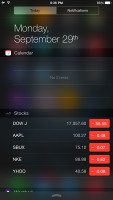
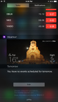
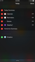

The Notification Center - Today tab • adding widgets • Notifications
The interaction with the pop-up notifications has been improved. Now you can quickly reply right inside the notification banner, discard calendar alarms, mark tasks as complete, comment and like on Facebook, among others.


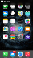

Interacting with popup notifications
While the refined Notification Center might look insignificant, it is among the places expected to make a big difference, in terms of usability. It has been unlocked to developers and various apps already offer interactive widgets. Unfortunately those have a long way ahead before they turn out as useful as Apple had in mind in the first place.
With the new generation of bigger iPhones Apple has implemented an easier way to reach what's on top of your screen, including the status bar for notification access. All you need to do is tap (not click, tap) twice on the Home key and your entire UI will drop down at your fingertips. It isn't pretty, but it works.
This quick access works within all apps opened in portrait mode, too.
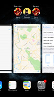
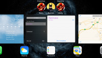
The task-switcher interface is invoked with a double tap on the Home key. It looks a lot like the webOS cards of old and, more recently, the HTC Sense Task switcher - all apps are presented with cards that you can swipe up to close. Each card has the respective app icon so you can easily recognize what's what.
The Task Switcher got an extra row at the top - a list of your recently contacted Favorites followed by your recent contacts. A tap on a contact here will reveal additional options: call, message.
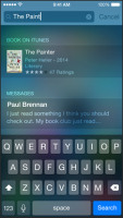
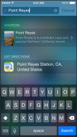
Apple made a big deal of the Spotlight update - the unified search tool now supports smart suggestions. Spotlight is now capable of pulling suggestions from Wikipedia, IMDb, an assortment of news sources, nearby places, App Store and iTunes content, iBooks and more. This is indeed a tremendous usability boost. By the way, suggestions work within the Safari browser too.
Another notable improvement over the previous iOS version is enabling developers to add their own sharing options or actions in the iOS contextual menus. For example, if you have an app that sends files over Bluetooth, it can integrate with the iOS contextual menus and there you go - you get standard Bluetooth file sharing in just one click. You can edit the available sharing options and actions in these menus, so they don't get cluttered.
Open In option is available as well - you can redirect any file of unknown format from anywhere to any app you want. For example you open a document within your Dropbox and they you can choose Open In and open (a copy of) the file with an office editor of your choice.


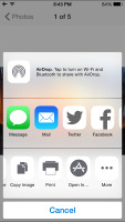

This is where the new sharing and action plugins appear • Open In
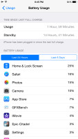
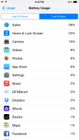
Apple has finally added battery usage stats in the Settings menu. There you can find which app drained your battery and how (low signal, background usage, etc.). You get daily and weekly stats.
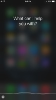
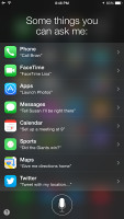
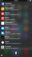
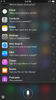
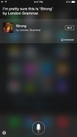
The intelligent voice assistant Siri got better with iOS 8. Its most important new addition is the Shazam integration. There is no need to ask Siri to recognize a song - just open Siri and let it listen - then it will tell you the name of the song and will provide you with an iTunes link. Another new cool option is voice activation. If your iDevice is hooked up on a charger/cable you can summon Siri by saying "Hey, Siri".
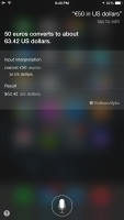
Siri can carry out commands affecting the iOS - it can turn Bluetooth or Wi-Fi on/off, increase brightness, play voicemails, check other people's social network status, play iTunes Radio stations, etc. It is a really powerful voice assistant capable of even POI search. Assistance with restaurant booking is part of Siri's set of skills. It will find you exactly the restaurant you are looking for and filter the results based on user reviews. You can run impressively detailed searches based on food type, location, outdoor, pool, price range, ratings, etc. This feature is not available in every country, though.
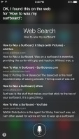
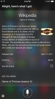
Siri also answer slots of questions and including game scores. History, stats, player bios, player comparison, teams, records, etc. Siri should be able to return most of the info right onto its own screen, without switching over to the browser. The same applies to movies. You will get all of your movie-related answers right inside the Siri window - anything about actors, directors, awards, movie stats, premieres and tickets, reviews, trailers, etc. Siri also comes with Wikipedia integration.
Finally, Siri in iOS 8 can take dictation in 24 new languages, which will spare lots of people some typing on the keyboard.
iOS 8 brings a very familiar user interface and logic of operations with minor improvements towards better customization. We've yet to see how this will turn out once the developers start offering various interactive widgets, sharing options and actions, but the platform should benefit a lot.
Reader comments
- Knowledge
- 06 Nov 2024
- rvy
Mu iphone screen dnt want respond
- Najib Abubakar
- 03 Oct 2024
- XBA
My iphone is upgrade to iOS 12
- Najib Abubakar
- 03 Oct 2024
- XBA
My iphone is upgrade to iOS 12
