Apple iPhone 7 Plus review: Hail to the king, baby!
Hail to the king, baby!
Apple iOS 10
Apple unveiled iOS 10 last June. As part of the new update Apple refined the lock and home screens, the notification and control centers, the 3D Touch experience, Siri, and improved the system apps.
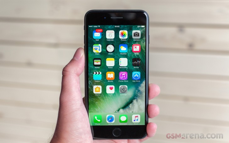
Since the beginning the iOS user experience has successfully revolved around a few basic premises anyone can pick up quickly and iOS doesn't bring any changes in that direction.
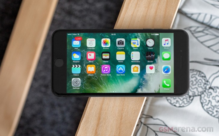
First - the homescreen. All apps go there and you can group those in folders. There are no widgets on the homescreen, there is no separate app drawer either.
The new addition to the homescreen is the fixed leftmost Today page, which now supports various widgets, including the mandatory Spotlight search. But more on the Today page later.
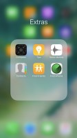
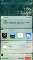
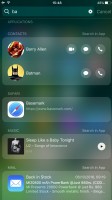
The homescreen • All apps are there • A folder • The Today pane • Spotlight search
Second - the Notification Center. It's a page you bring down from the top and it has all your notifications.
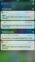
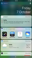
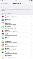

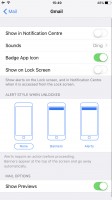
Notification Center • Today page in Notifications • Notification settings • Notification settings
Third - Control Center. You slide out this pane from the bottom and it packs quick toggles and quick shortcuts. You can swipe the contents of the pane left and right to get to music controls and HomeKit menus.
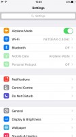
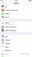
Fourth - the Settings menu. Every setting is packed in there, just like with any other mobile OS. It isn't the best organized settings menu we've seen as there are quite a few inconsistencies, but it does the job.
Now that's out of the way, join us as we explore some of iOS 10 features in more detail trying to see what's new and what's gone for good.
Apple has redesigned the lockscreen and even though it seems familiar, it has lots of new features. It now supports pick up to wake and the phone lights up every time you take it in your hand.
There is an easier way to access the camera now - just swipe left. If you swipe right, you'll find your Today widget page. At a time when Android has just gotten rid of the lockscreen widgets, Apple is keen on bringing them back.


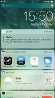
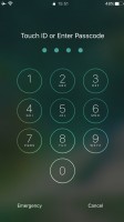

The new lockscreen • quick camera access • Today page • PIN • You need to press for unlock
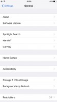
The screen may wake up automatically, but it doesn't unlock when you laying your finger on the Touch ID sensor. Instead, you'll need to press the Home button to go further. This ensures you have the opportunity to interact with the widgets and notifications on your lockscreen but many users will find this new way inconvenient. Luckily, you can enable Rest Finger to Open option from Accessibility -> Home Button. The Today page on the lockscreen, along with the Notification and Control Centers can be disabled.
Speaking of the Notification Center, it has been redesigned with new bubble-like notifications. The Today page is also available here.
The notification screen shows all your recent notifications that you can 3D Touch to expand and see additional options. A notification can be expanded into a card where you can see a lot more content and even images and videos. iMessage, for example, will not just show the message but when expanded it will show the entire chat that you can scroll through and reply to as if you are in the app. You also get more than two options when you expand a notification now, which is handy. This works within the Notification Center, on the lockscreen, and if you are in another app.
The Control Center is now comprised of three panes - one with toggles and one with music controls. Its design also features bubbles. There is a third Control Center Tab if you are using the new Home app - shortcuts for your home appliances.
Unfortunately, the Control Center is still a rather sad place that prioritizes unnecessary functions and no customizability. For one, you can't get to the Settings menu by longer pressing of the toggles. Secondly, neither AirPlay and AirDrop, nor Night Shift deserve the prime-time location that they get on the panel, and should have been reduced to smaller buttons. And finally, the four toggles at the bottom can be 3D Touched for additional functionality but you cannot add or replace any of them. This is rather frustrating as there was ample scope to turn it into something truly useful here.
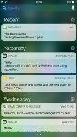
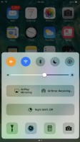

Notification Center • Control Center • Control Center
Let's talk about this new Today page we've mentioned so often. It's like a homescreen with a list of widgets and you choose which ones should be present. The top is always the Spotlight search field, and then you can put weather, calendar, Siri app suggestions, and whatever widgets your apps are offering.
The Today screen shows you the clock as well as all your widgets. Widgets have also been updated in iOS 10 and look similar to notifications. They support two sizes now, the default compact size and an expanded size you can get to by tapping Show More. A developer can choose to show additional information this way by expanding the widget to a much larger size. Adding and removing widgets works the same way it did before, and the Add Widgets screen will show all your widgets that are present on the device from the installed apps.


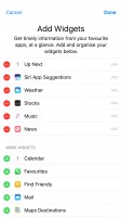
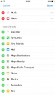
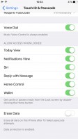
Today • Today • Adding widgets • More widgets • Disable Today within Touch ID settings
The Today page is the leftmost page on your lockscreen, homescreen, and Notification Center. If you prefer, you can disable it altogether.
The 3D Touch functionality got implemented into even more places across iOS and Apple is fighting well for its last year innovation. It may have started as a gimmick, but its usefulness is growing with each update.
You can use the 3D Touch on various app icons to reveal quick actions. But now Apple has expanded those quick actions with system apps by showing an additional row of favorites, quick contacts, recent music, and other relevant app-specific content. When you 3D Touch an icon that has a widget, the widget now appears along with a list of 3D Touch options. You can also 3D Touch folders now to rename them and see the apps inside that have a pending notification.
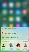
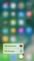
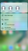
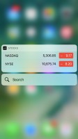
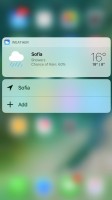
Using 3D Touch across the interface
Naturally, pop-up preview of pictures, web links, messages, mails, notes, and photos, is available.
You can now force press on notifications (both in the Notification Center or the pop-up ones) and expand them into actionable balloons. Apple calls those Rich Notifications. This means you can chat on Viber, respond to messages, or mails, straight from those 3D Touch bubbles and then return to what you were doing without ever leaving the app.
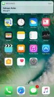


A notification • Replying with 3D Touch in a bubble • 3D Touch overview of a conversation
Siri has gotten an update, too. It is now opened to developers. What does this mean? Well, you can call an Uber via Siri. Or send Viber text and photos. Or send money through a Money app such as PayPal. If an app is compatible with Siri, you can now ask Siri for specific third-party app actions and it will do it.
Lastly, you can now finally uninstall some of Apple's own apps from the phone. Well, maybe not fully uninstall, but they do get hidden. You just have to press and hold on them to remove them like third party apps. Not all apps can be removed but the list of ones that can be removed is longer than those that cannot, and other than basic apps like Phone, Safari, App Store, Clock, Messages, Photos, Camera, Settings, Wallet, Find my iPhone, and Health, all the other apps can be removed. This frees up some memory but not a lot. Once you remove them, you can get them back by going to the App Store and searching for Apple's apps.
Apple did a good job refining the interface and there are enough new features to enhance the user experience without complicating it. You may never use some of those and you will still get to experience the iOS in its full beauty. But if you do, you may find it easier to just force press on something or ask Siri to do stuff instead of you. It's nothing ground breaking, but it's definitely moving forward.
Reader comments
- suraj kumar
- 13 Jun 2024
- Cb8
this iphonme 7 pluse is amezig. i'm very happy.thanks for apple.
- Bazzu
- 30 Nov 2023
- Nh{
I think this platform focuses much on the Iphone and ios related content,maybe to save your energy,cut the crap and carress your android antiques in peace. Ios all the way💯🙌
- Anonymous
- 29 Sep 2023
- tZk
The last of generation of affordable Apple phone.. Pleasant to use with no major hiccups… Now the new Apple phones price are just not worth buying.. Might as well use Samsung midrange phones and change every 2 years still cheaper than iPhone 15…
