Apple Watch review: Uncharted territory
Uncharted territory
User interface
Apple Watch runs on the newly unveiled Watch OS, currently in version 1.0.1. That .1 at the end points to the first firmware update that Apple released in mid-May, which was said to improve the performance with some apps, while adding support for new languages and bringing better notifications.
Just like iOS, the Watch OS follows a What-You-See-Is-What-You-Get UI approach. There are no hidden menus to be invoked with the hardware keys though the enhanced longer press (Force Touch), which requires somewhat heavier pushing and holding, will open up some contextual app options which may not be obvious at first. These appear in apps like Messages, Music, and Calendar. It also lets you select different watch faces, pause or end a workout, search an address in Maps, and more. Some third-party apps also have contextual menus that open upon a Force Touch.
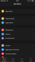
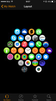
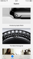
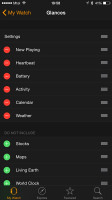
Apple Watch app on the iPhone 6 • Configuring Glances
The Watch OS has four major components - main menu, notification center, the Clock app and Glances. It relies on its touchscreen for navigation, the Digital Crown for precise positioning and scrolling, as well as Force Touch (a heavier press on the screen, like on resistive displays of old). The latter is mostly used for accessing configuration and viewing settings of different apps.

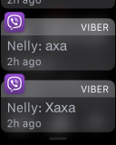
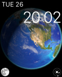
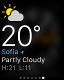
Main Menu • Notifications • Clock • Glance (Weather)
Upon pairing you will be asked to choose on which wrist you will be wearing the Watch. This way you can use the Apple Watch on your right hand as opposed to the default left hand. The UI will switch the orientation accordingly and the Digital Crown won't be awkward to use.
The pairing process takes a minute or two, which is rather long, but since it's a one-time thing we don't really mind. After that the Apple Watch is ready to use, but you'll have to enter some additional details if you want to use the fitness tracking and health-related apps and services.
Naturally, the Clock app is the most important app in the Watch. You get 9 different watchfaces at launch, but hopefully Apple will add more in the future. We also hope Apple will allow third-party watchfaces in the Watch Store, but for now we'll have to rely on updates to expand the catalogue.
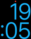
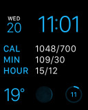
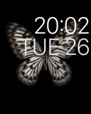

Watchfaces - X Large, Modular, Motion, Astronomy
Anyway, you've probably seen most of those watchfaces in the official ads - Utility, Modular, Simple, Motion, Astronomy, Color, Solar, Chronograph, Mickey, and Large. Most of those are configurable - you can opt for additional on-screen information such as calendar events, sunrise and sunset, moon phase. Adding and removing watchfaces is easy, but rather useless at this point, as there are no more watchfaces besides those.
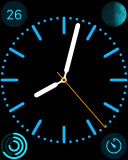
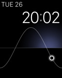
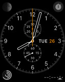
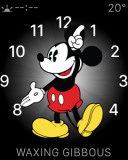
More watchfaces - Color, Solar, Chronograph, Mickey
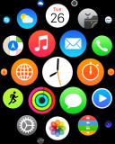
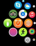
The Main Menu has all the apps you have installed on the Watch, displayed with circular icons. You can scroll through them with fingers and zoom in with the Crown. You can rearrange the icons on the go, uninstalling happens the same way as on the iPhones. Many apps now offer extended support for the Watch and you can notice various icons on your Watch at first run - SkyView, Yahoo Weather, Instagram, TripAdvisor, etc.
A push on the Digital Crown means Back to Main Menu when you are within an app or a Glance, but it will focus on the Clock app if you are in the Main Menu, or it will just launch the Clock if the app is already in focus (centered).
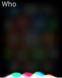
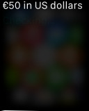
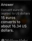
If you click and hold the Crown, then you'll summon Siri. It does pretty much the same stuff as it can do on the iPhone, its UI has been just converted to support the Apple Watch. Experience with Siri at this point is dodgy at times, particularly when the phone is more than a meter away from the smartphone.
Occasionally the virtual assistant will refuse to come up on your Watch screen and other times it simply won't accept your commands. The lag with executing commands is also far more prominent than on the iPhone, but that was to be expected.
Glances is a system similar to the Android widgets. One Glance takes one screen and you can have as many Glances as you want. Key features are all covered - Calendar, Heart Rate, Connectivity toggles, Maps, Battery widget, Activity tracker and Stocks. All of your iPhone apps that support Watch Glances appear on your Apple Watch app and you can easily enable them.
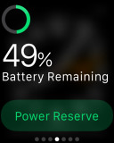
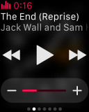
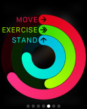
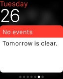
Glances - Battery, Music, Activity, Calendar
To access the Glance screen you just need an upward swipe on the watchface. If you swipe down instead, you'll bring down the Notification Center, which appears to be the same as on the iPhone, just properly resized and simplified.

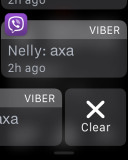
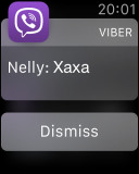
The Notification Center • Viewing a single notification alert
Many developers are adding Glance support to their apps, so the number of available Glances should rise quickly over the next few months.
There is no Watch Store on the Watch, you have to add the apps from the Store tab in the Apple Watch app. That's the way competing platforms work and the reason is quite clear - browsing apps on the tiny watch screen is a real pain.
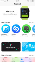
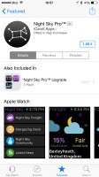
The Watch Store within the Apple Watch app on the iPhone
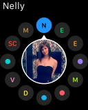
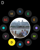
Pressing Favorites key launches a reel with your Favorite contacts and you can easily interact with them via the Crown. Call and Message - just a tap away. A press and hold on the key pops up the Power menu.
If your Favorite contact also uses an Apple Watch, a new key appears below the picture. If you tap on it you can send your heart beat (hold with two fingers on the screen), poke him/her (just tap on the screen), or send a small drawing (you can choose the color of your marker). Those are rather cool features, but wear off very quickly.
Unfortunately those arrived rather slowly on the other end and the Watch didn't give us notifications about the drawings.

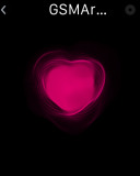
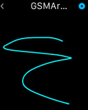
Sending heart beat and drawings is easy
Making or taking a call on the Watch is hassle-free. If you opt to take a call on your Watch, you need use both its speaker and microphone. The speaker quality is excellent, though it is quiet and you'll have a hard time hearing anything when in even moderately noisy environment.
The microphone is pretty decent and if there's no external noise the people on the opposite side won't notice you are talking from something else but your smartphone. The lack of a second mic for noise cancelling makes things far trickier when there's ambient noise, though.
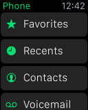
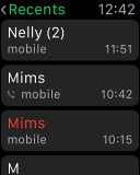
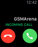
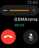
The Phone app - making or taking a call is easy
The problem with the Bluetooth hands-free priority remains though and Apple must fix it with the next firmware update. As things stand now, the Watch can hardly coexist with a Bluetooth headset or a car infotainment system - the double-bridged Bluetooth connection and the resulting lag just ruins the entire call.
The Watch supports Do not disturb and Airplane modes. You can turn on/off those separately or you can set them to mimic the other one's behavior - scheduling/turning on or off those on the Watch does the same on the iPhone and vice versa.
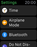
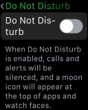
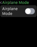
Settings • DND mode • Airplane mode
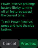
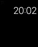
Finally, the Watch comes with a Power Reserve mode, which is basically a secondary operating system that turns your smartwatch into a regular one. It removes all eye-candy and all features, and does nothing but display the clock upon detection of your wrist movement. It does prolong the Apple Watch battery life tremendously though, but unless you only need to know the time we find it rather pointless.
Speaking of the wrist detection, the Watch is accurate 90% of the time and turns the screen on as expected. That's decent if not quite as perfect as we hoped - after all if you are going to bet on one gesture to activate the screen rather than give users a choice, you need to make it work flawlessly.
After all the Apple Watch uses an AMOLED screen, which should have allowed it to show the time all the time like some smartphones do. And if that meant sacrificing some battery life then perhaps it would have made sense to have it as an optional toggle so everyone would be free to chose what they prefer.
Reader comments
- cesta sol12
- 24 Aug 2016
- v{Z
very good model...i really like this
- Droid
- 03 Dec 2015
- mrC
To be honest. Could you compare this gadget to huawei watch or moto 360 2? No realist fans
- Krishna
- 12 Jul 2015
- X0E
Nice watch an apple company is very good company an product an good
