Archos Diamond Omega review
Stripped-down Nubia UI
We expected Archos' involvement in the UI department to only have to do with customizing the OS to better fit the French and other EU markets. However, the Nubia UI launcher we found on the phone seems to have been rather stripped of most extra features we're used to seeing on Nubia phones.
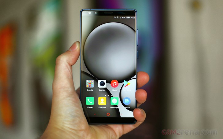
Don't get us wrong, we do appreciate the lack of bloatware and the full Google app package and Play Services integration, however we miss the numerous interesting features the Nubia UI is known for. These appear to have been "plucked out" of the software often times leaving behind noticeable holes and even non-functioning menus and controls.
To be fair, Nubia has never been overly consistent in the OS department either. Throughout the years, their phones have oscillated from having vanilla ROMs to being incredibly bloated and heavy - especially on non-international versions of its devices.
To Archos' credit, there are still a few of Nubia's value-adding features on the Diamond Omega. But, more on that in a bit.
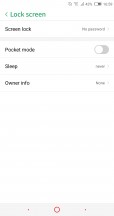
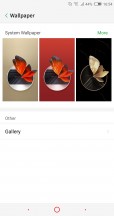
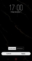
Kicking things off, we have the lock screen. All you get is a simple wallpaper and a clock. Nubia's GalleryLockScreen is gone.
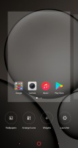
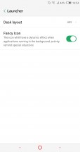
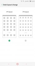
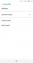
There is no support for themes either. No fancy FIT Card side swipe interface or special home camera and neoShare panels either. We get a basic launcher with not many custom features. You can manage the number of columns in the launcher and that's about it.
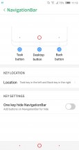
At least, you can still re-arrange the on-screen navigation controls. By default, the back key is on the right, old-school style. You can toggle that the other way around. Still, we can't help but remember past Nubia devices also having custom long-press gestures. Those didn't make it in this edition of the software.
Moving on the UI itself, a lot of it takes after Apple's iOS. There is no app drawer. With this launcher style, especially popular in China, you have all apps on the homescreen.
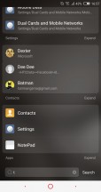
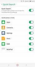
Folders can help organize the apps and you can dock the 4 or 5 most used apps in the bottom row. There are no app suggestions underneath folders and no neoShare home panel to the left - both signature Nubia UI 5 features. Perhaps, the Z17s variant of the handset will have those intact. At least the convenient system-wide search feature is there. You just have to swipe up to open it.
However, you do have to be careful exactly where you swipe up from. One of the major changes which has been introduced in Nubia UI 5 and is present on the Archos Diamond Omega is the new notification and quick toggle shade, or should we say shades. Nubia decided to separate the two things out in a fashion vaguely resembling the latest iOS on iPhone X. Swiping from the top of the interface opens a dedicated notification area - one of several the OS recognizes as distinct places for notifications.

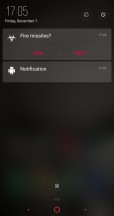
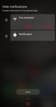
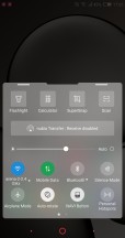
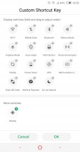
Dedicated notification shade • Notification blocking • Separate quick toggle shade
The quick toggles and brightness slider are moved to their own shade. It can be pulled up from the bottom of the UI. Unlike in previous iterations of Nubia UI, the new V5 finally offers some degree of customization.
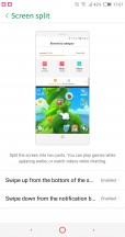
Just be sure to swipe up a little to the left or right of the home button. Doing a central swipe is a different gesture, which by default, triggers the Split screen UI. The gesture situation gets even more confusing if you opt to trigger the split screen feature with a downward swipe as well.
Clearly, one thing Archos didn't clean up is the confusing mess of gestures within Nubia UI.
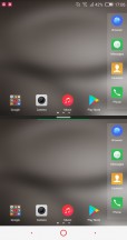
The Split Screen feature is actually one of the better implementations out there, minus a few slightly irritating issues. For one, you can view the homescreen twice, dock and all, which just looks weird. Also, not all apps resize to fit their allotted portion of the screen; most remain a downscaled 16:9 version of themselves, which is often too tiny to use properly. The good news is that even third-party apps seem to work in this mode and some of them are smarter about resizing than the Nubia's native apps.
Before we get into all the extra usability features, and there are a lot of them to cover, let's finish off with the basic navigation and notifications. The app switcher employs a horizontal layout, with a swipe away gesture for recent apps. There's also an X that will "Accelerate" your phone by closing running apps and freeing some ram.
App management has always been one of the more powerful aspects of Nubia UI. Unfortunately, Archos cut many of these features out of its ROM, but some still remain. Notification management, for example, is really in-depth. Nubia UI 5 recognizes a few distinct types of notifications and areas to display them in. It also offers a phenomenal level of per-app granular control. Bear in mind that most apps tend to install without granted access to any notification privileges by default. So, if you need something in particular, you have to go in and enable it specifically rather than the other way round.
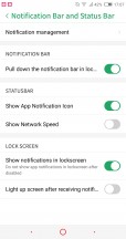
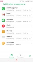
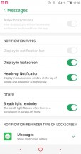
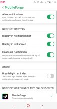
Powerful notification management
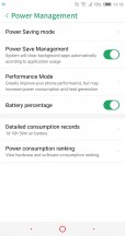
Power management still gets its own dedicated menu on the Archos Diamond Omega, but the level of control available is noticeably less than on Nubia handsets we have reviewed in the past.
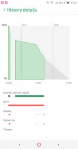
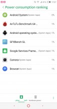
You can check out per-app battery statistics, as well as hardware power usage. There are a couple of battery saving profiles and those are the only way to kind of control background activity. A real shame, since Nubia UI 5 on the Nubia Z17 had a powerful NeoSafe to manage permissions, hardware access and even background service activity on a per-app basis.
Other missing advanced management features, Nubia users are likely familiar with include Flow - the WiFi and mobile data manager, as well as Intercept - the call blocker and whitelist manager.
Gestures
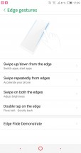
On a more positive note, most Nubia gestures are present on the Archos Diamond Omega as well. While Nubia's approach to a curvy front panel might not be the most cutting-edge or technologically advanced one, the OEM has managed to make great use of its bezel-less design with lots of custom gestures.
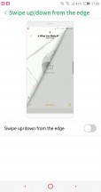
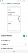
Swipe up or down on one side of the screen - that can switch back and forth between apps or launch a couple of apps (one for up, one for down). Swiping on both edges simultaneously can be set to adjust the screen brightness. An up-down-up-down gesture on one edge can only be set to accelerate the phone, i.e. close running apps, complete with a cool animation. Double clicking the edge can double as a back button or bring up a floating navigation ball.
And that's not all. There are a few other gestures that don't pertain to the edges of the phone.
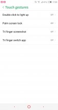
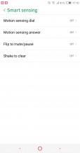
You can double tap the display to wake the Diamond Omega. Also cover the screen to lock it. There are also a pair of three finger gestures, which we almost didn't even have the energy to research at this point. With "Smart sensing" you can pick up the phone to dial or answer and flip to mute or pause playback. Also, shaking the phone can be used to "conveniently" invoke the "Accelerate" feature.
At least, to Archos' credit, there are no untranslated Chinese texts in the Nubia UI 5 accessibility section this time around.
There is also scheduled power off and on and even a toggle to disable the standard Android button combination for grabbing a screen capture. Nubia does provide the option to use a press on the fingerprint reader for that instead, so we guess it sort of makes sense.
Beyond the features we already mentioned, the Archos Diamond Omega also has App Clone, a dedicated Game Mode, to better cater to users, potentially struggling with the new ultra-wide aspect ratio, as well as the convenient, scrolling SuperSnap screenshot option.
Each of these is neat to have baked in. That being said, we would have preferred an untouched Nubia UI 5 ROM, complete with Google Play Services. Maybe an international Nubia Z17s can deliver on that end.
Reader comments
- Anonymous
- 21 Dec 2017
- nYK
Not much french left of them, it's 99% China now.
- AnonD-722550
- 14 Dec 2017
- 3L4
Zte z17s has quickcharge 4.0 and archos has only 3.0V
- Loach
- 14 Dec 2017
- 8kn
And the Honor V10 will come also around 500€...A much better deal as I see...

