Asus Google Nexus 7 (2013) review: The magnificent seven
The magnificent seven
User interface
The 2013 Asus Nexus 7 2 was announced alongside a new Android version. This time around, Google added another tenth to the Android release number and brought 4.3 Jelly Bean to the world.
You can take a quick look at the new OS in action in the video below.
While at a first glance, the newly launched OS version appears to be a minor release, it comes with plenty of tweaks under the hood, thud optimizing an already well accomplished OS.
The most notable changes in Android 4.3 include improved multi-user support with the introduction of restricted profiles (read Kid's Mode, of sorts), updated stock apps, and improved notifications.
Further on, there's support for OpenGL ES 3.0 for even better graphic and gaming experience, support for Bluetooth 4.0 with low energy (LE) mode, and new hardware-based encryption for DRM for easier streaming of copyrighted high-definition content.
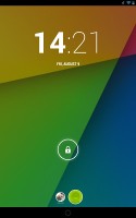
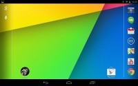
As expected, the lockscreen area of the new Nexus 7 offers a great deal of functionality. There are multiple unlock routines, some more secure, some quicker to unlock, but the default is swipe to unlock.
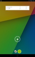
The clock on the lockscreen is now a widget rather than a fixed item. You can have multiple widgets (you swipe left and right to go between them) and you can rearrange them similar to homescreen widgets. The difference is that only one widget can be visible at a time. The widgets that are available by default are a digital clock, Gmail and Calendar (you can have multiple copies of each). Apps can add their own lockscreen widgets to the list.
If you have more than one user set for the tablet, you'll see their images as circles at the bottom of the screen. This is a great way to share a tablet at home as everyone will get to use the slate as they like - as long as you don't use it at the same time, of course.
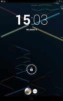
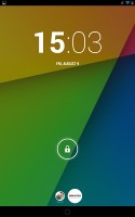
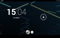
Switching accounts is really neat
You can tap a circle to switch to that user, which will also change everything from settings through what installed apps are installed to what files are accessible. So, if you snap a photo while signed into your account, it will only be accessible from that account. That works even when you hook up the tablet to a computer - you can't access files from another account.
If you try to install an app that's already installed on the tablet, but on another account, the OS will make it available for your account too (without re-downloading it). The apps files will be separate for the different accounts.
Overall, the multi-user support is a great way of sharing your Nexus 7 with your partner/kids or even roommates. It doesn't waste any storage and there's no need to fear that your settings will be messed up or your apps/saved files deleted. Nor is there the need to deal with other people's apps that you don't need either.
The addition of restricted profiles to Android 4.3 allows the tablet's primary owner to choose which applications a restricted user can access. Naturally, before setting up a restricted user on the slate, the primary one will need to set up a secure lockscreen feature for his/her own profile.
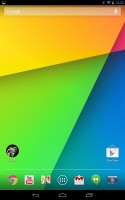
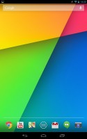
There are still the usual five homescreen panes, none to be added or removed.
A portion along the bottom of the display has been reserved for three on-screen buttons - Back, Home and Recent apps. The buttons are easy to reach on the tablet's relatively compact display.
Above the row is the tray where the most commonly used apps can be docked. The Nexus 7 allows up to six shortcuts to be placed within it, surrounding the app drawer shortcut in the middle. Any of the six shortcuts can be customized by dragging icons into and out of the tray, and you can even create folders by dragging icons on top of one another.
Another permanent fixture is the Google Search bar at the top of the screen, which stays in place as you scroll the homescreen panes.
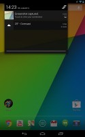
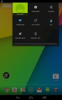
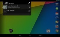
The notification area is split into two, much like the split-screen keyboard in iOS, so you actually get two separate pull-downs. The first handles all the system notifications -emails, instant messages, app notifications, etc. The second pull-down tray holds various settings shortcuts.
The one in the top left shows the current user and lets you switch to another one. Other settings include Wi-Fi, auto-rotate, battery info, airplane mode and Bluetooth. Wi-Fi and Bluetooth will bring you to the full settings instead of just toggling them on and off as is more common with notification area toggles.
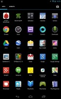
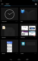
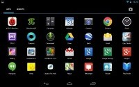
The app drawer holds no surprises compared to previous Android versions. It features two tabs - Apps and Widgets - that feature side-scrollable pages. If you don't like swiping, you can tap on the margin on the left and right of the grid of shortcuts to quickly move between screens.
If you scroll past the available apps you automatically move into the Widgets tab. There's also a shortcut next to the tabs, for quick access to the Android app market. A slight annoyance is that apps and widgets are ordered alphabetically and there's no other sorting option or a way to manually rearrange them.
Placing a shortcut or widget works as you would expect - you press and hold to grab it and then position it anywhere on the homescreen. While you're dragging, an Uninstall field will appear along the top of the screen, where you can drop to remove widgets.
Besides being resizable both vertically and horizontally (some can be resized only in one direction), homescreen widgets in Jelly Bean automatically adjust their size to fit in the spot where you want to place them. This is especially useful on an already busy homescreen. Also, if you drag one widget on top of the other, it will make space for itself by forcing the icons underneath to rearrange.
To resize a widget, you tap and hold and then release it. Four handles will appear on its sides, allowing you to change the widget's size in the direction you want.
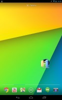
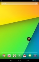
Folders are created in much the same way as in the shortcut dock; you simply drag one shortcut on top of another. By default, a new folder won't have a label, but you can name it by opening it and tapping on the "Unnamed folder" label. Opening a folder expands it only as much as needed to display the icons inside.
The folder icons are circular with the shortcuts inside lined one behind the other as if looked at an angle (complete with perspective). They are lined up in order, so the first shortcut in the folder will be the only one clearly visible, with the rest falling behind progressively smaller and obscured.
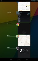
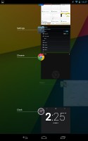
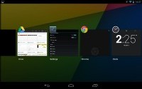
The Recent apps button brings up a list of your recently-used applications. It displays thumbnails of the applications which you can press to open quickly, or swipe to the side to remove.
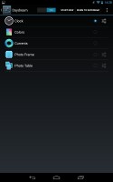
Android 4.3 Jelly Bean isn't just business and no play. Google has integrated a little feature called Daydream, which is simply a sort of a screensaver. Once turned on, you can set it up to show photo albums or the latest news from Google Currents when the device is either docked or idle.
Reader comments
- Anonymous
- 16 Aug 2016
- JHF
LOL the one thing that can't be fixed by a software update is a grounding issue. That's the most basic hardware issue there is! Similar to the on/off switch being broken...
- ksinha165
- 26 May 2015
- X0Q
Yea surprisingly we can bro :D
- yardbird
- 10 Sep 2014
- LaT
Yes it does support OTG and it had sim slot(only lte version)
