Asus Zenfone 9 long-term review
Updates
The Zenfone 9 got two software updates while we were using it for this long-term review, and the first one brought Android 13, back in early December. That's a very good turnaround time compared to most OEMs that aren't Google or Samsung, so we commend Asus for working to quickly send out the latest version of the OS to the Zenfone 9, though it looks like older Asus smartphones will have a lot more waiting to do than this one.
Then there was an additional update a few weeks later, which was much smaller so we assume it only packed bug fixes and various improvements. The point is that for big Android updates, as long as you have the latest high-end device it makes, Asus is quick enough in our book. Again, it may not be the quickest, but there are plenty of much slower rollouts out there.
We can't speak a lot about how timely the security updates are, since the early December rollout of Android 13 did also bring with it the December security patch level, and most companies that aren't Google or Samsung haven't sent out the January patch to their phones yet.
The situation seems to be similar, however, with updates going out slower than the fastest movers out there but still faster than a lot of the Chinese competition. In a nutshell, things are about average on the software update front - above average if you have the latest and greatest, and perhaps below average if you don't.
ZenUI
Asus' skin on top of Android is called ZenUI, though you wouldn't know it from the About phone page in Settings, where there's no mention of it. All you get is the Android version and a convoluted build number.
Anyway, this is one of the lightest skins around, which takes Google's Android, keeps the looks intact, and adds a bunch of extra options here and there. "Stock Android" purists may or may not like it - after all, it isn't stock Android, but it's also not MIUI or One UI or ColorOS. It's far from those in its design language, and in fact if you don't pay too much attention you might think this is the same software Pixels run.
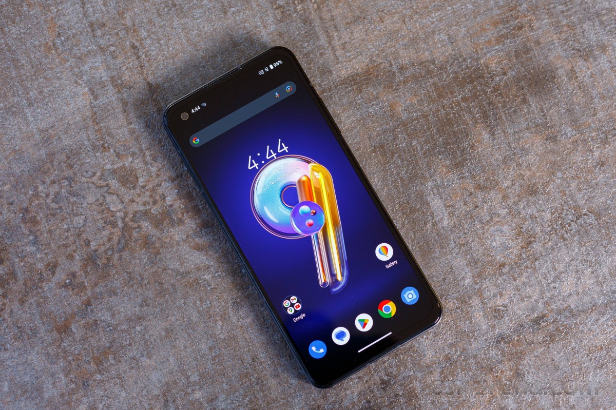
Whether that's a good thing or a bad thing is up to you. It could be argued that it's good since Asus has less things to modify and thus possibly mess up, or that it's good because it looks pretty much like Android does in Google's presentations. On the other hand, skins are, for better or worse, a point of differentiation between Android phones, and if your device's software looks just like a competitor's, it's losing at that specific game.
We don't lean in either direction because there are plenty of other options out there if you don't happen to enjoy Asus' take on the software. There's even a similarly sized device with a very not-stock-like skin, in Samsung's Galaxy S22, and as long as there are multiple choices out there, we're happy.
Perhaps unexpectedly, the Settings menu on offer on the Zenfone 9 is one of the busiest we've encountered recently, so if you thought there wouldn't be so many things to choose from because of its stock-like looks, you'd be wrong. It's easier to navigate than some heavier skins' Settings menus, however, and even if you struggle to locate something the search function is always there for you.
Interestingly, you can choose between two types of Quick Settings designs, the more traditional one with circles for toggles, and the newer one with ovals, which take up much more space for no good reason whatsoever. You probably guessed that we went with the former, and you would be right.
Launcher, Recents
The launcher is pretty standard, with an app drawer and all, but for such a stock-like skin we're baffled by the omission of the Google Discover feed as an option to show up to the left of the leftmost home screen. This is now a thing even on much heavier skins like MIUI, so the fact that ZenUI doesn't have it is strange. Obviously, though, it's not hard to live without - unless you're a die-hard Google Discover feed addict. Do those even exist?


Launcher with home screen and app drawer
Anyway, we digress. The Recent apps display is horizontally scrolling, as are most these days, and you get a couple of big options at the bottom, of which Screenshot is incredibly redundant, as there are at least three other ways to achieve the same purpose - you can tell Google Assistant to take a screenshot for you, or press the power and volume down buttons at the same time, or double tap the back of the phone - our favorite.
Speaking of double tapping the back, you can set that to do other things, naturally, if you aren't inclined to use it for screenshots. Just note that, as this feature uses the accelerometer, your taps need to be much more decisive than a tap on the screen would be.
Back to the Recents menu - the Clear all button is simply pointless in this day and age, when smartphones have ample amounts of RAM, and Android is actually very good at managing memory. But there are still those people - you know who we mean, the ones that keep their OCD at bay by tapping pointless buttons. This is one of them.
Gesture navigation, Dark system color scheme
On the topic of pointless UI elements, the white (or black, depending on background) pill-shaped bar thing that shows up at the bottom of the screen when you have gesture navigation enabled probably takes the cake. All of the cakes, in fact. And since this is a stock-like skin, you unfortunately can't turn it off, like you can in some heavier ones. You're just stuck with it forever.
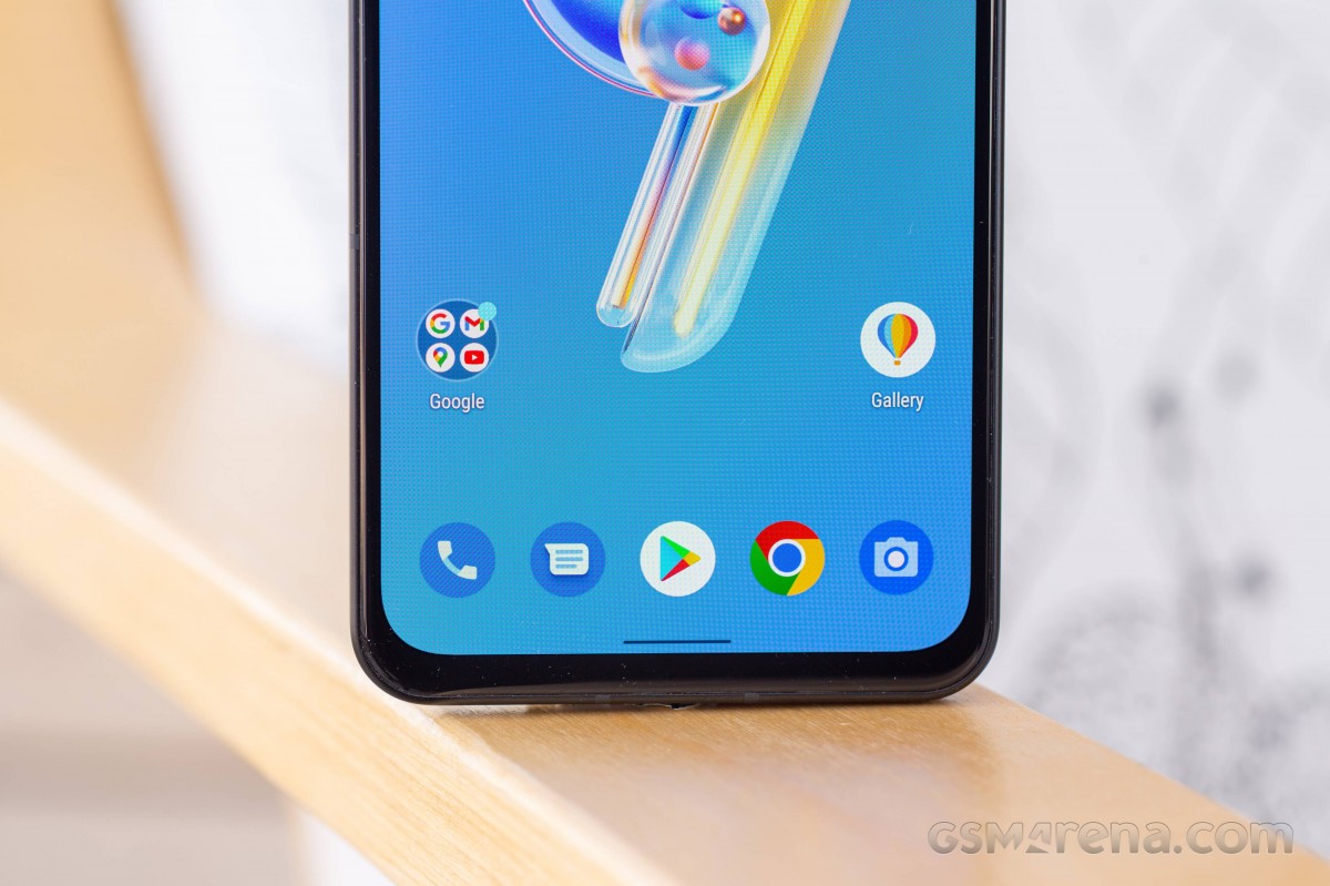
It's always there when you're using the phone, and it's never not useless, as you could in fact swipe across the bottom even without this eyesore constantly 'indicating' to you that it's there - that's how they do it on other skins. Zero functionality taken away. But no. Google insists you look at the pill bar, and Asus does too. You'll either have to deal with it or switch back to a navigation bar with buttons, which takes up even more screen real estate, so the pill is the lesser of two evils for sure.
There are two sensitivity sliders for the Back gesture when you have gesture navigation turned on, and you can play with these if you feel like that gesture is either too easy or too hard to trigger. We thought the default settings were just fine.
Asus calls its dark theme "Dark system color scheme", which feels like someone was desperately trying not to use the same words as everyone else in order to feel different. Just call it a dark theme, or dark mode. It's more efficient when two words can be used instead of four.
Anyway, the dark theme (we're not playing Asus' game, sorry) exists, and is schedulable to go on automatically at sunset and off at sunrise. There are no custom schedules, though, which is a weird oversight. On the other hand, you can choose whether to tint your wallpaper dark, and by how much, with an Opacity slider.
This feature is "only available for non-default wallpapers", for whatever reason, and while it's certainly welcome (and seen in many other skins), the slider is probably overkill for most people. We found its default setting to be perfectly adequate.


Dark system color scheme settings
Finally, you can force the dark mode onto selected apps. You get a list of all your installed apps, which is sorted alphabetically, and there aren't any other sort options. But there is a very welcome search function that will quickly get you to the app you're looking for, in case it still doesn't have a dark theme of its own in this day and age.
Bugs, annoyances
While we have received a second smaller update after the one that brought us Android 13, which we assume was intended for bug-fixing purposes, there are still some bugs running around on the Zenfone 9 after installing that. We're hoping these get addressed as soon as possible, as they are annoying even if you might be able to live with them - or perhaps not even get them at all. That's the nature of random bugs, they don't necessarily show up on every device.
Anyway, let's start with the biggest one. When picking up a call we randomly can't hear the person at the other end, but they can hear us perfectly fine. This has happened only a few times, and before you say maybe it was network-related, it's never happened to us on any other phone, ever, and every single time it was always us who couldn't hear them, and not the other way round.
This same thing happens much more often when you switch between earpiece, speaker, and Bluetooth earbuds while already in a call. Around 80-90% of times after switching, we couldn't hear our interlocutor anymore. The only fix that works every time is to hang up and call back, which definitely is anything but ideal. Switching again to the earpiece, speaker, or Bluetooth accessory sometimes works too, but oftentimes it doesn't.
Oh, and speaking of the speakerphone, it's bad - to the point where most people we were talking to while on speakerphone constantly asked us to repeat what we just said, even when we were in a quiet room. This is another one of those small details that generally differentiates true flagship smartphones from the mid-rangers (and sometimes 'flagship killers'), which isn't obvious from looking only at a spec sheet, and unfortunately, the Zenfone 9 does not pass the flagship test in this regard.
Next up, some milder annoyances. Wi-Fi randomly turns back on again after you've turned it off, and initially we thought this was just a bug within the function that is supposed to automatically turn Wi-Fi back on when you're in an area where you've used Wi-Fi before. And then we turned that off, and it was still happening. Within a few minutes after turning Wi-Fi off, it's back on again - even if you're in a part of town where you've never used Wi-Fi. This is much less of a battery drain problem nowadays than it used to be, and so you can safely just ignore it, but it's still a baffling bug to experience.
The manual adjustment slider for brightness, which is located at the bottom of the expanded Quick Settings view, constantly gets stuck in one specific scenario. When you enter a pitch black environment, the brightness appropriately goes down to its minimum. But the slider is stuck on the previous position, never actually getting to the leftmost point. This is obviously even more easily ignored than the Wi-Fi problem described above, since it's just a cosmetic issue, but it is a bug we've noticed a lot so we thought we'd mention it nevertheless.
The status bar can only show you a grand total of three notification icons at one time, even if there's obviously ample room for more. It feels like this feature was implemented back when notches were a thing, and a wide thing at that, and then Asus' software engineers just forgot about it and never changed it once hole-punches took over.

Three notification icons is all you get
And now a(nother) small nitpick to end with. The stock Phone app's call log doesn't contain a detailed calling history with a specific contact. If you tap the contact it immediately calls, and tapping "i" just gets you to the contact page. On many other skins, there is a way to see your full call history with said contact, but not here.
Reader comments
- I like turtles
- 04 Jan 2025
- U2J
Got the phone since it came out. Its a solid phone. Overheated alot here in aussie summer weather. The frame has a lot of scrathces and dings. Battery is still mint. Screen got damaged from extreme heat (part of screen got whiter/faded like image bur...
- Electra
- 26 Jul 2024
- 0Vm
I've had my zenfone 9 for 8 months now. My first OhNo surprise was that the sdcard slot was gone, it used to have one in the reviews I read before I bought it, and I would never had bought it if I knew. Another issue is the camera. Well as it do...
- rohitmishra
- 09 Jul 2023
- Dkx
Hey, I'm on the same boat as you. I wanted to get the Zenfone 9 but it never came to India and I'm not really hopeful about the 10 either. Where did you manage to get the Xperia? I'm looking to get one new from Amazon UK. Found a selle...


