ZenFone Max M1 and Lite L1 hands-on review
Design
One of the major differences between the Lite and the Max is the design.
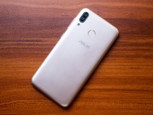
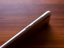
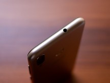
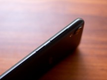
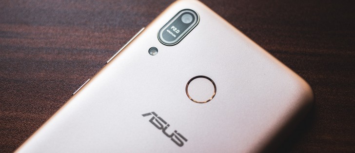
The Max is the fancier of the two. It has a nicer metallic paint finish with smooth curved corners. On the front, the curved glass blends smoothly into the curved sides. The back camera is cleverly designed to look like it has a dual camera system, even though it doesn't. The power button on the side has a spun metal finish.
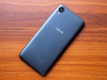
The Lite doesn't exactly look bad but it definitely doesn't look as nice as the Max. The paint has a dull finish but the most noticeable thing is the flat glass on the front that neither looks nor feels nice.
Both phones are built reasonably well. They are entirely made out of plastic but they don't feel cheap. They are also very light - particularly the Lite - which could be a consideration for some.
Overall, these are fairly well-designed and well-made phones, but you definitely get a much better overall package with the Max.
Display
Both phones have an identical 5.45-inch, 1440x720, 18:9 IPS LCD. As mentioned before, the Max has a curved 2.5D glass while the Lite has a standard flat glass but both are reasonably scratch resistant and have an oleophobic coating.
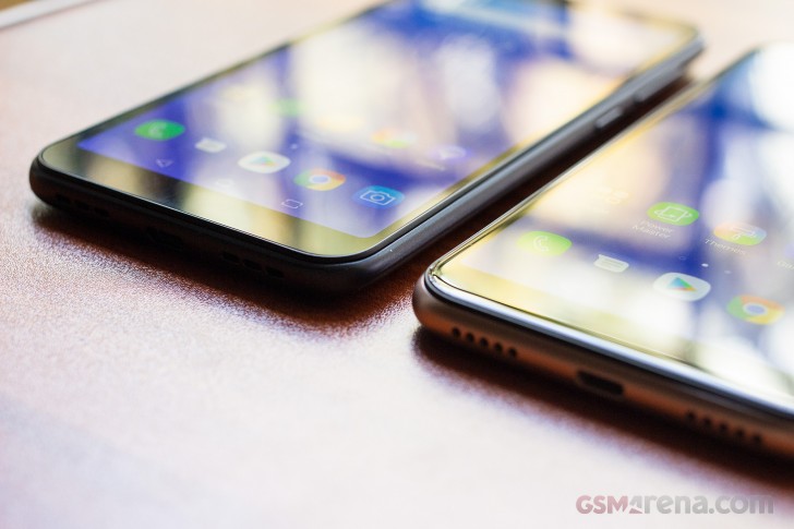
Image quality on both displays is pretty good for the price. The colors look good and the sharpness is adequate. The displays also get pretty bright and have good visibility and viewing angles.
Overall, the display on these phones is pretty good and doesn't leave much room to complain.
Reader comments
- riversin
- 17 Sep 2022
- 7Xn
so very nice phone, qua;ity phone
- Bikram
- 11 Jul 2020
- DkB
More phone darkar asus zenfone max and lite L1

