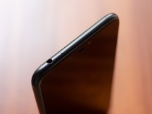
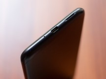
Asus Zenfone Max M2 hands-on review
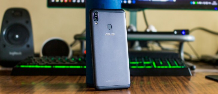
Design
The design of the Max M2 is different from the Max M1, although not remarkably so.
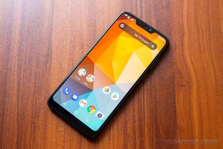
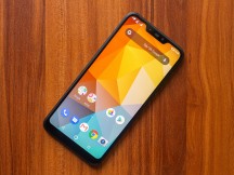
The main difference is on the front, where the new Max M2 has much smaller bezels, including a thinner chin and a notch at the top. This does make it look a bit more modern but whether it looks better or not is entirely subjective.
From every other side, the two phones are nearly identical. The few minor differences that exist include a slightly redesigned speaker grille at the bottom.
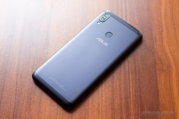
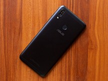
Aesthetically, the Max M2 looks alright. It's very understated and simple without any of the fancy glass back or two-tone finish of its rivals. Some may see this as a benefit while others might find it a bit boring.
Despite the budget pricing, however, the phone is built very well, with no flex or creaking in the body and a firm, uniform feel throughout. It's also fairly slim and light.
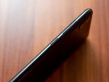
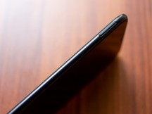
Ergonomically, the phone is decent. The power button on the side falls within easy reach although the volume buttons are a bit of a stretch. Similarly, the fingerprint sensor on the back is placed just a tad bit too high so you have to shift your grip between using the sensor and then using the phone. It's also a fairly large and tall phone, so not for those who like something more compact and manageable.
Overall, the ZenFone Max M2 is a reasonably well-designed and well-built phone, although the design does feel a bit stale compared to its rivals or even the more expensive Max Pro M2.
Display
The ZenFone Max M2's 6.26-inch, 1520x720 resolution IPS LCD is decent. It has reasonably accurate colors, once you set the manual white balance control all the way to its warmest setting and also gets extremely bright at about 482 nits. It's also fairly large, which is great for watching videos or playing games.
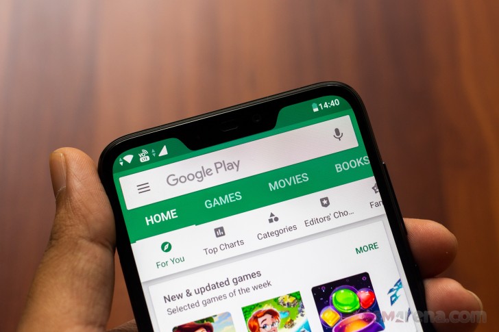
Unfortunately, it's only 720p resolution, which shouldn't really be a thing in 2019, especially on a phone that isn't exactly entry-level. While the phone does get by in most cases by having a rather large default font size, smaller text and icons are less forgiving.
There are also no notch settings on this phone, much like on the more expensive Max Pro M2. You can't set individual applications to use the full height of the display, which means content gets cut below the notch when the apps go fullscreen.
The display also has a dimming feature that dims the display when showing darker content to improve the contrast. Unfortunately, it's a bit aggressive and can be distracting at times, especially since it's on all the time and outside of video applications it's largely unnecessary.
Overall, the display on the Max M2 isn't too bad but isn't high enough resolution for a panel this big.
Reader comments
- Darren Paring
- 08 Aug 2021
- x{6
Asus_X01AD Can't activate volte fully updated
- Anonymous
- 07 Nov 2020
- 7Xq
I've been using my Asus Zenfone Max M2 for more than a year already and I am satisfied with it. Satisfaction depends on your usage. If you want a long life battery, I can say that this is worth it. It lasts up to 48 hours (depends on your usage)...
- Imran
- 03 Jun 2020
- rJd
Asus zenfone max m2 is the worst handset I had ever purchased. Purchased year: Jan 2019. Performance: Jan 2020 replaced motherboard due to software issue and same had been incurred after 4 months without any physical damage. Now compa...
