Asus Zenfone Max review: Tanking up
Tanking up
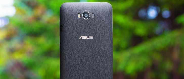
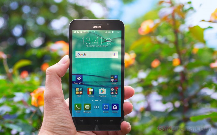
Android 5.0.2 with ZenUI on top
The Zenfone Max comes with Android 5.0 out of the box, which certainly is not the latest available version but Asus is usually good in updating its phones down the line.
Google's OS has been the object of a total makeover by Asus, and the overlay is called ZenUI. It's not merely a skin too - instead, the company has added a host of proprietary apps and features.
Double tap to wake is enabled by default and sending the phone back to sleep can be done by double-tapping on an empty area of the interface. If you're running a full-screen app, double-tapping on the notification bar will do the trick. You could disable the feature in settings and use the power button located conveniently on the right side (unlike other Zenfones which have top-mounted power buttons.)
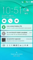
The lockscreen will be familiar to any previous Asus user. You're greeted by a time and weather widget, but also three shortcuts to the camera, dialer and messaging apps. They are customizable too, and you can assign any installed app of your choice to either of the three slots.
The list of notifications follows and, unlike some other Lollipop builds, double tapping on one takes you straight to the app that pushed it. Unlocking only works with an upwards swipe.
Beyond the lockscreen is the Android homescreen with four customizable shortcuts docked at the bottom, the app drawer shortcut always in the middle. You cannot add more icons beyond these four, but there is folder support. Removing one does not rearrange the others, leaving an odd empty space.
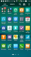
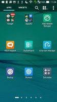
There are preloaded Asus and Google folders, packed to the brim with a selection of applications from the respective companies - custom Asus apps in one, and the default Google apps in the other. When you install a new app, the phone will suggest a folder for its placement, aiming to keep things nicely organized.

Default homescreen • folder view • system-wide search
A pinch zoom lets you rearrange your homescreens, as well as select a default homescreen and add additional ones up to seven in total.
Holding your finger on a homescreen brings a popup menu. It gives access to icon packs (of which there's only one on board, but the Play Store has plenty), scroll effects and wallpapers. You can even set icon and text size!
Additionally, it provides another way to get to the app drawer and settings menu.
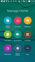
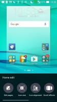
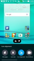
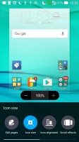
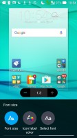
You can have a total of seven homescreens • Customization menu
There's a theming engine with plenty of free themes available online, if you want to abandon the default cartoonish Asus theme, or go for an even more colorful one.
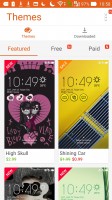


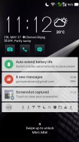
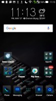
Theme store • Effect of themes on the interface
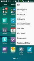
The app drawer has plenty of customization options itself. Grid size can be adjusted in the 3x3 to 5x5 range, with the latter making more sense on the 5.5-inch screen. Apps can be arranged alphabetically (the "All" setting), manually, or by frequent use, and you can also choose to only display the ones you downloaded yourself. Alternatively, you can have the Max group apps into folders according to their use.
The notification area has seen extensive customization as well. A single-finger pull-down only brings up the notifications and no quick toggles. Side swiping removes the notifications and a "clear" button does away with all of them at once. A second swipe from just below the date reveals the toggles, and whatever notifications you have left get squished to the little space underneath.
A two finger pull-down gets you straight to this state, which features a brightness slider with an auto mode, a 4-in-a-row set of quick tools and a 3x4 grid of toggles. Both the quick tools and the toggles can be chosen and rearranged, but you need to have exactly 4 tools and at least 8 toggles lined up.
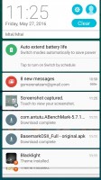
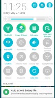
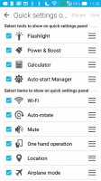
Notification shade with tools and toggles
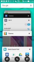
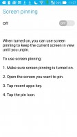
The task switcher is the standard Lollipop style virtual rolodex, but with a twist. In-between the typical "Close all" button and shortcut to the Apps section of the Settings menu, you get an App Pin option. What that does is it allows you to keep the selected app in view regardless of any taps on the capacitive buttons. It's a convenient feature and might be used for locking a child into a certain app or game as it's a bit fiddly to get out of (it requires a press-and-hold on the back and task switcher buttons simultaneously.)
Quick trigger is Asus' answer to the problem of handling large devices single-handedly. It's evoked with a double-tap on the home button, provided you've enabled it first in settings. What it does is it shrinks the entire interface to a portion of the screen, which is resizable and can be moved around to suit left or right handed use.
With the touchscreen always-on for the double-tap-to-wake feature, Asus was able to implement a few other nifty shortcuts. For example, drawing the letter "C" on the screen while it's sleeping will wake the phone and straight up launch the camera app. "W" launches the browser and presumably stands for Web. While the letters are preset and you get six of them, you can assign any app of your choice to any letter.


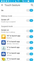
Quick trigger simplifies one-handed operation • Motion and touch gestures
Reader comments
- sonia singh
- 17 Sep 2020
- Dk4
I brought this fon may2016 to till .2020 sep. this is an amazing phone ..its very nice all functions good working.. but it is slip from my hand thats why a little bit screen are not working
- Previous user
- 14 Jul 2020
- IVA
I have used this phone since January 2016, it's almost 5 years old now. It was quite a good experience. Towards the latter half of 2019 it lost some sensitivity in the touch screen and in early 2020 almost 70% of the screen was no longer sensiti...
- Test
- 05 Mar 2020
- PR$
Good strong phone I brought 2016 still using it. basic phone for general use you can't expect much like modern phone. Due to technology advancement it will not support the latest app I mean it work but very slow we lost our coolness. phone software s...
