BlackBerry Curve 8900 review: Curved right
Curved right
Design and construction (continued)
The backside packs the 3.2 megapixel camera lens and the flash. The snapper low-light capabilities are supposed to be increased by this built-in LED but as usually it fails to make a big difference at distances greater than a meter. The loudspeaker grill is below the camera panel.
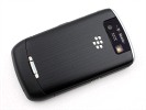
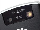
A 3.2 megapixel camera is at the back
Under the battery cover lies the memory card slot, which is hot-swappable. You will have to remove the cover every time you want to replace it but at least you won't need to turn the phone on and off, saving yourselves quite a lot of time. But even if you need to do this often, the rear cover is easily removable upon a gentle push of the lock.
The back cover is made entirely of plastic, thought thanks to the brushed finish it stylishly resembles the Blackberry Storm metal back cover.
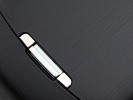
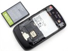
The memory card slot is under the battery cover but is still hot-swappable
The good news is that the memory card slot can easily handle 16GB microSD cards which are the largest currently commercially available. Furthermore, much like the BlackBerry Storm, the Curve managed to scan and initialize a 16GB card in a few measly seconds, which raised a cheer.
The BlackBerry 8900 Curve is a very nice and handy device, and is compact enough for a QWERTY messenger. Even if the Curve is all plastic, it feels quite sturdy and can rival the higher-ranked BlackBerry 9000 Bold in terms of looks. Both the faux chrome frame and the faux brushed-aluminum rear are not the real thing but the phone still has the solid and sophisticated feel, which we appreciated in the Storm.
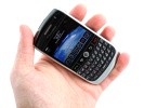
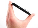
The BlackBerry Curve 8900 held in hand
BlackBerry OS hasn't changed too much
The BlackBerry Curve runs on the proprietary BlackBerry OS v4.6. It comes across as quite a looker at first, just as we noted reviewing the BlackBerry Storm. The homescreen and the main menu have neat and simple, yet very appealing icons. On top of that, the main menu and the standby screen can be customized beyond recognition and look even more attractive.
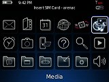

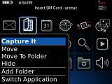
The user interface has nice graphics and allows vast customization
Alas, you just can't do anything about the text-only submenus, which are more frequent than one might think on the Curve 8900. Some nice graphics there couldn't possibly have cost RIM too much and it's a pity they spared themselves the effort.
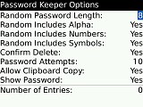
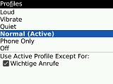
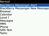
Digging deeper brings out the ugly side of it
Some might argue it's all hairsplitting here as the Curve 8900 target audience is less likely to be impressed by the eye-candy than functionality. That would be a point we guess but this shortcoming is still worth noting. After all you won't notice menus like that on Nokia E71, for instance.
The BlackBerry users will find their way around the Curve 8900 menu pretty easily but newcomers will need some time getting used to it. A nice example here would be the file manager, which is located in the media submenus. Not that big a deal though, and everyone is likely to get familiar with the landscape in a couple of days. But it will take quite some firmware upgrades to fix the basic looks of the deeper UI levels.
The homescreen is pretty well organized with 6 (by default) shortcut buttons placed at the bottom and all status icons at the top.The profiles can also be accessed straight from here, as well as two other features that you choose to assign to the convenience keys.
Quite naturally the main menu gets launched via the menu key. The BlackBerry Curve's interface is only operating in landscape mode as this is the display's default orientation.
The menu navigation of the BlackBerry Curve 8900 is somewhat different from what the competitors have to offer. Most other brands use soft-key based navigation where the available options for every menu item or feature are assigned to the context keys.
The Curve has the menu key in charge of all that and it's really a new experience if you're used to the soft key labels keeping all options in sight. Well, you may have to spend a bit longer studying the available features if you are a first time user.
The BlackBerry Curve 8900 has pretty decent performance with very few instances of lagging for the time of our review. The Storm had it much worse with submenu taking their time to open pretty often. We didn't experience any freezes either that would have made us reset the handset.
While it was obvious that the Storm interface wasn't up to the competitors' standard, passing a verdict on the Curve isn't just as easy. The Curve 8900 is a business device and the target audience isn't likely to hold the dreary looks of the deeper menu levels against it. That, we think, is the major shortcoming and luckily for the 8900 it isn't make or break.
The performance is what matters here and the Curve manages to deliver on that pretty well. The response is more than adequate so this here QWERTY fella won't be discriminated against based on its UI. Well actually, it won't draw the biggest cheer either but it sure gets things done.
Reader comments
- MASSI KM
- 03 Dec 2016
- 7ki
My phone not on please solution
- mohamed
- 06 Apr 2015
- Nut
This cell phone always keep remiding me of been old fasioned. I cannot download anything from the web. Honestly I love this brand.Please help me to upgrade it. My email address is; medkamara27@yahoo.com
- adi
- 15 Mar 2014
- 6ch
very good