BlackBerry Key2 hands-on review
Hardware
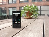
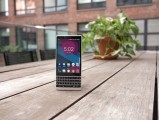
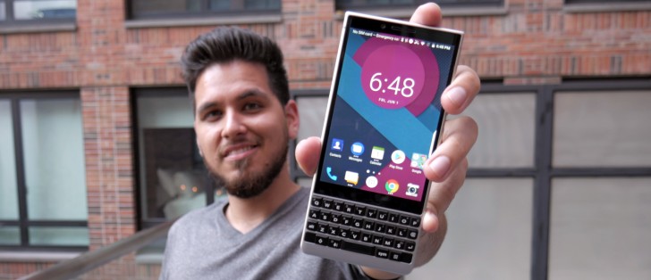
There's no doubt that the Key2 is instantly recognizable as a BlackBerry. In fact, that is true regardless of the angle you spot it from. Even if it weren't for the QWERTY keyboard, the textured rubberized back hasn't really been a wide-spread thing for a few smartphone generations. However, the Key2 is not exactly uniquely identifiable.
Physically, the Key2 is almost identical to its predecessor. Just a bit wider and a smidge shorter. So, ignoring some details, like the dual camera, it's easy to get the two confused. The Key2 is noticeably thinner, though, at 8.5mm. That's rather interesting since the battery capacity is unchanged at 3,500 mAh. The Key2 is also a bit lighter, likely thanks to the use of 7 series aluminum. The material is really rigid and feels quite nice. A large chunk of it is exposed as well since it comprises the sides of the phone, as well as the area around the keyboard.
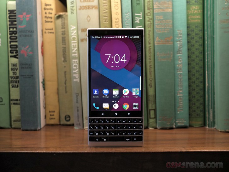
The two are not milled out of one piece of aluminum. Instead, the keyboard backplate is its own separate piece. Still the joint is hardly noticeable and overall, you really get the feeling that you are holding a metal brick - it's a reassuring sensation that you can't really get from a modern "glass sandwich" handset.
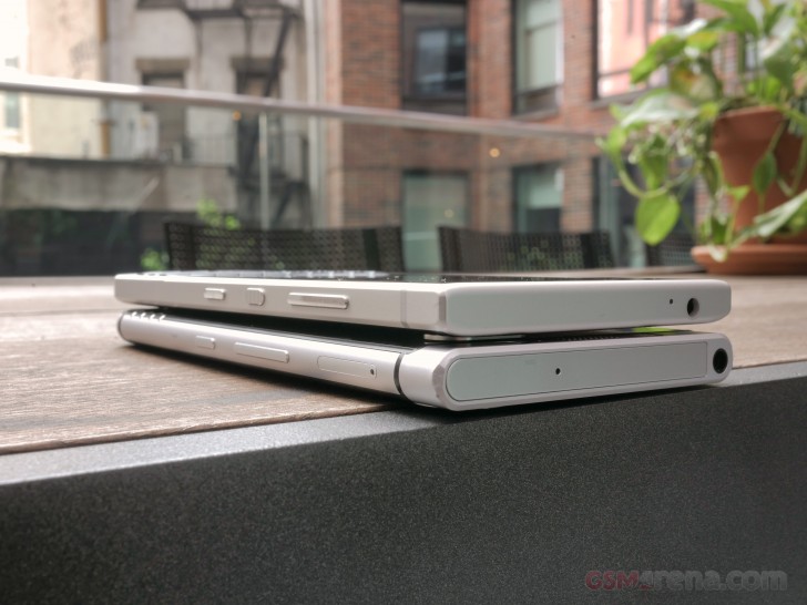
Circling back to the comparison with the original KeyOne, TCL went for much sharper corners and lines, this time around. It makes for an arguably more aggressive look, compared to the rounded shape of its predecessor. It's kind of a throwback to devices like the BlackBerry Bold.
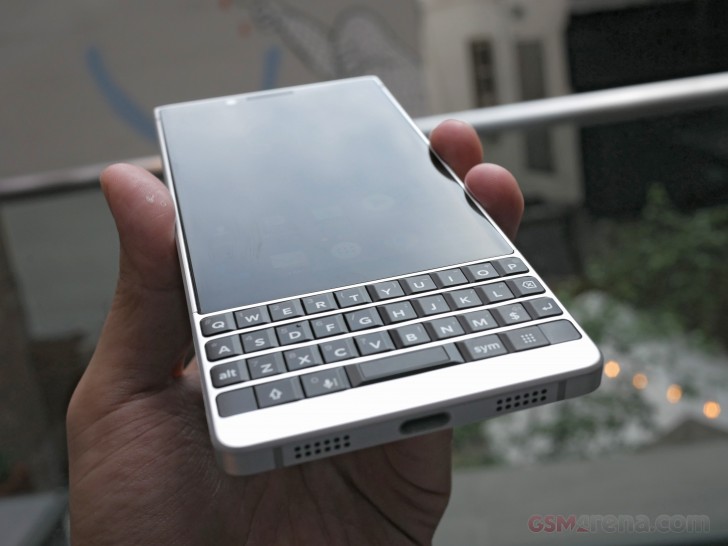
One of the more modern design choices on the Key2, we mentioned earlier, is the extended front glass. The KeyOne utilized a metal strip as a top chin. The Key2 take a different approach, instead of extending the Gorilla Glass up to cover the selfie camera, sensors, and earpiece. It definitely makes for a more 2018 look and helps everything blend together more seamlessly. Especially on the black color version.
As is evident by our photos, we kind of like the silver one better. It just brings out the metal vibe in our mind. The extra tall Gorilla Glass also gives off the subtle impression of a taller display. That's not the case.
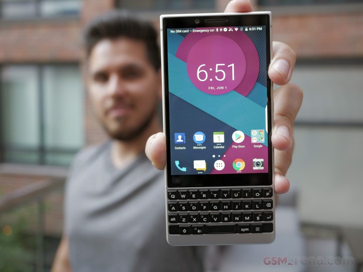
The Key2 seems to borrow its 4.5-inch, FullHD (sort of) panel directly from its predecessor. At least on paper, that is. It is in the same 3:2 aspect ratio, which is admittedly off for viewing standard 16:9 video, but a lot comfier for reading text, like emails, in a vertical orientation. At the end of the day, a function clearly takes precedence over form in BlackBerry's book, which we can definitely appreciate.
We'd understand why the small diagonal might be off-putting to fans of big screens. But it's a tradeoff that had to be made to fit the keyboard on the front.
On the other hand, we don't mind that the screen is now protected by a Gorilla Glass 3 instead of the GG4 they had on the KeyOne. GG3 seems to be less prone to scratches than GG4 which is geared more towards shatter proofing when you drop your phone.
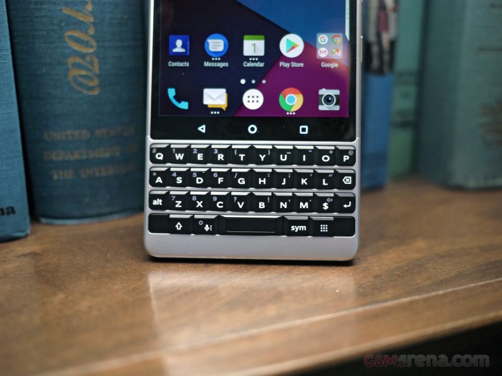
Before we get further down to the QWERTY keyboard description, we feel like BlackBerry's persistence with capacitive navigation keys is worth a mention. It all seems to come down to providing a familiar experience to long-time users and the old-school navigation strip, underneath the display is a perfect example of that.
On to the keyboard then. Like most other aspects of the Key2, it is familiar, yet still improved. The layout is slightly tweaked, making for a slightly roomier layout for improved typing. The sharper edges allow for flat buttons, even close to the sides of the phone, effectively fixing the issue some typist have with the rounded edge-buttons on the KeyOne, floating off of the device.
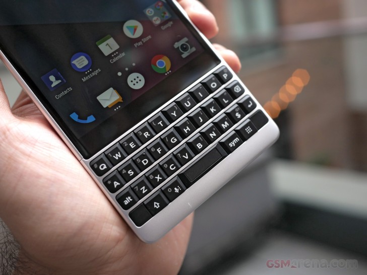
The key travel also feels smoother than on the KeyOne. The "squishiness" of the original is a thing of the past. The tactile feedback is also better. According to TCL, the keys, themselves, are actually 20% taller, which definitely helps the overall experience.
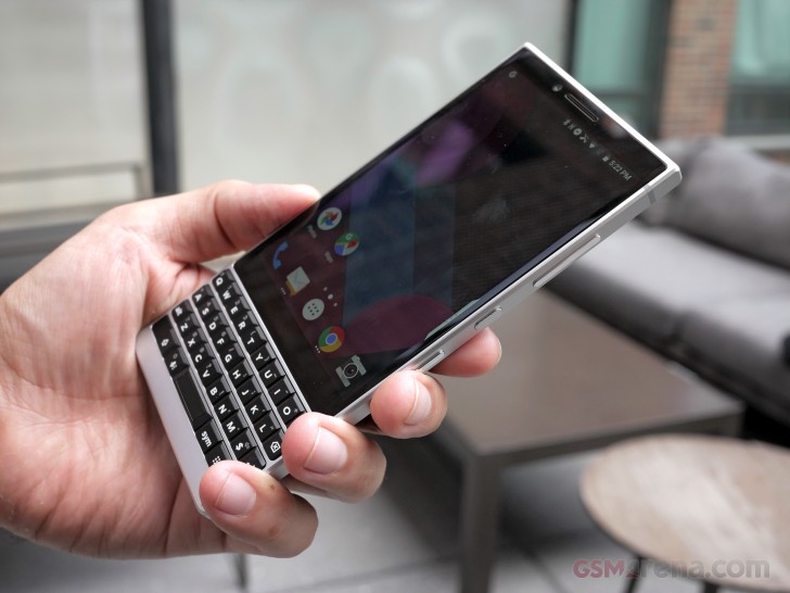
Aesthetically, there have been some changes as well. The keys have finer beveled details and are now matte instead of glossy. The shiny chrome accents are also gone with matte-finished elements in their place.
As far as advanced functionality goes, the familiar "flick typing" is back from the original, now with improved predictive text algorithms. Since the entire area is touch-sensitive, it can also be used as a trackpad, for panning and scrolling. It's surprisingly convenient for navigation. Easy to get used to and then miss on every other Android device.
The fingerprint reader is still in the familiar, although not exactly conventional spot - the space bar. One new addition to the mix is BlackBerry's "Speed Key". It sits on the right side of the spacebar and is basically a shortcut for your shortcuts. It's actually an improvement over the original KeyOne's extensive shortcut system, which allowed users to map any of the keyboard keys to a specific app ot task. This, however, could only be triggered from the home screen. On the Key2, pressing the "Speed Key" lets you trigger them from any interface. If you are persistent enough to build the necessary muscle memory for it, this new addition can potentially automate a lot of the everyday actions to wizardly levels.
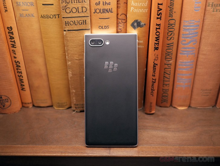
That about covers the front of the Key2. Flipping it around reveals a new and subjectively comfier diamond pattern for the rubberized back. The material seems to be changed a bit as well. Also, the new dual 12MP camera setup. But, more on that in a bit.
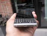
BlackBerry Key2 top and bottom
The top and bottom sides of the phone haven't really changed that much, apart from the shapes and edges, of course. On the bottom - a single speaker and the main microphone, on either side of the USB 3.0, Type-C port. Quick Charge 3 support, should make for snappy battery top-offs. For maximum versatility, TCL has thrown in OTG, as well as DisplayPort out support in the connector. On top- the secondary microphone and the good old 3.5mm audio jack.
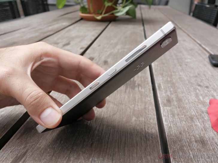
In contrast, the sides have a slightly different layout, The power button has not only been redesigned to feature a textured surface but also moved from the left to a much less awkward stop on the right. It sits between the convenience key. In turn, the SIM and microSD card tray is not on the left-hand side, with nothing else really keeping it company.
Reader comments
- Anonymous
- 07 Sep 2020
- pLk
Just you
- herreralu1985
- 04 Jul 2018
- PuI
Is it just me, or the dual cameras in the back look like two very tired eyes?
- YoloBS
- 26 Jun 2018
- Dks
What about rumors key2 lite. I hope blackberry gonna release a blackberry classic or blackberry torch 9800 with oreo go or something!
