BlackBerry Z10 review: Swipe clean
Swipe clean
BlackBerry Hub is a messaging power house
BlackBerries were the phone of choice for business users and they have to deal with tons of messages - so the interface has to be very efficient. And the BlackBerry Z10 saddled with the new Hub is as efficient as they come. Perhaps only Windows Phone is close when it comes to unified messaging.
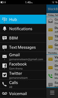
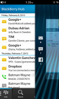
The Hub is pretty simple at first glance - a list of messages with an icon that indicates the service (SMS, BBM, email, Twitter or Facebook, but also calls and voicemails) and also flags messages read or unread (color icons are for unread messages, monochrome icons are for read messages). Messages are indexed by date.
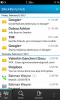
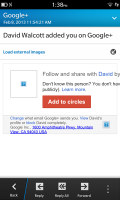
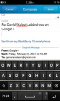
The BlackBerry 10 Hub • reading a message • replying
Tap on a message to read it and you can respond to that message from the same screen too. That's great because you don't have to worry about where a message came from, you just type a response and it will be sent back through the proper channel. Getting back to the Hub is done either by the Back button in the lower-left corner or by a swipe right.
If the list of messages is too much of a mess, there's Search or you can swipe right to reveal a list of all services that feed messages into the Hub. You can then filter messages by service.
That's where the whole swiping business starts to get a little confusing. First, the Hub can also show you your agenda - swipe down to view it. But make sure the swipe starts from inside the screen (think "pull down to refresh" on iPhone). If you start from above the screen, the gesture will bring up the quick toggles instead.
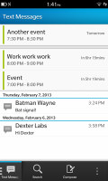
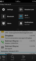
Agenda is part of the Hub • the quick toggles are also revealed by a swipe down
That's not the end of it either - a right swipe leads you to the list of all services piped into Hub, a swipe left (or tap on the right side of the screen) brings you back to Hub. BUT if you start the swipe from the just outside the right side of the screen, you might end up on the task switcher pane instead.
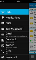
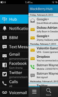
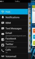
Swiping right to get back into the Hub • Swiping the wrong way
Confused yet? There's a more refined way to filter Hub - the down arrow in the top right corner. Using this interface, you can search for individual folders (e.g. Inbox, Outbox, Missed calls, etc.).
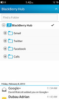
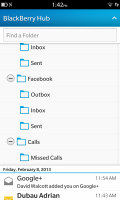
Yet another way to filter the Hub
There's a menu button in the lower-right corner of Hub, which brings out some handy options like Scroll to top (or bottom), search, compose, refresh, select multiple. You already have Search and Compose buttons at the bottom of the screen, but the others can be useful.
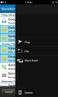
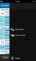
The message management skills of the Hub don't end there - a long press on a message brings out a long list of options on the right. You can "drag" a message to one of these options in the same gesture or lift your finger and tap the option you like, whatever seems easier. The three vertical dots button expands the pane with options to include labels, not just icons - you'll need that at first, until you learn what icons stand for.
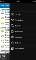
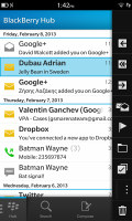
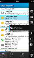
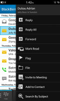
Menu on the right • the long-press menu on the right
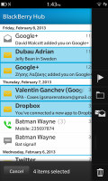
More than one message can be selected here, but if you select messages from different sources, only the options that apply are displayed (e.g. you can mark both emails and tweets as "unread", but you can't tag tweets, only emails). The multiple select can be used for mass delete too.
Texting and BBM
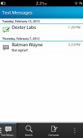
SMS and MMS messaging is handled by the BlackBerry Hub - the Text Messages shortcut in the app drawer just leads to them.
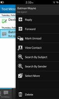
We're covering texting in more detail because it's used all so much. Messages are organized into threads and use speech bubble UI, both threads and individual messages can be managed by using the long press gesture. You can name a conversation thread, which will help you find it easier later.
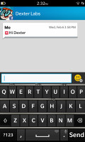
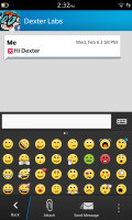
Composing a message is no different than on other OSes. The text input area is quite small - it starts off as a single line and grows to only four, so composing longer texts can be a bit annoying. There's no character or message part counters.
Multimedia and other data (contact info, appointment even generic files) can be attached to the message, turning it into MMS. There's an option to attach a location (either your current location or point on a map) to the message, which is great for giving directions. More than one item can be attached.
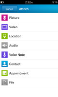
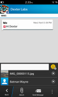
Attaching multimedia turns the message into an MMS
BlackBerry Messenger is one of the hottest features on BB phones. At the base level, BBM can do text and voice chats (over your mobile data connection or Wi-Fi). You can attach multimedia content to a BBM message, too.
BlackBerry Z10 runs the latest OS, which also adds BBM Video - video calling with a twist. The twist, as you might know, is that instead of footage from the front-facing camera, the phone can stream the contents of its own screen.
This way the other party sees just what you see - a great way to show someone how to do something, walk them through a document or anything else you can think of. It's a great (and unique) feature, but we wonder how well it will work when the square-screened BlackBerry Q10 comes out.
Text input
The new on-screen keyboard in BlackBerry OS 10 is one of the most important features - hardware QWERTYs have always been a defining feature for the brand and the Z10 doesn't have one.
BlackBerry has taken care to make the stock keyboard one of the best keyboards around by enabling a ton of advanced features, some of which adapt to you.
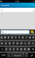
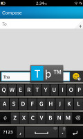
There are "frets" between the keyboard rows. These are important as the word suggestions will appear on them. The way suggestions are ordered is pretty clever - they appear over the next letter of the word. For example, if you've typed "th" the word "the" will appear over E, "thanks" over A and so on.
It takes some getting used to, but once you do it's a real time saver - when the word you need appears it's over the next letter of that word, where your finger is going anyway. Then swipe up to "push" the word up into the text field. Suggestions work for up to three languages at once, great as most people will need to mix in at least some English into their text.
The keyboard can scan your messages from the past week to learn more on your writing style (similar to Android's popular SwiftKey).
Also, it learns how you press each key after only 6-8 taps - this can vary a lot from person to person and will reduce the number of mispresses. To further help with this, the keyboard is multi-touch enabled so you can press the next letter before you raise your finger from the last letter.
Like Android and iOS, the BlackBerry keyboard can use voice dictation to input text.
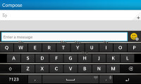
A landscape QWERTY keyboard is also available. It's still a split screen keyboard, which means it doesn't completely overlay the current app like the Android keyboard does.
Telephony and phonebook
The BlackBerry Z10 has no hardware buttons so the quickest way to get to the dialer is by tapping the Phone shortcut in the bottom left corner (it's visible on all homescreen panes but the Hub).
The dialer has three tabs - Calls, Contacts and Dial pad. We were a little disappointed to find out that you can't swipe between those two (after all, you can swipe between almost anything else so far).
The Dialer has been pushed to third place because it's not very useful - with no smart dial, you have to enter the number manually. There is a feature called "Smart dialing" but it's not the usual "find as you type" feature. Instead, it only automatically applies country and area codes to the numbers you dial.
A nice option for those still using cellphone holsters is the option to automatically answer and hang up when taking the Z10 out of the holster and putting it back in again.
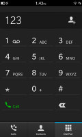
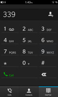
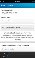
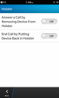
The dialer is very basic • Smart dial • holster options
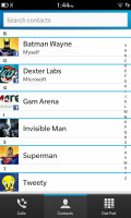
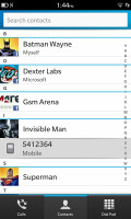
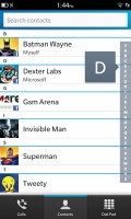
Anyway, you're better off using the Contacts tab. It's an alphabetical list of contacts indexed by their first letter. There's a search field and an alphabet index available for quickly jumping to a specific contact. A tap on a contact expands into a list of all assigned phone numbers.
The Call log features three shortcuts on top - Voice Mail plus two contact numbers. You can add more quick-dial numbers here, but the more you add, the further down the actual call log gets pushed.
The call log itself displays either all calls or just missed calls (there's a toggle just above it). Calls are grouped together to save space, e.g. two outgoing calls to the same contact are displayed as one item with a call counter.
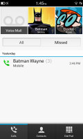
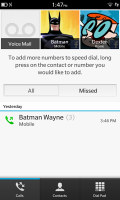
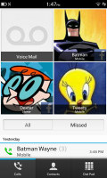
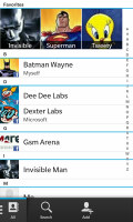
The call log has quick dial contacts • the Contacts tab has them too
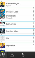
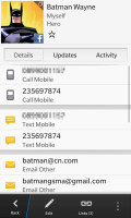
The Phonebook looks a lot like the Contacts tab of the phone app, except it doesn't have the alphabet index on the right (but the search field on top is still there). Tapping on a contact here brings you to the contact info, which is split into three tabs.
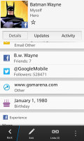
The first tab is details - this is where all the phone numbers, email accounts, web site, birthday and other info (including Facebook friends and Twitter followers count) are listed. If the same contact uses multiple services, you can link the entries and have everything in the same place.
The second tab is Updates. All social networking updates are listed here chronologically, along with automatically generated entries under the Company News heading. If you've entered a company name (or the phone can guess it from the social networking accounts associated with this contact), the phone will search the web for new relevant content and give you a four line preview. A neat feature for sure.
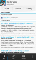
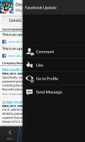
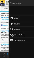
The Updates tab • you can like Facebook posts, retweet and so on
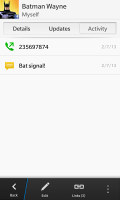
The third tab is Activity, a list of phone calls and messages between you and the contact.
Just like in the Hub, you can swipe right to view a list of all services that provide contacts - your phone, the SIM card in it, BBM and BBM Video, Gmail, Twitter, you name it. You can use this to browse contacts coming from a specific service only or go into the settings to hide contacts from services you don't need.
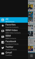
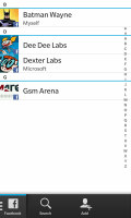
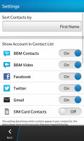
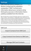
Filtering contacts • more filtering options • contact management
We found this bit to be a bit buggy - we'd switch off a service (say Facebook) and the contacts from it will still be visible. We had to go through the swipe-right interface to a single service (any will do) and then back to All contacts for the list to refresh. The same thing happens when enabling a service back again.
Yet another trick from Hub is the long press - this gives you an easy access to several options straight from the contact lists. It's especially quick if you do it as one gesture (press and hold on a contact then move your finger to the option and release).
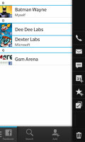
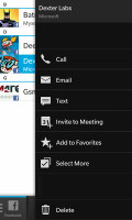
Long press options are available here too
The BlackBerry Z10 doesn't have the loudest ringer in the world, but combined with vibration you shouldn't be missing any calls. You can read about how the loudspaeker test is done here.
| Speakerphone test | Voice, dB | Ringing | Overal score | |
| Apple iPhone 5 | 66.8 | 66.1 | 67.7 | Below Average |
| Nokia Lumia 920 | 61.6 | 64.8 | 65.8 | |
| 67.7 | 65.1 | 66.6 | ||
| Apple iPhone 4S | 65.8 | 64.5 | 74.6 | |
| HTC One X+ | 64.6 | 65.8 | 74.6 | |
| Nokia Lumia 820 | 67.2 | 66.6 | 70.7 | |
| 70.7 | 67.7 | 73.0 | ||
| Google Nexus 4 | 71.1 | 66.6 | 78.8 | |
| Samsung Galaxy S III | 75.1 | 66.5 | 75.0 | |
| BlackBerry Bold Touch 9900 | 71.0 | 72.7 | 76.3 | Very Good |
| 74.6 | 71.3 | 82.7 | Excellent |
Reader comments
- Ashraf
- 19 Jul 2023
- ru5
My blackberry Z10 does the same...searches for WIFi and then ,it's stuck with your blackberry is now connected to the wifi network and nothing further ,it's like stuck on that screen ever since Pleasew help..,..
- Silverstar
- 22 Sep 2022
- mFd
My bb is complaning about full storage i try deleting apps and games but it keeps saying the same thing what should be the problem?
- Anonymous
- 07 Apr 2020
- rJF
my bb z10 is not starting
