Dell Streak review: Size does matter
Size does matter
User interface
There’s no denying that the Dell Streak’s user interface (much like the device itself) is easily standing out in the Android crowd. It takes no more than a glance to realize it’s the first ever Android designed with landscape operation in mind. And it does make sense too – it feels much more natural holding the 5-inch Streak horizontally.
Don’t get this wrong – the menus have portrait mode as well and most apps that require vertical orientation work as they should but the homescreen is landscape only. So unless you want to constantly rotate the Streak back and forth, horizontal is the way to go.

The Streak homescreen works in landscape mode only
Dell made other customizations to the homescreen, too. You start with four screen panes (which Dell called rooms) to fill with widgets, shortcuts and folders but you can either increase that count to six or get rid of a few to speed up navigation.
Strangely enough, Dell got rid of the single background (the extended wallpaper that underlies all the screens and scrolls slower than the icons on top to simulate a 3D homescreen). It’s only eye-candy but we really liked it and we do miss it here.
Needless to say, live wallpapers are not supported since our Dell unit is still stuck on Android 1.6 (Donut). If you get your hands on an Eclair tablet though, that should be fixed.
The main menu shortcut is moved to the top right corner this time, instead of its usual location at the bottom. By default it only shows you one row (which presumably contains your favorite apps) and you need to hit the more key for the full list of apps to appear. We don’t see much reason behind this as the part of the homescreen that is still visible in the single-line mode isn’t active. Anyway, since you only need to hit the more key once and it stays like that until next restart we aren’t going to complain much.

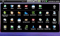
The main menu works in a different way here
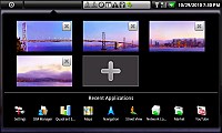
The second tab on top of the screen takes you to the task switcher/ homescreen editor. Mind you, you aren’t able to rearrange screens – just add new ones or remove existing. Putting these two (the task switcher and the editor) together is strange enough in the first place as they have very little in common. It’s nothing you cannot get used to though.
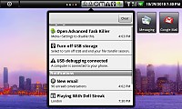
The third tab is the notification area, which is as usually one of the nicest Android perks. Accessible from anywhere except fullscreen apps, it brings all things requiring your attention on screen with a single tap. Since the Streak isn’t a Froyo device just yet, there are no shortcuts to controlling the phone’s radios here.
The notification area is opened by a click, rather than a swipe
However Dell found a clever way around this and added those to a forth tab, along with battery status and a shortcut to the settings menu.
The connectivity manager got its own tab
All in all, we find the Dell reasonably comfortable to use and if you are a returning Android user you will get used to its quirks quickly enough. One problem is that the device doesn’t seem to be compatible with most of the alternative launchers that are found in the market so if you are into customizations you might have a harder time than usual.
Performance, on the other hand, is pretty decent, though we have to admit we expected more from a Snapdragon on 512 MB of RAM. Actually the memory is more than sufficient but Donut obviously fails to bring out the best out of the CPU. It’s not burdensome or anything and, if you haven’t used a Froyo-powered device, you might not even notice it but the Streak doesn’t quite stand comparison to a Desire or a Nexus One.
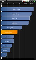
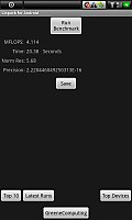
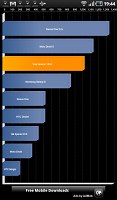
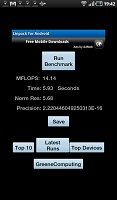
It’s certainly not as much difference as the following benchmarks show though. You might notice the huge gap there is between the Streak and the Galaxy Tab but in real life scenario it’s not as big in real life.
Reader comments
- joe nodden
- 11 Nov 2023
- j5{
Eh, they are kinda right about the weight I suppose. I didn't check, I just figured a phone with a 5 inch display couldn't weigh all that much. My Redmi K40 was the heaviest phone I've ever gotten and this Dell was 10% heavier than tha...
- Loli
- 09 Nov 2023
- 864
"Too large" - proven underseeing the future trend as you said, as now even most budget phones now have 6+ inch screens (BUT thinner bezels help too - Otherwise can't imagine a 6.X-inch phone with bezels as thick as this pioneer Dell in...
- joe nodden
- 08 Jul 2020
- jpa
"Too large and heavy for a phone" gotta love old reviews that couldn't get with the times.
