Facebook Messenger’s new UI has started rolling out to a few users
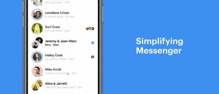
Back in May, Facebook announced that it was going to simplify the interface on its Messenger app to fewer tabs so you can simply stay connected. This redesign included a new streamlined interface, a proper dark mode, and remove some of the shortcuts and features that people don’t use.
Earlier today, Android Police reported of a reader who sent in screenshots of the update installed on their mobile. According to this reader, the update came as a server-side change since their Messenger app had not been updated via the Play Store prior to noticing the change.
Source: AndroidPolice
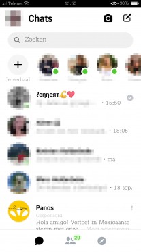
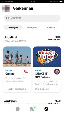
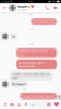
There are three tabs at the bottom: conversations, contacts, and an explore tab. This is where other unessential features have moved to including businesses and games shortcuts. Otherwise, the chat window has a cleaner interface with simpler shortcut icons all around.
Although there aren’t any dark-mode screenshots available from the source, we’re excited to see what it would look like once the update does begin rolling out on a wider scale.
If you get or have already gotten the Messenger update, let us know in the comments and tell us where you’re writing from! Also be sure to tell us on which device you’re seeing the update.
Related


Reader comments
- Sami
- 10 Nov 2018
- 6PJ
I would love to see this stunning dark mode
- bro
- 05 Nov 2018
- uSM
I feel you bro.
- Anonymous
- 29 Sep 2018
- vMf
Lite version is ok but it gets updated now n again....!


 Huawei
 Samsung
 Apple
Apple Xiaomi
 Xiaomi