Firefox OS review: Burning bright
Burning bright
User interface
Firefox OS is based on web technologies but that doesn't mean it's like the early days of Chrome OS, just a floating browser window. In fact, Firefox OS looks like a mix of Android and iOS. We're reviewing version 1.3, the latest currently available version but keep in mind these are its Cupcake days (in Android speak) - most smartphone functionality is present, a lot is still missing. What's more important, new features come leaps and bounds. Firefox OS 1.4 is behind the corner, and there is already talk about the Firefox 2.0, which might bring a total revamp of the OS as we see it today.
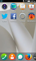
The Firefox OS homescreen is based on Everything.me. Everything.me started life as an Android launcher but the Mozilla Foundation is an investor in the project and is using the base tech for both its Firefox OS and corresponding Android launchers.
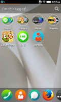
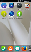
The launcher features multiple pages of shortcuts with a dock at the bottom. What sets it apart from the iOS launcher are the so-called Smart collections - it will automatically group similar apps into categories. Those folder-like groups go in the left-most page of the homescreen (actual folders are not supported).
You can hit the "I'm thinking of..." field and type in a query to view all relevant installed apps and web sources. For example, "movies" brings up IMDb, Rotten Tomatoes and others. The interface will react to your search, too - the wallpaper will change to something appropriate (say, a movie poster).
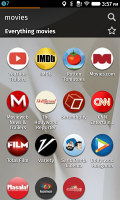

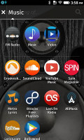
Smart collections combine folders with app search functionality
Here's what makes this launcher the perfect fit for Firefox OS - it searches not only for apps you have installed, but also lists web sites almost as if they were apps. You can save searches as Smart collections to be readily available later.
Since native apps are built on the same HTML5 + JavaScript base, a well-designed mobile site will look and behave in Firefox OS just like a native app. And Mozilla is pushing for increased adoption of the new web technologies that enable the advanced features in Firefox OS, which will blur the distinction between a native app and a mobile site even further.
That promises a bright future, but the current reality is less than ideal. For our movie query we got results like The Hollywood Reporter and CNN Entertainment, which were either broken or nothing like an app. Unfortunately, Firefox OS phones will need to hit a critical mass before site owners put significant resources into OS-specific optimizations.
Still, we've seen plenty of people comment that they've abandoned Facebook's Android app and use the mobile site instead, so there is some merit to this approach. We shouldn't let a few bad examples taint the whole experience, again these are the early days.
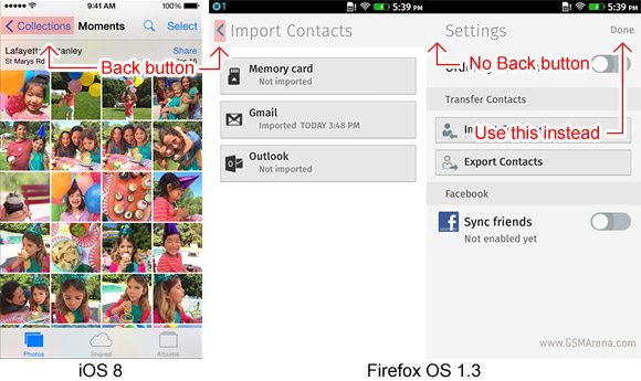
Firefox OS has borrowed more from iOS than just the homescreen look. It also relies on a single Home button with on-screen Back buttons that are part of the app. This doesn't work too well because the logic is somewhat erratically applied.
The Back button is typically in the top left corner, but sometimes there's no Back button at all. Instead you need to hit a confirmation button (e.g. Done) or an X button in the top right corner instead. Depending on where you are in each app, going back to the previous screen may require some mental effort rather than just an acquired reflex of tapping a specific part of the screen.
Another gripe we have is that unlike iOS, the Back button is just a small < symbol in the top left and it can be hard to hit accurately. On iOS the target area for that button also covers the label next to it, making it a much bigger target.
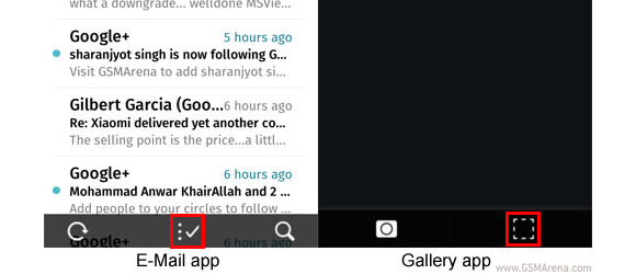
And that's not all, some apps (like Mail) have the "hamburger" menu, which is perhaps familiar to Android users. It's comprised of three horizontal bars stacked vertically in the top left corner where Back usually goes. When you tap it, an additional menu panel slides in from the left. This panel can have a Back button, but it's only for the panel itself and not the app (in E-Mail, it's for navigating multiple accounts).
Another complaint we have about the consistency of the UI is that shortcuts don't always use the same icons.
The Firefox OS interface includes a lockscreen. It has a separate wallpaper and a slider at the bottom that either unlocks the phone (right) or launches the camera (left). It shows the date and time, plus recent notifications, but there are no widgets.
As you've probably guessed already there are no widgets on the homescreen either.
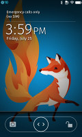
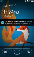
The lockscreen can display notifications
A notification area is a must for a modern OS and Firefox has one. It follows what has already become the de facto industry standard - a list of notifications, which you can swipe to dismiss individually or all at once with the "Clear all button". Interestingly, the event notifications are listed from top to bottom, while some recurring notifications start at the bottom.
When a new notification arrives, it's shown at the top row of the screen, similar to Android L notifications.
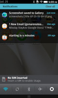
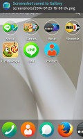
The notification area • new notifications appear on the top row of the screen
Also at the bottom are four quick toggles and a Settings shortcut. The toggles are Wi-Fi, Background Data, Bluetooth and Airplane mode, there's no way to change or rearrange them.
An app switcher is another essential part of the OS interface. It uses large cards that preview the contents of the app. There's a small X button in the top left to dismiss an app but you can also just swipe up to dismiss them. This switcher also needs work, right now the currently selected app takes up almost the entire screen. You can see tiny portions of another couple of cards to the left and right but not enough to tell what those apps are until you swipe to them.

The app switcher is not well-proportioned
One cool feature we found in the Developer options is to switch between apps directly by swiping from the left or right edge of the screen. WebOS had and iPad iOS has a similar feature. Note that here the gesture works with only one finger (it's four in iOS) and also doubles as a Back button in the browser (as in iOS).
Reader comments
- Anonymous
- 26 Nov 2015
- X}8
Can you use it like an MP3 player?
- celicia
- 18 Sep 2015
- Nm$
How do we get to load whatsapp on this handset please.
- Anonymous
- 17 Mar 2015
- Hkq
can anyone tell me are apps stored in internal memory or on the memory card in Firefox os phones???
