Galaxy S8 interface revealed: a new minimalist look for Samsung
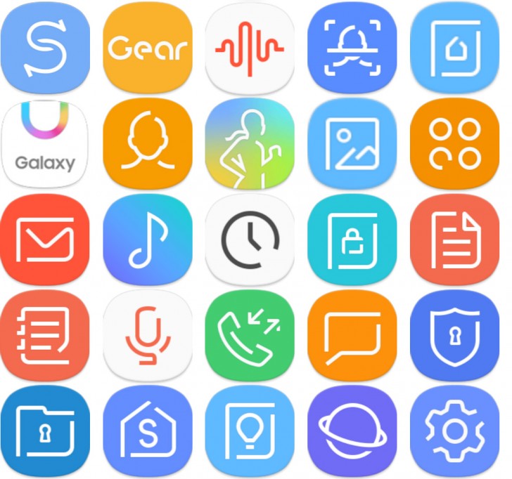
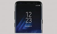
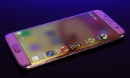
We noticed the new Android buttons on the side-by-side shot of the Galaxy S8 and its bigger sibling and now we get a better look at the new icons of the Samsung Experience skin.
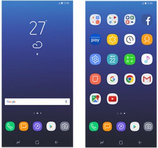
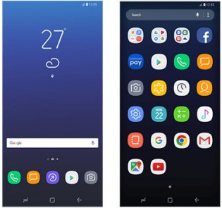
Screenshots of the Samsung Experience homescreen
Those were discovered hiding in the latest version of the Smart Switch app, which was updated in anticipation of the new flagship.
Samsung has meandered quite a bit when it comes to graphics style, the latest iteration features solid colors with (mostly) white outlines forming the shapes of the icons. Fans of minimalistic design should appreciate them, though they do clash with the more elaborate icons that Google prefers.
Related
Reader comments
- Sh!tSung
- 20 Mar 2017
- 2pH
Resembles more to Symbian Icons and Honor UI...
- A Note 4 user
- 19 Mar 2017
- Bbx
I don't like these rounded icons.. seems like samsung phones will soon become a one perfect ball.




 Samsung
 Xiaomi
 Samsung
 Sony
Sony OnePlus
