Nokia gets a facelift: bye to Nokia Sans, hello to Nokia Pure
Have you ever thought to what extent a font can change the perception of a company's brand or logo? We guess you might have, but we bet you've never put as much attention into it as Nokia has. And it's only natural, as their current font (or typeface) is one of the most recognizable ones in the world.
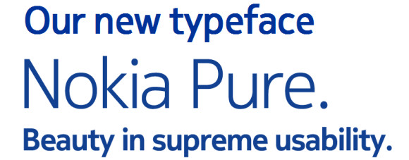
Not surprisingly, in tune with its new market strategy, the company is also changing its branding, going from the well known Nokia Sans to something more modern - the Nokia Pure.
The Nokia Sans font was something most of us are so accustomed to that even a character or two in the recognizable blue color allows it to be immediately recognized.
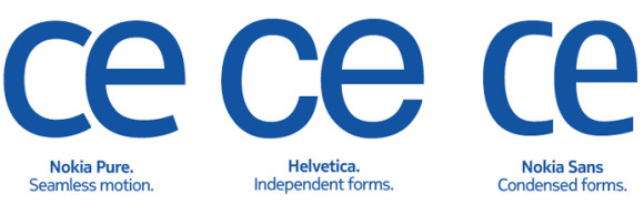
The Nokia Pure compared to other fonts
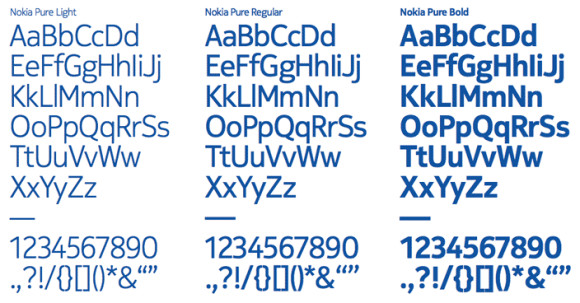
The Nokia Pure is by all means a clean and beautiful font. And Nokia claims that it was designed specifically for digital environments.
It will soon land on all Nokia devices, Nokia's website, ads and documents.
Update: It appears that the Nokia Conversations blog has added two pictures, showing the way Nokia Pure font will look on a real mobile device and the way Sans did look on it. The blog specifically points out that these are not pictures of an upcoming interface or device, but rather just mockups to show people the difference.
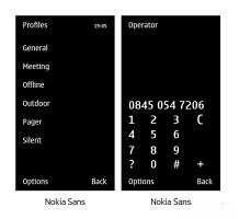
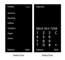
The Nokia Sans versus the Nokia Pure
Still we can’t help but see the resemblance with the way Windows Phone 7 shows menus.
Reader comments
- Anonymous
- 24 Mar 2013
- uCm
I do not like Nokia Pure, it's just like Arial Unicode MS, Droid Sans, good for eyes. But I prefers Nokia Sans because it's THIN!! Good for mobile those screen aren't BIG and WIDE.
- JH
- 14 Jun 2011
- m}P
I definitely like Nokia Sans better than Nokia Pure! If it ain't broken, don't fix it!
- AnonD-7236
- 28 Apr 2011
- vad
I like N8, esp GPS !!


 Samsung
 Xiaomi
 Samsung
 Sony
Sony Xiaomi