Google+ gets a makeover, focuses on Collections and Communities
Google is rolling out an updated design for the web and mobile versions of Google+. Starting today, users on the web will be prompted to switch to the new design if they wish.
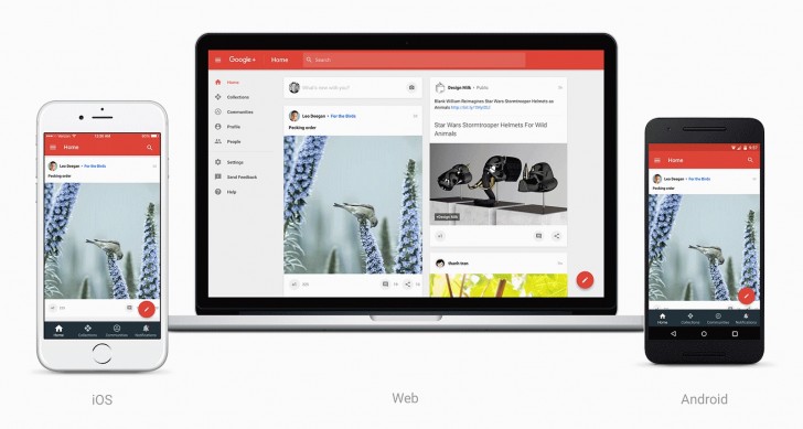
The new design is more than just rearranging things and making it simpler. Google had a bigger goal with this redesign, and that was to focus more on the Collections and Communities features of the service. Collections is, well, a collection of posts matching a certain interest, such as photography. Community is where people can form a community based around an interest for likeminded people to share and communicate in.
The features have been around forever but with the new design Google is putting more focus on them by giving them a prime location in the new side menu.
Google is also consolidating the design across platforms, as there was a quite a discrepancy in the way the service looked on desktop and on mobile. Following the website redesign rollout, Google will also be updating the Android and iOS apps with the same design.
The web redesign is now rolling out. Look out for the option to switch to the new UI. You will be able to go back to the older design if you wish as the new site doesn't have all the existing features.
Related


Reader comments
- AnonD-169922
- 18 Nov 2015
- d$x
Will still only use google+ so I don't need to make an account on all the random sites I visit.
- AnonD-110191
- 18 Nov 2015
- Gj9
Im sorry but i never ever saw google+ as something interesting. I never will. Its bland, boring and just plainly not interesting.


 Xiaomi
 Samsung
 Apple
Apple Infinix
 Xiaomi