Honor View 20 long-term review
Software
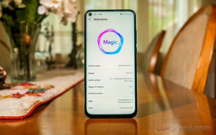
The Honor View 20 is among the first Honor devices to come with the newly-rebranded "Magic UI". The UI was rebranded from EMUI with a new look and new features in China with its Yoyo Assistant. Otherwise, there aren't any drastic changes to Magic UI, it feels and behaves like EMUI did on the Mate 20 Pro.
Magic UI takes a very utilitarian approach to Android with lots of options, settings and features to play with while also keeping a simplified surface layer for those who aren't power users. Some might be put off by the UI's look-alikeness to iOS but it has been better about this over the years.
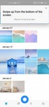
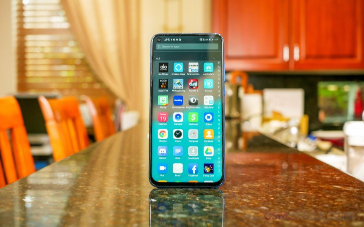
The launcher still feels very much like Android but Magic UI hasn't gone as far as implementing a swipe-up gesture to open the app drawer. The "drawer' button is used here (should you choose the option) and a vertically scrolling drawer pops up. Though it's far from stock Android, the stock Magic UI launcher has quick access to your Google Feed just like the Pixel - one swipe left from the homescreen.
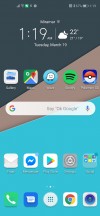
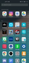
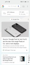
Home screen • App drawer • Google Feed
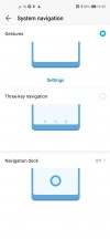
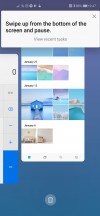
Since we started using the View 20, we've got the gesture controls down pat. They are similar to the iPhone's: swipe up from the bottom edge to go home, swipe from either the left or right edge, to go back, and swipe up and hold for recent apps. This indirectly makes it easy for anyone with an iPhone X or newer to switch to a Huawei phone. Oh yeah, and swiping up from either corner of the bottom edge will summon Google Assistant.
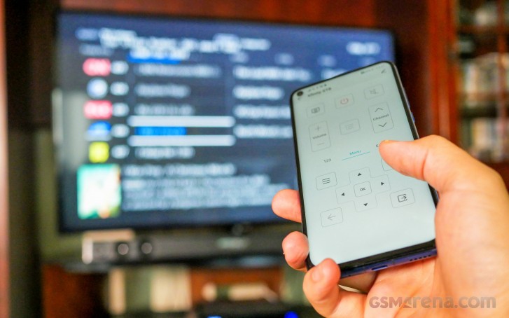
What we do miss with gesture controls is quickly switching between two apps by double tapping the Recents nav button. It's not a huge disadvantage because you can still swipe up + hold, and tap in the center, but it requires more thumb travel. No biggie, though because the trade-off is that you get to use the entire length of the screen.
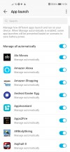
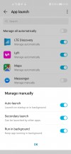
Magic UI offers extensive battery settings but the one we're going to look at is the "App Launch" settings. It's the page where you can select which specific apps to manually or automatically manage in terms of when to allow the app to launch itself or manage whether it should run in the background.
Quoted from this page: "When Manage automatically is enabled, some app launches will be prevented based on scenario to save power." This means the UI will judge apps based on their drain and might disable them from running in the background. This is a double edged sword because it could potentially stop any important apps from running in the background like workout or messaging apps. It would be a good idea to check these settings and manually manage important apps so you don't miss important functions or notifications.
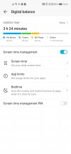
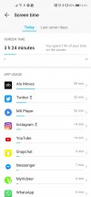
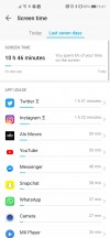
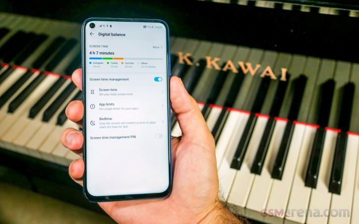
The phone offers the "Digital balance" app which is integrated into the phone and lets you set time limits to apps and as set a bedtime period which turns your display to monochrome to help encourage you to head to sleep. You can also set a separate limits for weekdays and weekends. You can see a visual graph that lets you see how much you've used an individual app in a day or over the last week.
You can also set a screen time limit so you can see your overall screen time and you can see how many times you unlock the device throughout the day so you can perhaps become aware of this and set goals to reduce your unlocks per hour.
Other manufacturers like Apple and Google have built a time management feature into their phones and we feel like Magic UI's implementation is a bit simple. Is it still usable? Yes, but it doesn't have as many other features and visual graphs as other executions of the feature.
After using a few phones with in-display fingerprint sensors, we came back to the rear-mounted fingerprint on the View 20 and concluded that it is much quicker and more accurate to unlock. There's also face unlock, which isn't as secure, but does offer a "smart notification" feature which hides notifications while the phone is locked but will display them if the front camera sees the registered face.
Lock screen notifications have also come a long way and we're glad they finally behave as they should. In previous EMUI versions, lock screen notifications were annoying, unpredictable, and performable actions on notifications from the lock screen were very limited.
Notable software features
Huawei Share
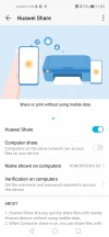
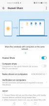
We like that Huawei has the closest thing to Apple's AirDrop and its called Huawei Share. It works very well and consistently, but it only works among other Honor or Huawei phones or computers. We like that we can instantly see those nearby with Huawei Share enabled and that we can very quickly send full resolution photos and videos.
Huawei Share also makes it much easier to print documents directly from your phone onto printers connected to your network. This is especially useful when you need to print boarding passes from your email and would rather not have to pull it up from a desktop.
Huawei Easy Projection
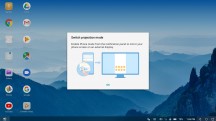
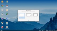
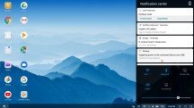
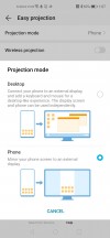
One of the more underrated features of the latest version of Magic UI (or EMUI, for that matter) is the ability to use the device in a desktop interface on higher-end phones. Huawei Easy Projection offers the choice to either mirror the screen's contents or open a desktop interface when connected to an external display, either wireless via Miracast, or an HDMI connection via the USB-C port's TV out.
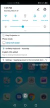
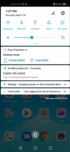
A notification lets you switch between "Desktop mode" and "Phone mode", but the best feature is being able to use both the phone and desktop simultaneously so you can still check your phone while working on a larger display.
Although this isn't a feature that everyone would use, we love that Honor decided to keep it for the View 20. Honor could have cut corners by not allowing TV-Out via the USB-C port to save cost but kept it anyway.
One-handed mode
There's a nifty one-handed mode that's easy to access whether you're using nav buttons or gesture controls. Given the phone's large display, this makes it easier to reach everything being shown on the screen while your other hand might be busy holding other things or if you'd just rather want to do some one-handed operation.
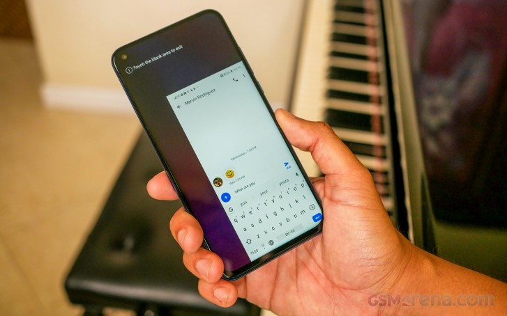
Some phone makers don't bother to put any kind of one-handed operation mode so this is nice to see in such a simple implementation.
Performance
We've used smartphones that tend to slow down as time goes on. As you download and use more apps, the operating system tends to bog down to the point where you're forced to use some clean-up or performance booster app that alleviates lag for a couple of days.
Not the Honor View 20. EMUI has incorporated background maintenance and optimization of apps since the Huawei Mate 10 when it first coined the phrase: "Born fast, stay fast". So far, we've not seen any slowdowns that we'd typically begin experiencing with a Samsung, Google, or Apple device after about a month of demanding usage.
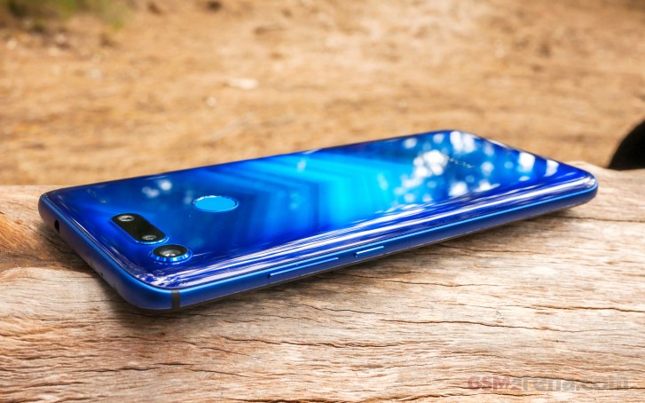
This phone doesn't "think", it does everything without hesitation or even stutter. The View 20 even performs well after using a bunch of apps. It feels like the OS is one step ahead of you, just waiting for you to perform the action.
The Kirin 980 is the same 7nm CPU as on the Huawei Mate 20 Pro so it's a seriously powerful yet future-proof chipset. Honestly, Honor could have gotten away with using the previous-generation Kirin 970 and it still might be worth its price, but there would then be that tradeoff. Honor/Huawei never put recycled chips in their more expensive devices because it believes the consumer deserves the best available hardware at that moment.
Although our unit is an 8GB RAM + 256GB model, we have no doubt that the 6GB variant will run just as quickly and smoothly. In terms of gaming performance, there is no game that the View 20 can't handle. If you're chasing higher benchmark scores, the Kirin 980 isn't a chart-topper among 7nm chips by Samsung, Apple, and Qualcomm, but it will deliver excellent real-world performance and the deca-core Mali G76-MP10 GPU will handle any mobile game.
Battery
Our proprietary battery test serves one main purpose: It's an objective test used to compare battery life across devices. Actual power consumption, on the other hand, is subjective. We're not retesting scores here, but we'll talk about some aspects of battery life that are worth revisiting.
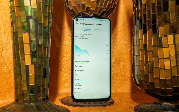
In real-world usage, the Honor View 20 performed exceptionally well. With a full battery charge, we didn't have to worry about battery life for at least 24 hours. Not only this, but we found an average endurance of about a day and a half of use, averaging between 5 to 6 hours of screen-on time.
Real world usage was roughly along the lines of the following:
- One hour of google maps navigation and/or simultaneously streaming Spotify over Bluetooth
- Two hours of scrolling through social media apps.
- Two hours of messaging apps: Messenger, Telegram, WhatsApp
- One hour watching videos on YouTube or on workout apps
We love that the View 20 supports both Huawei Super Charge and Qualcomm Quick Charge because you at least have an alternative that isn't as slow as molasses. With the Super Charger, a 10 to 20 minute top-up can make a great difference if you're quickly getting ready to head out the door.
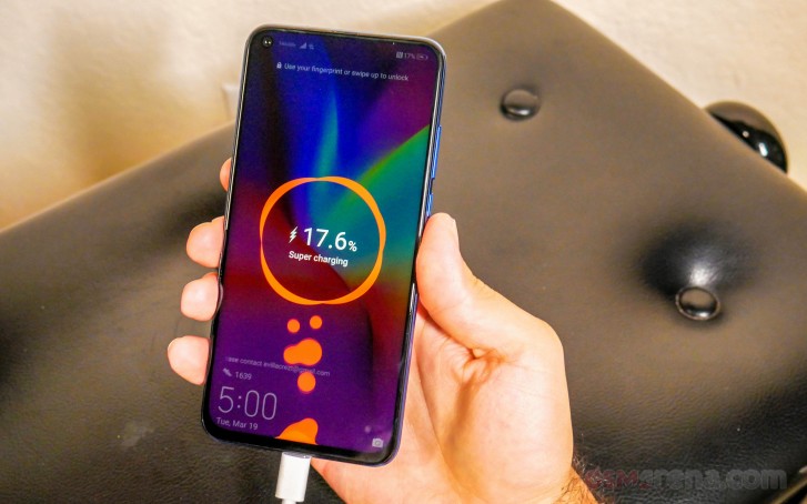
We tested this exact scenario and from a 10% battery and after the first 10 minutes, we were at 27% capacity, which should be enough to comfortably last you through a few hours on a night out. We charged it for 10 more minutes and it reached 44%. With light to moderate usage, you could easily make it through a work shift with this much charge.
During our time with the View 20, on one occasion we were able to go out to a music show at a bar and headed there with 21% battery. We were out for no more than three hours, during which we were taking photos, videos, and posting some Instagram stories - we made it back with 10% to spare.
Reader comments
- Chimm
- 02 Feb 2024
- tVk
My honor view 20 so far still good until now.video plus photos still beautiful. My problrm because I cannot put the sd card as the internal memory is not enough for me
- Anonymous
- 14 Dec 2020
- mX0
eBay stock it, about £25
- Anonymous
- 11 Oct 2020
- xCD
my honor view 20 broken any one knows were can i find a LCD for my phone .
