HTC Desire review: A desire come true
A desire come true
User interface (continued)
When you select a widget you are prompted to choose between several versions - most widgets have at least two styles. The different versions typically offer at least two sizes of the widget, different look (There are twelve different clocks. That's right, twelve!).
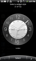
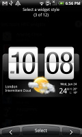
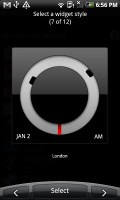
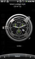
Some different styles of the Clock widget
And some widget styles even offer different functionality. Take the Twitter widget for instance - one version also shows updates for the people you follow, while the other version only lets you tweet right on the homescreen. There's nothing stopping you from using both of course.
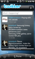
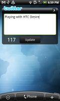
The two versions of the Twitter widget are functionally different
The HTC widgets offer a better level of interaction than the stock widgets - there's a Favorites widget that keeps a list of your favorite contacts you can scroll through, no need to get to the contact list.
Friend Stream shows the latest status updates of your friends. To use this widget you must link your profile to Facebook and have matching friends to your phone’s contact. After this is done properly, their latest updates will be noted in the Friend Stream widget.
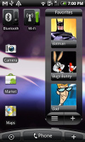
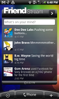
The People widget and Wi-Fi and Bluetooth setting widgets • Friend Stream widget
The Photo album widget is a "stack" of photos that shows all the photos in some folder and you can flick them to view the next photo in line. This is quite fun but the experience is somewhat ruined by optimization - during the animation of the photo going up and the next one settling in, the widget uses low resolution previews of the photos and it takes a couple of seconds for the next image to load up in full quality. Higher-res photos suffer the most from this, of course.
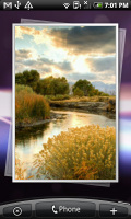
Photo widget is smoothly animated, but not smoothly drawn
The Messages and Mail widgets work much the same way, but instead of photos, you scroll messages. And you don't get the pixelation issue.
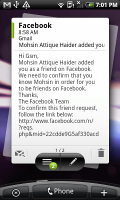
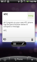
The Mail widget • Messages widget
Android 2.1 offers animated wallpapers and the Desire has plenty of those preloaded. They look impressive, extend over all of the homescreen panes and don’t slow the interface at all. You may even choose the Nexus One original wallpaper.
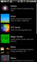
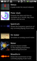
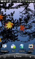
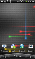
Choosing a live wallpaper • the live wallpapers in action
Well, that’s about the part of the Sense UI that’s closest to the surface. There’s more to it but we’ll discuss those bits and pieces throughout the review.
The HTC Desire UI is generally fast and we must give credit for that to the faster CPU and the optimized software. This time around the UI performance is great - even with lots of files on the microSD card.
The only noticeable slowdown is with widgets that need internet connection to refresh content, but that’s completely normal.
Here is how the HTC Desire compares to the Legend and Sony Ericsson XPERIA X10 in terms of performance. We used the free Benhcmark and PiBenchmark apps from the Android Market for the test and the results are here for you to see.
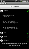
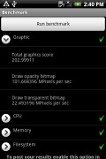
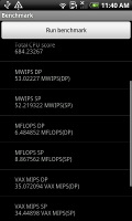
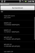
HTC Desire • HTC Legend • HTC Desire • HTC Legend
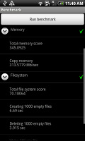
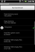
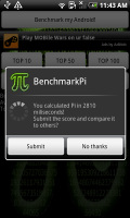
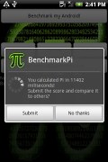
HTC Desire • HTC Legend • HTC Desire • HTC Legend
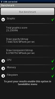
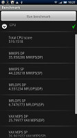
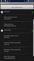
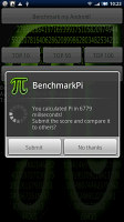
Sony Ericsson XPERIA X10 benchmarks
The new trackpad is an auxiliary navigation tool here – given the responsive capacitive touchscreen. You can swipe, scroll and precisely select elements with the trackpad, but sometimes you’d swipe your finger over it incidentally. The hardware keys are very close to the trackpad itself, so be careful there.
We found ourselves barely using the trackpad except in the camera app, where it serves as the shutter key. Even there, it’s non essential, as the touch focus works well.
Two more things - most apps won't run without a microSD card inserted and screen vibration feedback works on the virtual QWERTY keyboard but nowhere else on the homescreen.
Reader comments
- Su
- 26 Dec 2021
- d%5
Try the pro21 you will change your mind
- Anonymous
- 12 Mar 2020
- CAx
Very good
- Anonymous
- 18 Jan 2016
- KIA
Frz HTC dresia a8181 price 2500/-