HTC Desire 510 review: Inbetweener
Inbetweener
HTC Desire 510 runs on Android KitKat + Sense 6 UI
The HTC Desire 510 comes powered by Android 4.4.2 KitKat complete with the home-baked Sense 6 overlay. Under Sense 6, the user interface has been improved in terms of both functionality and looks. Each of the built-in apps each has a different accent color but it changes its color when visiting the status bar to create a uniform effect - similar to what we've seen with Apple's iOS 8.
Here's a brief rundown of Sense 6 UI on the HTC Desire 510.
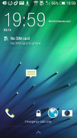
The lockscreen hasn't really changed much since Sense 5 - there's a clock with weather information and four app shortcuts. Swiping up unlocks the screen, swiping to the left gets you to your default homescreen, while swiping to the right will take you to BlinkFeed (if enabled).
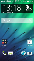
Once you unlock the Desire 510 you're greeted by a familiar homescreen and virtual on screen buttons. Having the buttons on-screen ensures better response time and less chance of operational deterioration but also means you're effectively giving up part of your screen estate.
The background behind the buttons is transparent and they obediently move out the way when you're watching a video or image so it's not that bad. But some apps still haven't been optimized to work with on-screen buttons and will stubbornly leave them there and shrink back the content to fit them, which isn't ideal.
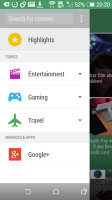
The leftmost homescreen pane of the Desire 510 is reserved for HTC BlinkFeed. It aggregates content from your social networks, as well as from various news sources. You can pick what topics you're interested in and BlinkFeed will automatically pull fresh content for you. You can also search for specific content. You can turn BlinkFeed off if you prefer or choose not to have as your default homescreen.
You get up to five homescreen panes to fill with shortcuts and widgets (the sixth is reserved for BlinkFeed). You can set any of the panes as default.
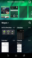
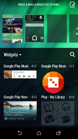
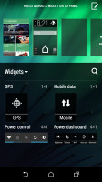
Adding widgets to the homescreen
The notification area is business as usual - you get notifications in the default page and quick toggles in the second one. You can access the quick toggles by a tap in the upper right corner or through a two finger swipe down from the status bar.
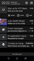
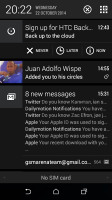
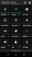
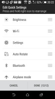
Notification area and Quick Settings
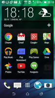
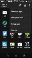
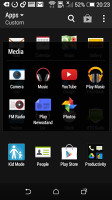
The app drawer is vertically scrollable. Aside from the usual alphabetical and chronological order of apps you can also sort them in a way you see fit. The grid of apps can either be a 3 x 4 or the more sensible 4 x 4.
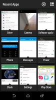
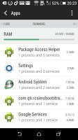
Getting to the recently-opened apps is done via the dedicated on-screen button. The interface shows a list of thumbnails for each app. You can swipe them away one by one as before or use the new close all option, thankfully. You can also get to the task manager from the recent apps screen - it shows you the currently active apps and RAM usage.
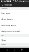
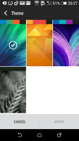
Wallpapers, lockscreen style, ringtones, notification sounds and alarms can be customized via a dedicated menu. This time around, the lockscreen styles cannot be changed.
The HTC Desire 510 also has a built-in restricted access Kids mode. It is an app that lets you set up a profile for each of your kids, with a photo and birthdate and pick which apps they can have access to.
Reader comments
- Boyo
- 03 Jul 2018
- q$J
Never but tgis stupid phone
- MOHAMMED Almoqry
- 02 Mar 2017
- sty
Plz can anyone tell me what I can do The phone give me this massage and doesn't wake up from the white screen, the massage is :this build is for development purposes only do not distribute outside of htc without HTC's written permission.failure to...
- Jaggi
- 09 Jun 2016
- uvm
Please give intruction for sim 1 & sim 2 place


