HTC Desire 700 dual sim review: Smarts for size
Smarts for size
Outdated Android 4.1.2 coupled with outdated Sense 5.0 UI
The HTC Desire 700 dual sim runs Android 4.1.2 with Sense UI 5. It's a bit behind the curve with the more premium HTC One and One Max, which are rocking Android 4.3 and Sense 5.5 with upcoming updates to 4.4 KitKat.
Still, HTC has treated its dual simer with some of its attractive proprietary software features such as BlinkFeed and Zoe.
Here's a quick showcase of the HTC Desire 700 dual sim.
HTC's Sense goes against the grain of most Android custom launchers and relies heavily on vertical scrolling, which can take some getting used to if you're coming from a different brand.
BlinkFeed is the first place you'd encounter it - it's a stream of articles from around the web delivered directly to your homescreen combined with account updates from the social network services you might be using, such as Facebook and Twitter.
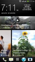

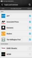
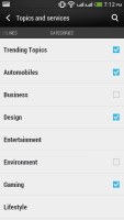
BlinkFeed • viewing an item • news sources • social networking accounts
When you tap on an item you get a preview with one big picture and a short blurb. Social networking items open the respective app instead. You can also search BlinkFeed and post updates to social networks straight from it.
BlinkFeed is a part of the homescreen - the leftmost pane.
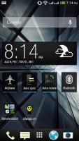
Regular homescreens are available too
You can long press on the homescreen or do a pinch zoom out gesture to enter the homescreen edit mode. Here you can add and remove homescreen panes, rearrange existing ones and set one of them as Home (the Home buttons brings you there). The only limitation is that you can't remove or rearrange the BlinkFeed, which is always the leftmost homescreen pane. As we saw from the other HTC smartphones this limitation is only removed from Android 4.3 Jelly Bean (Sense 5.5) upwards.
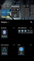
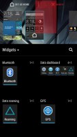
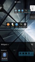
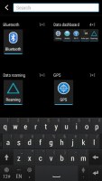
Managing widgets and app shortcuts
The Android app drawer is the second place where HTC went with vertical scrolling instead of the more popular paged interface. The drawer displays a 3 x 4 grip of shortcuts by default (which leaves a lot of padding around icons). You can use folders to group similar apps and make better use of the screen space. The other option is to switch to a 4 x 5 grid in the settings menu.
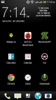
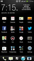
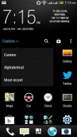
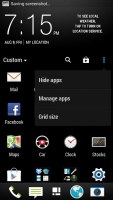
The default app drawer • a folder • the 4 x 5 grid option
Note that to access the settings in the app drawer and BlinkFeed you have to swipe down. The Desire 700 dual sim doesn't have a Menu button, but you can assign the long press action of the Home button to cover for it. If you do that, you'll give up its default purpose of opening Google Now - which will be a swipe up gesture instead.
At the top of the app drawer is a big clock with date and weather info (a big icon and smaller text with more details). This same clock is at the top of the BlinkFeed screen, which makes the two feel very similar.
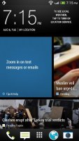

The clock and weather info offers nice continuity
The shortcut dock at the bottom holds four shortcuts plus the app drawer button in the middle. These icons are always visible - in BlinkFeed, in the regular screens, in the app drawer, even on the lockscreen.
The notification area is pretty much stock Android - it shows only notifications by default (below the top row, which is reserved for the time and date, plus two shortcuts). There aren't any quick toggles for system settings, a feature that we very much miss. The other HTC phones running Android 4.2.2 already have that sorted out.
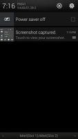

Notification area sans quick toggles
Unfortunately, the same goes for the widget lockscreen feature, which is present only on devices running Android 4.2.2 and up. As a result, on the Desire 700 dual sim you only get a traditional lockscreen with four non-customizable app shortcuts with the time and weather displaying above them.
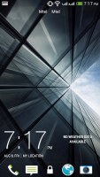
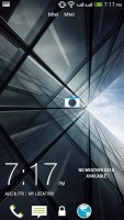
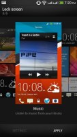
The enhanced lockscreen provided by the Sense 5 UI • Picking a lockscreen style
There's no way to change lockscreen shortcuts independently from the ones docked on the homescreen. Many users may find that inconvenient - LG and Samsung both let you do that.
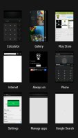
HTC has fiddled with the app switcher - it is now launched by double tapping the Home key. It shows a 3 x 3 grid of thumbnails of the recent apps. The upside is that you don't have to scroll like you do in the regular Android app switcher, the downside is that you can't scroll at all even if you wanted to - you only get to see the last 9 apps and no more (though for some that's quite enough). You can swipe up to dismiss an app (which leaves an empty slot, an older app doesn't fill its place).
There's an interesting option in the phone's Security settings, borrowed from the Windows Phone 8 playbook. It's called Kid mode and it is actually an app that lets you set up a profile for each of your kids, with a photo and birthdate and pick which apps they can have access to. One annoying bit is that to enable Kid mode the first time around, you need to sign up via email.
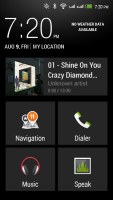
The HTC Desire 700 dual sim also comes with a dedicated Car mode screen, which has been styled to look like the rest of the interface. There are only five big controls besides the clock and weather info. There's music info too, which takes a whole row by itself, along with shortcuts to Navigation, Dialer, the Music player (again) and Voice commands.
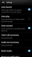
The Sense customizations also extend to the Settings menu - HTC has prettified it a bit with custom icons and added several new options (like Media output and Personalize).
If you're upgrading from another phone, you should give the Setup app a spin. It hooks up to your old phone over Bluetooth and pulls all the data it can, even things that Google doesn't sync (settings and such, not just the contacts). This also works for phones that can't sync with Google, like various feature phones.
Reader comments
- Anonymous
- 24 Apr 2018
- KcW
My HTC mobile SIM 2 is not working. What is the reason?
- Jifaad
- 21 Jul 2017
- fuN
Can HTC desire 700 dual SIM be upgraded?
- Shoopaw
- 22 Feb 2016
- X}6
Yes, thus phone is very interesting.Can you use restart everday:-) :-) :-)
