HTC Desire C review: Welcome aboard
Welcome aboard
Android ICS with the latest Sense
The HTC Desire C comes with Android 4.0.3 and Sense 4.0 - that's no longer the most recent Android release, but as most of its competitors are still stuck with Gingerbread it's still quite an achievement. We've seen this particular combo of ICS and Sense several times already on the HTC One series phones, but it's still interesting to see it perform on a much cheaper device like the Desire C.
The user interface is trimmed down just like it was on the HTC One V - this time around, it isn't just the small screen but the less processing power too.
Anyway, what's missing compared to the One X and the One S is Leap View. The Recent Apps interface is the vanilla ICS layout and the lockscreen cannot be customized: you cannot assign custom app shortcuts - you get Phone, Mail, Messages and Camera, and that's nonnegotiable. There are no different lockscreen types to select from either - the only option the Desire C gives you is the ability to show or hide the default four app shortcuts.
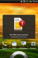
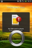
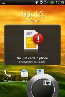
The lockscreen is still quite efficient. There are the usual four shortcuts and a ring at the bottom. You can either drag the ring towards the center of the screen to unlock the phone, or any of the shortcuts into the ring to unlock the phone and launch the corresponding app.
The number of homescreens is locked at five - like on the One V, you cannot add or remove any. There is no leap view either. You get an auto-hiding indicator of which screen you're on and a brand new dock with five shortcuts - the middle one is locked to the app drawer, while the other four can be customized as you please (you can even put a folder there, if four shortcuts isn't enough).
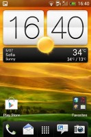
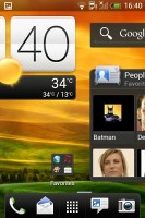
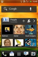

Some of the homescreen sections
Sense offers one of the most full-featured customization suites around. The proprietary Scenes interface lets you choose from various custom homescreen setups, which provide new wallpaper and widget sets that can be further customized to suit your needs. This version of Sense only comes with one preloaded, but hitting the 'Get More' button on the upper right will take you to the HTC Hub where you can download additional Scenes.
Switching between scenes takes a couple of seconds, but they're a handy feature if you want to quickly change your phone's functionality, such as going from work to home.
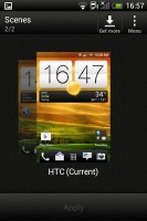
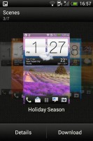
The preset and downloadable Scenes
The HTC Sense has another customization option called Skins. Every skin changes the look and feel of most of the onscreen buttons, application screens, option menus, and other items. They also come with unique wallpaper each and use different colors for various UI elements. The Desire C comes with a total of two preloaded skins, although like with Scenes, it's easy to get more.
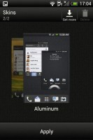
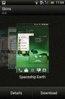
Getting various Skins is also easy
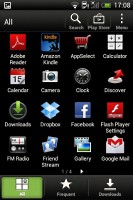
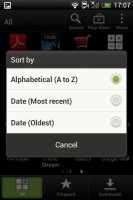
The main menu has the typical grid layout, which is composed of vertical pages with shortcuts sorted alphabetically. You can set different sorting options - alphabetical, most recent or oldest - but you can't rearrange them manually. There are Search and Play Store shortcuts along with a menu for some options.
The App Drawer uses a tabbed layout similar to different Sense elements (such as the phonebook). There are three tabs available at the bottom - All apps, Frequent and Downloads. You can rearrange them or remove Frequent and Downloads if you don't need them.


You can remove whichever tabs along the bottom you don't need
The Personalize app also has Sound customizations - you can pick a Sound set or individual ringtone, notification and alarm sounds.
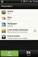
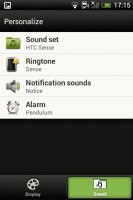
The Personalize menu does sound too
Adding widgets to the homescreen is done in a similar fashion to Honeycomb and is one of the less successful changes since Sense went ICS.
You press and hold on the homescreen and everything zooms out so that the homescreen panes are visible as thumbnails on the top row of the screen. You tap a homescreen to select it and then select a widget to add to it (or you can just drag the widget).
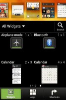
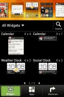
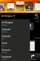
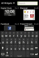
Adding a widget to the homescreen
The main problem here is with how widgets are selected - they are shown four at a time and there's a lot of scrolling involved. Widgets are available in multiple versions - usually differing in size, but also functionality - and they're all dumped into the list, so you're scrolling through a lot of duplicates.
There's a search option to speed things along or you can choose a widget from the dropdown menu and then select which size you like, but that still feels like an extra step.
The old setup of picking a widget and then adjusting its size (if applicable) seemed simpler.
Editing the homescreen is different from vanilla Android. You can tap and hold on a widget and you can drag across homescreen panes. While you're dragging a widget (or shortcut or whatever), two fields appear at the top of the screen - Edit and Remove. You can drop the widget on either one to perform the corresponding action.
When it is highlighted, Edit can be used to modify the settings of a widget - e.g. choose a different folder for the Photo Frame album or even choose a different version of the Clock widget. This saves you the trouble of first deleting a widget and then putting it on the screen again to choose a different version, setting and so on.


Dragging a widget gives you options
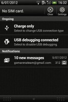
The notification area no longer has the list of recent apps - it's reserved for notifications only. No more tabs and toggles either, although you get a Settings shortcut here if you need to power something on or off. There's also a Clear button to dismiss all notification or you can swipe them off one by one.
Pressing the task switcher button on any screen displays a list of all your recently accessed apps, which you can remove with a swipe to the left or right. This is really just a quick way to access apps you've used recently, as swiping away doesn't kill them.
To actually terminate a running app, you have to close it via the traditional task manager we've become familiar with from Gingerbread. It's simple to use - each running app is listed with an indication of how much RAM it's using (no CPU usage reading though). You can terminate apps one by one and there's a Stop All button too.
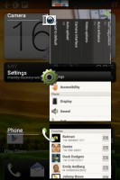
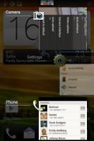
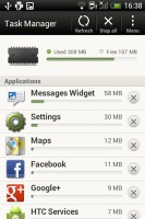
The standard task switcher • The task manager
Synthetic benchmarks
As we've already mentioned, the ICS build which graces the Desire C is one we were first introduced to when we examined HTC's One series phones. This time around, however, we have a sub-1GHz processor under the hood (of the Scorpion variety), and we're curious to see what HTC has held back from a software standpoint in order to keep performance up.
Judging by how extensively re-written and optimized the code behind the new Android 4.0 build is, we expect the 600mHz processor to perform better in our web browsing benchmarks than its Gingerbread counterparts, but we didn't really expected it to break any records.
BenchMark Pi shows a trend we'll see across the entire range of our tests, which is a huge dominance of the Sony Xperia U. There's no escaping the fact that the Sony smartphone with its dual-core 1GHz processor is miles ahead of all other smartphones in this price rage.
Linpack
Higher is better
-
HTC Desire C
16.2 -
Samsung Galaxy mini 2
19.9 -
Sony Xperia U
64.9 -
Samsung Galaxy Pocket
10.4 -
Samsung Galaxy Y Duos
10.3 -
HTC Explorer
15.8 -
Samsung Galaxy Ace
9.9
NenaMark 2 tests the GPU of mobile and while the Desire C's 16 frames per second are enough to top the other single-core devices, they hardly suggest spectacular gaming performance.
NenaMark 2
Higher is better
-
HTC Desire C
16.0 -
Samsung Galaxy mini 2
15.4 -
Sony Xperia U
28.3 -
Samsung Galaxy Pocket
12.9 -
Samsung Galaxy Y Duos
13.2 -
HTC Explorer
15.1 -
Samsung Galaxy Ace
12
In SunSpider and BrowserMark the Desire C was again able to get some good overall results. The results indicate pretty good web browsing performance, especially considering the specifications.
SunSpider
Lower is better
-
HTC Desire C
6971 -
Samsung Galaxy mini 2
5911 -
Sony Xperia U
2814 -
Samsung Galaxy Pocket
12105 -
Samsung Galaxy Y Duos
11966 -
HTC Explorer
10784 -
Samsung Galaxy Ace
9061
BrowserMark
Higher is better
-
HTC Desire C
24635 -
Samsung Galaxy mini 2
33994 -
Sony Xperia U
75906 -
Samsung Galaxy Pocket
20338 -
Samsung Galaxy Y Duos
19634 -
HTC Explorer
22464 -
Samsung Galaxy Ace
27844
Overall, the ICS optimizations were enough to get some extra bang out of the measly processor, but let's keep in mind that it's primarily that processor that puts the Desire C squarely in the budget category.
Web browsing on the Desire C is generally a decent experience, with the notable exception of flash content, which introduces a significant amount of lag.
Reader comments
- arsi
- 25 Dec 2014
- 3SM
Love this phone. I am using this phone as a second phone but this phone never let me down.
- Anonymous
- 08 Oct 2014
- v0q
H! Im leo from phils.and im the one fans of htc I wish this company to create again a small screen like 3.5inch 7mm thin a quadcore procesor and latest android version and a clear camera ang clear audio because I believe that many people like a small...
- Anonymous
- 08 Oct 2014
- v0q
I want htc
