HTC Explorer review: The start of a journey
The start of a journey
Sense/Gingerbread combo looks good
The HTC Explorer comes with Android 2.3.5 Gingerbread and a spruced-up version of the HTC Sense, v3.5. Like the HTC Rhyme, the Sense UI on the Explorer has had some custom touches to it - though they are different from the Rhyme's. In the case of the HTC Explorer, the interface had to account for the lower-res screen.
But let's start from the beginning. Here's a video demo of the latest Sense UI running on the HTC Explorer.
The HTC lockscreen has to be the most functional lockscreen we've seen yet. By default, it has four shortcuts and a ring at the bottom. You drag the ring towards the center of the screen to unlock the phone.
Or, you can drag any of the shortcuts into the ring to unlock the phone and launch the corresponding app. You can assign any four apps to the lockscreen that you like.
During charging, a battery graphic appears that shows the charging progress.

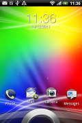


The charging indicator on a locked screen • The lockscreen is brilliant
The HTC Explorer comes with just a single lockscreen preinstalled, you can't pick a different style like you can on its bigger siblings. Unfortunately, there're no extra lockscreen styles to download off the HTC Hub.
Going further than the lockscreen reveals the Sense homescreen. The old scroll arc at the bottom is now gone and replaced by a straight line over two buttons - the app drawer and dialer. It's simpler and better looking. It's also more thumbable than what we saw on the Rhyme (which does have a bigger screen).
There are seven homescreen panes as usual and scrolling between them is looped. Another difference from the Rhyme is you cannot add and delete panes. There are 7 of them and that's non-negotiable.
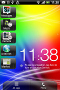
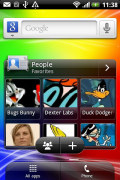

Some of the homescreen sections
The Leap view is a trademark Sense UI feature. Tap the home key (while on the main homescreen) or do a pinch gesture to zoom out to display the thumbnails of all seven homescreen panes at once. Upon a press and hold you can drag to reposition the homescreen panes as well. There're just no Add or Delete icons at the bottom of the screen.
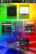
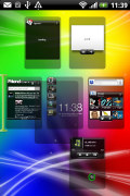
Leap View lets you quickly switch between homescreen panes • Deleting a pane
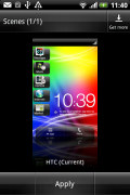
HTC Sense comes with the proprietary HTC Scenes – essentially several custom homescreen setups. Each scene changes the wallpaper and the set of widgets, but those can be customized, of course.
The Explorer came with a single preset Scene, but you can easily download more or create your own.
The main menu has the typical grid layout, which is composed of vertical pages with shortcuts sorted alphabetically. You can choose between two different sorting options - alphabetically or most recent - but you can't rearrange them manually. Alternatively, there's a list view.
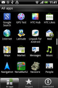
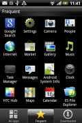
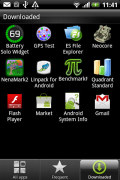
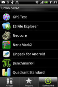
The grid layout • The list layout
The main menu has a tabbed layout similar to different Sense elements (such as the phonebook). There are three tabs available at the bottom – All apps, Frequent and Favorites. They are quite useful especially when you have lots of installed applications.
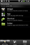
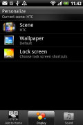
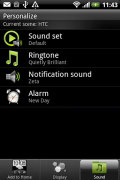
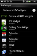
Tapping the Personalize button brings out a whole screen of items to choose from – for the display (scenes, wallpapers and skin), for the homescreen (widgets, shortcuts, folders, etc.) and even sounds (ringtones, alarms, notifications and Sound set).
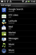
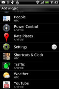
In the widget section, both types of widgets (custom HTC and stock Android) are placed on the same page. There are so many of them you may find the seven homescreen panes short. You can download new widgets off the Market or the HTC Hub.
When you select a widget, you are prompted to choose between several versions – most widgets have at least two styles. The different versions typically offer at least two sizes of the widget and different skins. For example, there are three different clocks.
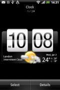
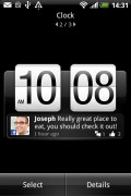
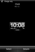
The three different clock widgets
The most interesting widget is the Shortcuts & Clock widget. By default, you'll find it on the central homescreen. It's a full screen widget that shows time and date along with weather information.
It also features five shortcuts that are not simple buttons but more like drawers - Messages, Music, Camera, Internet and Market. Tapping on the right side of each (which can be a little tricky on the small screen) opens up the drawer. There you'll find things like the last received message, music controls and track info or the latest shots you've snapped with the camera.
You can add different shortcuts if you don't like the default ones, but they won't offer the extra capabilities of the drawer.
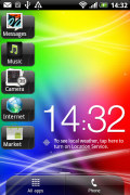
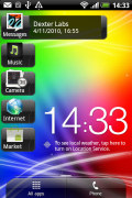
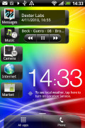
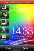
Shortcut & Clock is a really cool widget for your main homescreen
Editing the homescreen is different from vanilla Android. You can tap and hold on a widget and you can drag it across homescreen panes. While you're dragging a widget (or shortcut or whatever), two "buttons" appear at the bottom of the screen - Edit and Remove. You drop the widget on either button to perform the corresponding action.
Edit can be used to modify the settings of a widget - e.g. choose a different folder for the Photo Frame album or even choose a different version of the Clock widget. This saves you the trouble of first deleting a widget and then putting it on the screen again to choose a different version, setting and so on.
The second "button" is Remove, which obviously deletes the widget.
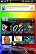
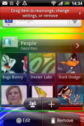
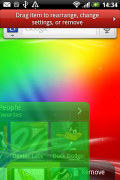
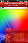
Dragging a widget gives you options
The notification area features a list of recent apps (in addition to the notification list), just like a task switcher. The usual press and hold of the Home button will launch the actual task switcher. The notification area is tabbed too - the second tab has toggles for WLAN, Bluetooth, GPS, cellular data or the Wi-Fi hotspot. There is a shortcut to the full list of settings and the last line shows used/free memory.
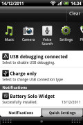
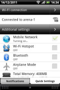
The new notification area doubles as a task switcher • the quick settings tab
Besides the standard task switcher, you get a task manager too. It's simple to use - each running app is listed with an indication of how much RAM it's using (no CPU usage reading though). You can terminate apps one by one and there's a Kill All button too.
Another useful app that HTC preloaded is the usage monitor - it tracks you data, call and message usage. There are apps in the Market that do the same, but this one is styled to match the rest of the interface. We wish it had a widget to let you monitor usage at-a-glance.
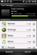
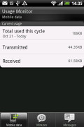
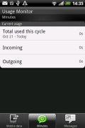
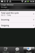
HTC's task manager • The Usage monitor
The fast boot feature is enabled on the HTC Explorer as well. The apps preserve their state after the restart – so if you were browsing a web site before turning the phone off, the browser will restore your session.
Synthetic benchmarks
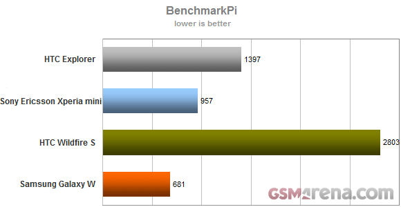
We ran some benchmarks to see how the HTC Explorer stacks up against other droids in the compact class, both old and new.
In Benchmark Pi, it does pretty well. It's not much slower than a Sony Ericsson Xperia active, which has a good 400MHz clock speed advantage. It blows past the old Wildfire S though.
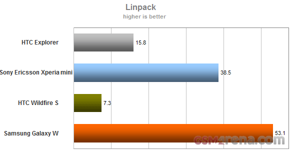
In Linpack it's a similar story - the Explorer offers nearly double the number the Wildfire S got, but it's far behind the faster Snapdragon chipset of the Xperia Active.
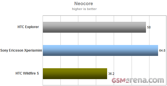
We don't have NenaMark 2 scores for the older models, so we did a quick comparison in Neocore. The HTC Explorer, Wildfire S and Sony Ericsson Xperia mini both have HVGA screens, but the mini uses Adreno 205 while the other two use Adreno 200. The Adreno 200 in the Explorer is supposedly boosted and it shows.
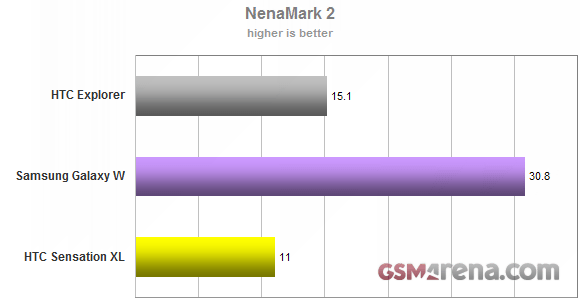
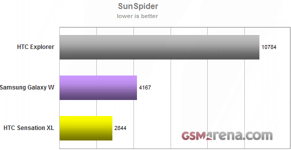
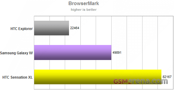
We also did a quick comparison with mid-range phones with faster chipsets. Keep in mind that the HTC Sensation XL and the Samsung Galaxy W have over twice the resolution to deal with. Still, the Explorer does pretty well, especially considering the problematic performance of the XL.
We also used those two for our browser tests. While those numbers don't usually mean much (whether a script runs in 10ms or 20ms, you probably can't tell the difference) but the slower processor on the Explorer puts it to a disadvantage: heavy JavaScript will tangibly slow down performance.
Reader comments
- sam
- 01 Jan 2016
- Xu4
Htc explorer when software upgrade this phone...
- sivajisandya
- 17 May 2014
- 7j{
Hi Iam using htc explorer in one year I don't understand I dont no how to use htc likes,htc hub, plz help me
- Anonymous
- 01 May 2014
- fJC
I m Qadir, I m using HTC Explorer last 1.5years. I m New in smart phone, I m quit satisfy my phone I like its resolution, but.when I received massage in Urdu or Arabic I couldn't not understand. I need upgrade htc model with extended Ram and Memo...
