HTC Legend review: A Hero becomes a Legend
A Hero becomes a Legend
HTC Sense reloaded
HTC Hero pioneered the Sense UI on to the Android handsets and won a huge fan base. HTC Tattoo was the next Sense-featuring device, but the UI just didn’t feel natural on the QVGA screen.
HTC Legend is the successor of the Hero slightly improving the CPU and RAM specs. It packs the latest Android v2.1 taking full advantage of its performance boost and full color capabilities. As result of that the pre-loaded Sense UI is even more pretty, fast and fluid. As we speak, the HTC Hero is about to get an update to ver. 2.1 too – it should be available in the beginning of April.
The main differences between this version of the Sense UI and the one back in the Hero are the new context icons, a few new wallpapers and the unified Widget section. Whether you are using the People, Mail, Music or Gallery Tabs, the scrollable icons at the bottom will please you with new color skins. We welcomed this change, since the old ones looked boring set on the otherwise graphically lively and colorful UI.
We should also acknowledge the role of the AMOLED display in making the new Sense UI look even more attractive compared to HTC Hero’s.
But let’s take a closer look for those who haven’t met the Sense UI yet.
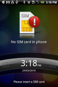
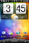
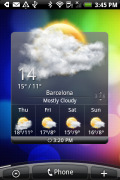
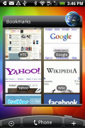
The lock screen • some of the homescreen sections
The arrow button at the bottom of the screen that used to pull the main menu up is now gone, replaced with three virtual keys and an arched scrollbar.
The left key launches the main menu. This time around you simply tap to get to it, you can't drag the menu out, though you can drag it back in.
The middle key is a shortcut to the Phone app and the right key brings up the "Add to Home" menu. And there's plenty to add to the homescreen but more on that later.
The scrollbar at the bottom is just an indication of which homescreen you’re on - it can't be used for actual scrolling. HTC have extended the homescreen to a total of seven desktops instead of the usual three (for Android) and six (for Hero). Even if it sounds too much, with all those widgets (which are quite useful too) it may not even be enough.
HTC Sense UI revolves around Scenes, which are essentially six custom homescreen setups (Work, Travel, Social, etc). Each scene changes the wallpaper and the widgets on the homescreen - for instance, the Work scene has a stocks widget, while the Social offers a Twitter widget.
You can't modify the scenes but if you rearrange the current homescreen you are prompted to save changes as a new scene.
The Clean slate scene in turn lets you start from scratch - it's just the default Android setup with a Clock and a few shortcuts underneath.
Switching between scenes takes a couple of seconds but sure allows wide customization - the business and personal modes that some competing phones offer seem quite limited compared to the HTC Scenes.
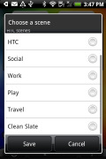
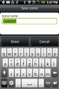
Predefined scenes • saving a new scene
Scenes are far from perfect though: the Travel scene has the HTC Footprints widget but nothing on GPS or maps. And as we already mentioned, you can’t edit the default scenes. Your only option is to save a new modified Travel scene under a different name along with the original. Yeah, it sucks, we know!
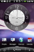
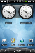
Social scene on the left and Travel scene on the right
Now back to the other stuff beyond the homescreen and the available Scenes. The changes brought by the Sense UI go deeper than just the homescreen.
For instance, the main menu has the typical icon grid layout, but you can switch it to a list similar to what you see in TouchFLO in HTC WinMo phones. With it, you can use an alphabet scroll, which makes locating apps faster.
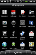
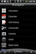
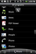
The grid layout • the list layout • alphabet scroll
The widget section has been revamped since the HTC Hero and now both types of widgets (HTC and Android) are placed in one page. There are so many of them that you may find the seven homescreens not enough.
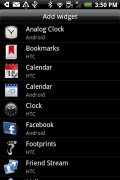
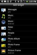

Plenty of HTC widgets • the Settings widgets are simple one-tap switches
When you select a widget you are prompted to choose between several versions - most widgets have at least two styles. The different versions typically offer at least two sizes of the widget, different look (There are twelve different clocks. That's right, twelve!).
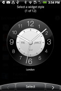
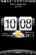
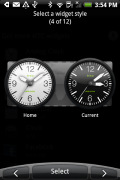
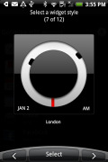
Some different styles of the Clock widget
And some widget styles even offer different functionality. Take the Twitter widget for instance - one version also shows updates for the people you follow, while the other version only lets you tweet from the homescreen. There's nothing stopping you from using both, of course.
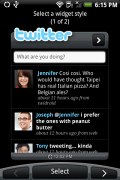
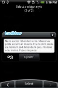
The two versions of the Twitter widget are functionally different
The HTC widgets offer a better level of interaction than the stock widgets - there's a Favorites widget that keeps a list of your favorite contacts you can scroll through, no need to get to the contacts list.
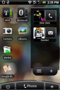
The People widget and Wi-Fi and Bluetooth setting widgets
The Photo album widget is a "stack" of photos that shows all the photos in some folder and you can flick them to view the next photo in line. This is quite fun but the experience is somewhat ruined by optimization - during the animation of the photo going up and the next one settling in, the widget uses low resolution previews of the photos and it takes a couple of seconds for the next image to load up in full quality. Higher-res photos suffer the most from this, of course.

Photo widget is smoothly animated, not smoothly drawn
The Messages and Mail widgets work much the same way, but instead of photos, you flick messages. And you don't get the pixilation issue.

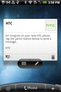
The Mail widget • Messages widget
Well, that’s about the part of the Sense UI that’s closes to the surface. There’s more to it but we’ll discuss those bits and pieces throughout the review.
The HTC Legend UI is generally fast and we must give credit for that to the faster CPU and the optimized software. This time around the UI performance is great - even with lots of files on the microSD card.
The only noticeable slowdown is with widgets that need internet connection to refresh content, but that’s completely normal.
Here is how the HTC Legend compares to its predecessor, the HTC Hero in terms of performance. We used the free Benhcmark and PiBenchmark apps from the Android Market for the test and the results are here for you to see.
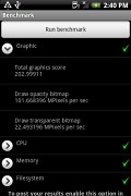
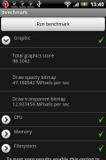
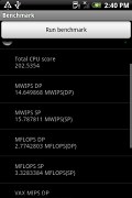
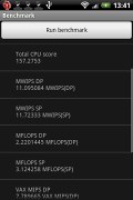
HTC Legend • HTC Hero • HTC Legend • HTC Hero
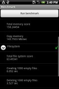
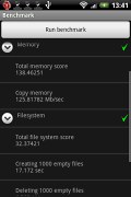
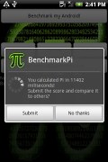
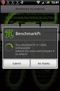
HTC Legend • HTC Hero • HTC Legend • HTC Hero
The new trackpad is powerful navigation tool, which we enjoyed playing with. Swiping, scrolling and precise selection of elements is easy, but sometimes you swipe your finger over it incidentally. That’s because the hardware keys are very close to the trackpad itself, so be careful there.
Despite the trackpad is good thing, we found ourselves barely using it. After all, the excellent screen does perfect job most of the time.
Two more things - most apps won't run without a microSD card inserted and screen vibration feedback works on the virtual QWERTY keyboard but not elsewhere throughout the homescreen.
And just wait to see what they've done with the phonebook.
Reader comments
- legend4eve
- 21 May 2020
- uZa
nothing compares to the legend. todays phones are all cheap plastic.
- Gorefest
- 10 Jan 2016
- m}3
HTC legend is a very likeable Phone the design is clever . The size of the Phone is great it's not too small and it's Great to handle the touchpad system Works well at finger and HTC legend Get's my points cause the whole Phone with all Butto...