HTC One S review: Onederful
Onederful
Latest Sense on latest Android
The HTC One S comes with Android 4.0.3 and Sense 4.0 - the newest software available from both Google and HTC. We've seen Android 4.0 Ice Cream Sandwich several times already, but not quite like this.
Here's a video demo with the highlights of the latest Sense:
HTC are famous for their deep customizations of the interface of the host OS and the latest version of Sense is no exception, though the Taiwanese have taken user feedback to heart and worked hard to provide a much more unobtrusive experience.
The brilliant lockscreen has been further improved, sealing its position as the most functional, most customizable lockscreen on a smartphone. By default, it has four shortcuts and a ring at the bottom. You drag the ring towards the center of the screen to unlock the phone.
Or, you can drag any of the shortcuts into the ring to unlock the phone and launch the corresponding app. You can assign any four apps to the lockscreen.


The new lockscreen is brilliant
But that's not the end of it - the HTC One S comes with eight different lockscreens preinstalled. You can access the others from the Personalize menu.
You get all the old ones - a photo album, Friend Stream, Weather, clock and stocks.
There are two new additions though and they're much more functional. The first is called Productivity and lists the latest missed calls, texts, emails and scheduled events.
The second one is People - you pick a group form your phonebook and a rectangular grid of their contact images will pop up on the lockscreen. Grab one of them and drop them on the ring to view their details. You can have more than one page of contacts too.


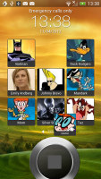
The two new preloaded lockscreens
If you're using the music player, the playback controls show up on the lockscreen (as usual), and you can drag that onto the ring to jump straight into the music player too.
Unfortunately, you can't download new lockscreens off the HTC Hub.
HTC have done a lot to streamline the lockscreen and the same goes for the homescreen. Gone is the scrolling indicator arc, gone is the three button dock that wasn't very useful.
You get an auto-hiding indicator of which screen you're on and a brand new dock with five shortcuts - the middle one is locked to the app drawer, while the other four can be customized as you please (you can even put a folder there, if four shortcuts isn't enough).
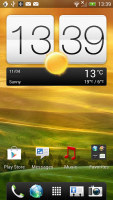
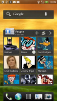

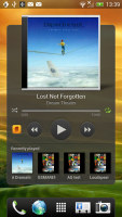
Some of the homescreen sections
Leap view is still here - tap the home key (while on the default homescreen) or do a pinch gesture to zoom out to display the thumbnails of all seven homescreen panes at once. Upon a press and hold you can drag to reposition the homescreen panes. A small "home" icon indicates the default homescreen.
You can have as many as seven homescreens - and with all the excellent preloaded widgets, you might want to keep all of them.
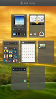
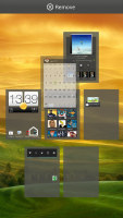
Leap View lets you quickly rearrange homescreen panes
One of the biggest complaints was that the Personalize button was just taking up space in the dock at the bottom of the screen. And it was - it has since been moved to the app drawer, but it still offers plenty of customization options.
The proprietary Scenes is one of them - essentially five custom homescreen setups (Work, Travel, Social, Play and default). Each scene changes the wallpaper and the set of widgets. For instance, the Work scene has a Stocks widget, while the Social offers a Twitter widget. Those can be customized, of course, and you can download new ones.
Switching between scenes takes a couple of seconds, but they're a handy feature if you use your One S as both work and personal phone.
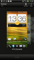
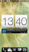
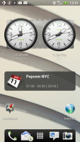
Preset scenes • The scenes in action
The HTC Sense has another customization option called Skins. Every skin changes the look and feel of most of the onscreen buttons, application screens, option menus, and other items. They also come with unique wallpaper each and use different colors for various UI elements.
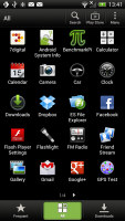
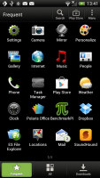
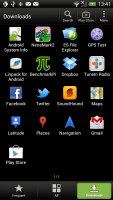
The main menu has the typical grid layout, which is composed of horizontal pages with shortcuts sorted alphabetically. You can set different sorting options - alphabetical, most recent or oldest - but you can't rearrange them manually. There are Search and Play Store shortcuts along with a menu for some options.
The main menu has a tabbed layout similar to different Sense elements (such as the phonebook). There are three tabs available at the bottom - All apps, Frequent and Downloads. You can rearrange them or remove Frequent and Downloads if you don't need them.
The Personalize app also has Sound customizations - you can pick a Sound set or individual ringtone, notification and alarm sounds.
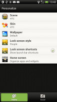

The Personalize menu does Sound too
Adding widgets to the homescreen is done in similar fashion to Honeycomb and is one of the less successful changes.
You press and hold on the homescreen and everything zooms out so that the homescreen panes are visible as thumbnails on the top row of the screen. You tap a homescreen to select it and then select a widget to add to it (or you can just drag the widget).
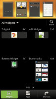
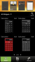
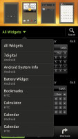
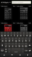
Adding a widget to the homescreen
There's a search option to speed things along or you can choose a widget from the dropdown menu and then select which size you like, but that still feels like an extra step.
The old setup of picking a widget and then picking the size (if any) seemed simpler.
Editing the homescreen is different from vanilla Android. You can tap and hold on a widget and you can drag across homescreen panes. While you're dragging a widget (or shortcut or whatever), two "buttons" appear at the top of the screen - Edit and Remove. You drop the widget on either button to perform the corresponding action.
Edit can be used to modify the settings of a widget - e.g. choose a different folder for the Photo Frame album or even choose a different version of the Clock widget. This saves you the trouble of first deleting a widget and then putting it on the screen again to choose a different version, setting and so on.
The second "button" is Remove, which deletes the widget as expected.
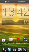
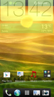

Dragging a widget gives you options
The notification area no longer has the list of recent apps - it's all available to notifications only. No more tabs and toggles either - you get a Settings shortcut here if you need to power something on or off. There's also a Clear button to dismiss all notification or you can swipe them off one by one.


The notification area has been significantly de-cluttered
HTC have remodeled the app switching interface - screenshots are displayed of the running apps, turned slightly to the side. They're ordered horizontally (instead of vertically as is the ICS standard) and you can swipe up to remove them. The not so-good news is that you can only see three of them at a time, even in landscape mode - a waste of screen estate.
You get the old task manager too. It's simple to use - each running app is listed with an indication of how much RAM it's using (no CPU usage reading though). You can terminate apps one by one and there's a Kill All button too.
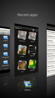
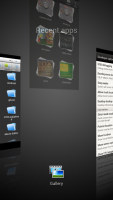
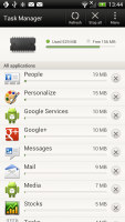
HTC's task switcher and task manager
Synthetic benchmarks
We were very curious about the performance of the new generation of Snapdragon chipsets. The main competitor right now seems to be the NVIDIA Tegra 3, which uses four CPU cores (with an older architecture) and NVIDIA's own GPU technology.
So, how do two Krait cores running at 1.5GHz compare to four Cortex-A9 cores at the same frequency? Both our CPU benchmarks say that the new design is faster overall, even at half the cores.
Oddly enough, single-threaded performance wasn't that different as Benchmark Pi shows, but Linpack tested in multi-threaded mode showed that two Krait cores leave the Tegra 3 quartet well in their rear-view mirror. As far as raw CPU performance goes, Snapdragon S4 is the king right now - don't fall for the "bigger is always better" trap and think four cores always beat two.
Benchmark Pi
Lower is better
-
HTC One S
306 -
HTC One X
338 -
Samsung Galaxy S II
452 -
Samsung Galaxy Nexus
408 -
HTC Sensation XE
536 -
Sony Xperia S
536 -
Samsung Galaxy Note 10.1
351
Linpack
Higher is better
-
HTC One S
210 -
HTC One X
126.1 -
Samsung Galaxy S II
77.6 -
Samsung Galaxy Nexus
77.1 -
HTC Sensation XE
50.4 -
Sony Xperia S
86.4 -
Samsung Galaxy Note 10.1
90
The 3D graphics department is handled by an Adreno 225 GPU and it showed enviable performance. On the qHD screen of the HTC One S, it hit just over 60fps. The NVIDIA GPU inside the One X did a little better than the Adreno - the 720p screen on the X has 1.5x the number of pixels as the qHD screen, so the Adreno 225 would probably hit around 40fps on that resolution, while the NVIDIA GPU does 47+fps.
NenaMark 2
Higher is better
-
HTC One S
60.5 -
HTC One X
47.5 -
Samsung Galaxy S II
51.6 -
Samsung Galaxy Nexus
24 -
HTC Sensation XE
23 -
Sony Xperia S
37.5 -
Samsung Galaxy Note 10.1
43.6
On SunSpider, the CPU-stressing JavaScript benchmark, the HTC One S posted a blazing fast result, beating all competitors. The HTML5 test, BrowserMark, however shows that HTC has some more work to do as the One S lost to an ICS-running Galaxy S II by about 10% (and the S II has a slower processor).
SunSpider
Lower is better
-
HTC One S
1708 -
HTC One X
1757 -
Samsung Galaxy S II
1849 -
Samsung Galaxy Nexus
1863 -
HTC Sensation XE
4404 -
Sony Xperia S
2587 -
Samsung Galaxy Note 10.1
1891 -
Apple iPhone 4S
2217
BrowserMark
Higher is better
-
HTC One S
98435 -
HTC One X
96803 -
Samsung Galaxy S II
111853 -
Samsung Galaxy Nexus
103591 -
HTC Sensation XE
72498 -
Sony Xperia S
74990 -
Samsung Galaxy Note 10.1
113256 -
Apple iPhone 4S
88725
All told, the HTC One S is the fastest phone on the market - there's no task in the mobile world it can't tackle. It will also throw a monkey wrench in the quad-core hype machine.
Reader comments
- Simon
- 08 Mar 2020
- 7AH
This was such an incredibly designed phone. I still feel like the One S and One X were the best-designed phones at their time ever. I don't wish we went back to the big bezels, but I do wish we got something as uniquely beautiful these days as well.
- AnonD-636492
- 22 Jan 2017
- 4A0
I enjoyed the feel of HTC sense running on HTC one S but HTC ended support updates very fast. The phone itself gets extremely hot easily and often lags and the screen quality could be a lot better
- AnonD-266796
- 24 May 2014
- i$M
Need are solution
