HTC One X+ review: The complete package
The complete package
Jelly Bean takes over, Sense gets a minor update
The HTC One X+, unlike any other HTC droid we've met before, runs on Android 4.1 Jelly Bean and features the updated version 4+ of the HTC Sense UI. Unfortunately, once you turn on the One X+ you'll have to dig deep to find the new Jelly Bean goodies. On the face of it, Project Butter's optimizations and Google Now are all that remind you what version of the OS you are currently running.
Since the UI is pretty much the same, everyone who has already used an ICS-powered HTC droid will feel right at home. Here's a demo video to get you started:
HTC is famous for its deep customizations to the interface of the host OS and the latest version of Sense is no exception. Despite Sense 4+ being almost the same as the 4.0 version, it runs a lot smoother because of Project Butter, due in large part to the consistent 60fps of all UI animations.
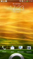
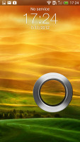
The lockscreen remains unchanged - by default, it has four shortcuts and a ring at the bottom, all of which are customizable. You drag the ring towards the center of the screen to unlock the phone, or to any of the shortcuts into the ring to unlock the phone and launch the corresponding app.
But that's not the end of it - the HTC One X+ comes with nine different lockscreens preinstalled. You can access the others from the Personalize menu - a photo album, Friend Stream, Weather, Clock, Stocks, Productivity, People, Music or just a plain wallpaper.
The Productivity lockscreen lists the latest missed calls, texts, emails and scheduled events. People lets you pick a group form your phonebook and a rectangular grid of their contact images will pop up on the lockscreen. Grab one of them and drop them on the ring to view their details. You can have more than one page of contacts too.
Music gives you a mini music player on the lockscreen.

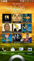
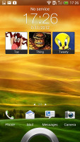
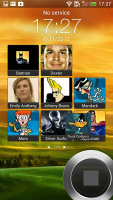
The two new preloaded lockscreens
The homescreen has an auto-hiding indicator of which screen you're on and a dock with five shortcuts - the middle one is locked to the app drawer, while the other four can be customized as you please (you can even put a folder there, if four shortcuts isn't enough).

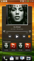
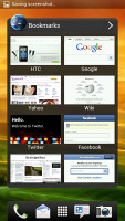
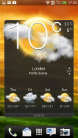
Some of the homescreen sections
Leap view is still here - tap the home key (while on the default homescreen) or do a pinch gesture to zoom out (with an awesome animation) to display the thumbnails of all seven homescreen panes at once. Upon a press and hold you can drag to reposition the homescreen panes. A small house icon indicates the default homescreen.
You can have as many as seven homescreens - and with the excellent set of preloaded widgets (and the huge variety available at the Play store), you might want to keep all of them. In case you don't - you can delete the unneeded ones right from the Leap view.
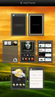
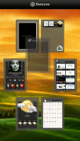
Leap View lets you quickly rearrange homescreen panes
The Personalize button is absent from the dock since Ice Cream Sandwich, but you can still find all of its functionality in the Settings or use the dedicated app within the app drawer.
The proprietary Scenes is an essential part of Personalize - essentially five custom homescreen setups (Work, Travel, Social, Play and default). Each scene changes the wallpaper and the set of widgets. For instance, the Work scene has a stock ticker, while the Social offers a Twitter widget. Those can be customized, of course, and you can download and assign new ones.
Switching between scenes takes a couple of seconds, but they're a handy feature if you use your One X+ as both work and personal phone.

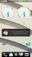
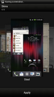
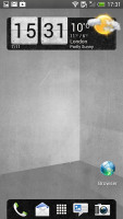
The scenes in action • The Skins in action
The HTC Sense has another customization option called Skins. Every skin changes the look and feel of most of the onscreen buttons, application screens, option menus, and other items. They also come with unique wallpaper each and use different colors for various UI elements.
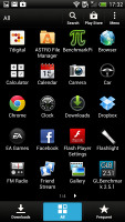
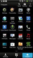
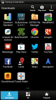
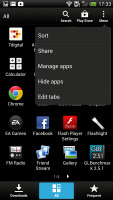
The main menu has the typical grid layout, which is composed of horizontal pages with shortcuts sorted alphabetically. You can set different sorting options - alphabetical, most recent or oldest - but you can't rearrange them manually. There are Search and Play Store shortcuts along with a menu for some options.
The main menu has a tabbed layout similar to different Sense elements (such as the phonebook). There are three tabs available at the bottom - All apps, Frequent and Downloads. You can rearrange them or remove Frequent and Downloads if you don't need them.
The Personalize app also has Sound customizations - you can pick a Sound set or individual ringtone, notification and alarm sounds.
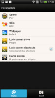
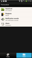
The Personalize menu does Sound too
Adding widgets to the homescreen is done in similar fashion to Honeycomb and is one of the less successful changes.
You press and hold on the homescreen and everything zooms out so that the homescreen panes are visible as thumbnails on the top row of the screen. You tap a homescreen to select it and then select a widget to add to it (or you can just drag the widget).
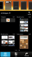
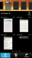
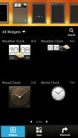

Adding a widget to the homescreen
There's a search option to speed things along or you can choose a widget from the dropdown menu and then select which size you like, but that still feels like an extra step-the old method of picking a widget and then picking the size (if any) seemed simpler.
Editing the homescreen is different from vanilla Android. You can tap and hold on a widget and you can drag across homescreen panes. While you're dragging a widget (or shortcut or whatever), two "buttons" appear at the top of the screen - Edit and Remove. You drop the widget on either button to perform the corresponding action.
Edit can be used to modify the settings of a widget - e.g. choose a different folder for the Photo Frame album or choose a different version of the Clock widget. This saves you the trouble of first deleting a widget and then putting it on the screen again to choose a different version, setting and so on.
The second "button" is Remove, which deletes the widget as expected.
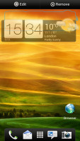


Dragging a widget gives you options
The notification area gives you a Settings shortcut here if you need to power something on or off. There's also a Clear button to dismiss all notification or you can swipe them off one by one.
There is just one toggle here which is new to the notification area - the Power Saver on/off switch. It does exactly what it's supposed to do - toggles the power saving mode or (if you tap on its name) takes you to the Power Saver options.
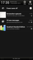
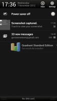
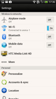
The notification area has been significantly de-cluttered • Settings
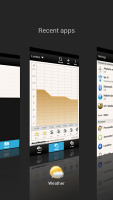
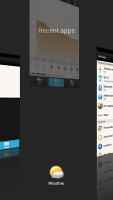
HTC have kept the cool app switching interface in the new Sense version - screenshots are displayed of the running apps, turned slightly to the side. They're ordered horizontally (instead of vertically as is the ICS standard) and you can swipe up to remove them. The not so-good news is that you can only see three of them at a time, even in landscape mode - a waste of screen estate. There's also no way to close all apps with one button.
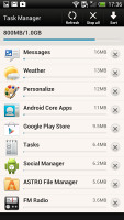
You get the old task manager too. It's simple to use - each running app is listed with an indication of how much RAM it's using (no CPU usage reading though). You can terminate apps one by one by and there's a Kill All button too.
Reader comments
- Djd
- 09 Dec 2013
- fuN
Ive been using my htc one x plus for over 6 mounth now after my galaxcy s2 broke......trust me or not it was the best decition ive made....this is one of the best phone....i even put my phone under the water tap to clean my screen at times and nathin...
- Karthik
- 30 Sep 2013
- vLy
I have been using HTC One X+ for few months now. Its amazing piece of engineering, sleek and beautiful. IPhone 5 is good looking than this, but considering the cost, this is more value for the bug. Specs are good. Couple of times, it became hot durin...
- Anonymous
- 23 Sep 2013
- Y6S
Thats right!!!
