HTC Titan II review: Wrath of the Titan
Wrath of the Titan
Windows Phone 7.5 Mango
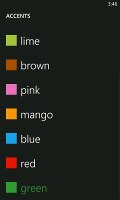
The HTC Titan II's user interface is the same as on any other Windows Phone. The only differentiating thing is the HTC trademark green color scheme.
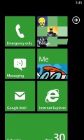
Windows Phone homescreen with the so-called Live Tiles is as clean and simple as usual. The tiles show information like the current date, calendar events, missed calls, unread emails and more, all without the need to open up any of the applications.
Pushing the unlock button reveals the lock screen, which displays the current time and date and shows calendar events, emails and missed calls. The background of the lock screen can be changed from either the settings menu or from the picture gallery.
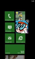
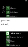
Swiping the lockscreen up unlocks the device and reveals the live-tile Metro user interface. It's a very fluid vertical grid of Live tiles that shows one or two tiles organized in bricked style. Each of these can be reorganized however you like and you pin almost any menu item as a tile.
The Live tiles, the basic building blocks of the Start screen of Windows Phone have been revamped. Now they are quicker and offer more info. For example, the Pictures tile shows an animated slideshow of your images. The Group tile (Groups is a new feature to boot) lists friend updates. The application list has grown a virtual Search button, which makes finding apps easier for those with many apps installed.
Here's a demo of the Titan II in action.
One of the main novelties brought by the latest WP build - 7.5 Mango - is multitasking. It still isn't true multitasking; things are being done the iOS way. Apps not in the foreground are suspended, but the OS has ways to take over and carry out the task for them.
This logic can be a bit too restrictive to some apps. Skype, for instance, still can't run in the background.
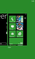
To switch between apps you press and hold the Back key (that's right, the Back key, not the Windows key). The app switcher itself looks similar to that of Symbian or WebOS: thumbnail snapshots of the apps, ordered chronologically left to right.
You can scroll the list horizontally to select an app and a tap will bring you back to exactly how you left it. Usually, the last 5-6 apps are here. You can't "kill" any of those apps; this is more of a history of the recently used apps.
Eventually, as you open more apps, the old ones start to drop out of the list. Once an app is gone, you have to launch it again the old fashioned way, which has the drawback of starting it over from the beginning. Finally, apps with active background tasks (e.g. streaming online radio) will keep on working.
Multitasking can be disabled from the settings to save battery. There you'll also find a list of all installed apps that support multitasking.
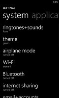
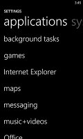
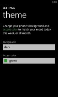
Opening the settings menu reveals two sets of options - system and applications. System covers all the settings you can think of like sounds, color theme, Wi-Fi, Bluetooth, Accounts, etc. The Applications settings enables you to configure individual settings for each app you have installed on the device - the People hub, Phone, Maps and more.
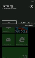
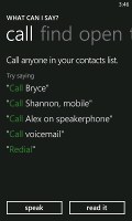
Windows Phone 7.5 can be controlled through voice only - you can dictate a text, have the phone read out the reply, you can initiate searches and so on. Other OSes are doing it too (*cough*Android*cough*) but voice commands are a big part of iOS (and a loudly touted one at that), so WP7.5 can brag about it too.
People Hub as a phonebook
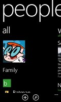
The People hub is present in the Phone app too. It takes the form of a contacts tab but only instead of contacts, you have people with profiles - a term taken right out of social networking.
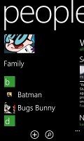
The first screen of the People hub shows you a list of all your contacts (phone contacts, social network friends, email pen friends - everything), with a search shortcut and an add contact button.
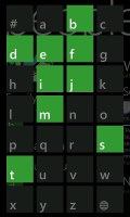
Contacts are ordered alphabetically, indexed with colored squares with a letter. You can tap any one of those letters boxes and the screen shows you the whole alphabet highlighting the letters actually in use. You can tap a letter to scroll to that part of the list.
Contacts can be sorted by either first name or last and they can be displayed as "First Last" or "Last, First" (the two settings are separate), you can also include or exclude Facebook friends, import only Facebook contacts that have a phone number and add several accounts to sync with.
Swiping to the side shows only new events from all contacts from social networks. Another swipe shows the recently called contacts. Instead of favorites, you can pin a contact to the homescreen.
Viewing a contact's profile shows the contact photo. Below that there are actions - "call mobile", "text mobile", "write on wall", "view website" and so on. Below each actions, in smaller type and grey or blue letters, are the target for the action (e.g. phone number, email, site URL) and where that info came from (Google, Facebook, etc.).
The soft keys let you pin a contact, link two (or more) contacts from the various services and edit. Swiping to the side brings out the "What's new" panel", which shows the latest updates and events just from that contact.
When editing a contact, you can add multiple phone numbers and email addresses of different types (home, work, etc), a custom ringtone, a note or a variety of different fields (like birthday, website, office location and so on).
The Me card is your own profile. From here you can post status updates, set chat status, check into locations (there's more location goodness coming on later). You can also change your profile picture (only for Facebook and Live though, not Twitter).
Another tab in the Me card lets you view notifications (e.g. Twitter mentions) and, finally, What's new lets you view your own status updates.
Reader comments
- TheStav
- 08 Jun 2012
- 2G2
My Titan 11 was delived a couple of days ago after a 2 month wait. Australia seems to be low on delivery list for some of the new tech even though in terms of smartphones we have the third highest uptake on a per capita basis. The Sams...
- AnonD-26870
- 02 May 2012
- 0C9
This isn't the only fail. HTC manages also to software-downgrade their phones hardware when they don't put enough storage capacity inside their phonhes. Titan I for example(same screen, no SD card ...) has some shameless video rec bitrate and huge co...
- AnonD-26314
- 01 May 2012
- mpp
Still using 800x480 on a 4.7 inch screen? They have failed before they started...
