HTC Touch2 review: Beyond the basics
Beyond the basics
Windows Mobile 6.5
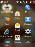
Pressing the Start button on the Touch2 opens something similar to the menus found in non-smartphones. In the new main menu you've got all the installed programs plus shortcuts to the settings menu.
And of course, as of Windows Mobile 6.5 the Main menu comes in a honeycomb pattern, which is supposed to make touch control even more comfortable.
The perfectly flat structure of the Main menu can surely get a bit clumsy in time due to the huge number of icons piling up, but still we'd prefer that over the confusing experience that so many Widows Mobile new adopters have had in the past.
Icons within the main menu are easy to rearrange: a press and hold is enough to move the frequently used icons to the top.
Without doubt, Windows Mobile 6.5 is the user-friendliest WinMo ever made. Unfortunately the improvements over its predecessor 6.1 aren't big enough to make it able to compete with the other contemporary platforms in terms of usability. Of course there is some touch optimization but the truth is a complete overhaul is needed rather than a facelift.
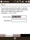
6.5 has brought little changes to the deeper levels of the WinMo interface
We recently published a dedicated article on the new Windows Mobile 6.5. Feel free to take a closer look and see how far WinMo has gone.
The contact manager is a winner
Contact management is usually considered one of the strongest points of Windows Mobile. You have an unlimited contact list, unlimited info fields for each contact and brilliant synchronization options.
Since the Diamond2, HTC have added a new interface which uses a small thumb icon for a person's picture, set against a gray background with nice font. You can pick a letter of the alphabet by using the letter column placed on the right.
Searching by gradual typing is also available.
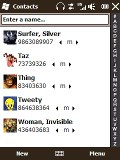

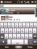
Phonebook with thumb scrolling • searching by typing or via the alphabetical list
The standard editing is OK, but unfortunately the advanced editing of a contact throws you back into the old WinMo depths. But hey, you still have a plethora of available info fields - and if by any rare chance those are not enough, you can always rename some of the existing ones and use them instead.
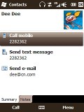
Viewing a contact is a whole new experience. HTC have done a great job again redesigning the whole interface into something quite stylish and visually attractive.
The contact's information is divided into groups - names, communication and information. There are four different icons at the bottom - the current info, all SMS with this contact, all emails and call history.
Good telephony, no perks
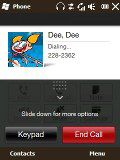
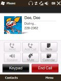
The Touch2 has no troubles during calls but skimps on some of the nice little perks that we liked in the Touch Diamond2 for example. The lack of an accelerometer leaves the Touch2 without turn-to-mute. Another omission is the active stylus. On the Diamond2 and the Touch Pro2, pulling the stylus out automatically launches the Notes application and even puts down the call details (the caller's name and the time of call) on the note for you.
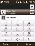
Smart dialing is enabled though, so you hardly ever need to go to the Contacts list in order to dial a number.
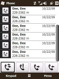
The Call log on Windows Mobile devices offers practically unlimited entries. HTC have pimped the look of the regular WinMo call log and have added thumb scrolling.
We also conducted our traditional speakerphone test and the Touch2 scored an Excellent mark, ranking pretty high on our list of tested devices. You can find more details about our test, as well as the results of all other tested handsets here.
| Speakerphone test | Voice, dB | Ringing | Overall score | |
| Apple iPhone 3G | 66.1 | 62.1 | 71.7 | |
| LG KC910 Renoir | 69.7 | 64.7 | 70.9 | Average |
| Samsung i900 Omnia | 70,2 | 64,8 | 75,2 | Good |
| HTC Touch Pro | 74,9 | 69,7 | 73,7 | Good |
| Sony Ericsson XPERIA X1 | 75.5 | 66.6 | 82.7 | Very Good |
| HTC Touch Diamond2 | 74.6 | 70.0 | 78.1 | Very Good |
| HTC Touch2 | 75.7 | 75.7 | 82.7 | Excellent |
Messaging: all the usual skill but no landscape QWERTY
The HTC Touch2 supports SMS, MMS and email. SMS and MMS share an inbox and a message editor and thanks to TouchFLO, you can enjoy thumb scrolling in the inboxes and in longer messages.
The Message tab offers a great interface for managing messages. With the nice interface and touch-optimization it's highly unlikely you will ever switch back to the standard Windows SMS inbox.
Threaded SMS is also available on the Touch2, just as it is across all Windows Mobile 6.1 and 6.5 devices.
The email inbox is also available as a homescreen tab with eye-catching finish. The email editor will hold no surprises for experienced WinMo users.
Setting up your email is easy as it is on most of the latest mid or high range phones. You type your email and password and all the other fiddly options are configured automatically.
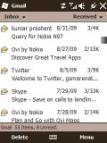
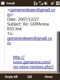
Browsing the email inbox • reading an email
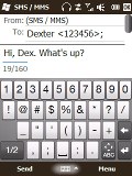
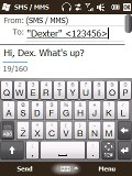
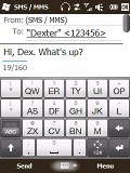
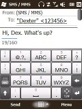
Perhaps now is a good time to mention input options on the Touch2. Since the device lacks any form of keypad you get a set of home-grown thumbable virtual keyboards. You can choose between a full QWERTY keyboard, a half QWERTY one, and an alphanumeric keypad displayed in portrait mode on the touchscreen.
Handwriting is not supported this time. But the bigger issue is all the keyboards - including the full QWERTY - are only available in portrait mode. That and the small Touch2 screen don't exactly suggest comfortable typing. Unless stylus is your game.
Reader comments
- Yorkish
- 02 Jan 2015
- fu}
i would like to change my htc 2 language to english.
- Akshay
- 07 Jun 2013
- YT8
How can i strat the wi-fi this phone.
- k22
- 09 Apr 2013
- PWD
I would like to switch 3G off on my HTC touch2 T3333, please help..
