HTC U12 life hands-on review
Design and hardware
As far as the overall footprint and shape go, the U12 Life isn't all that different from the U12+. After all, is based around an equally sized 6-inch display. One also complete with curved corners and no notch.
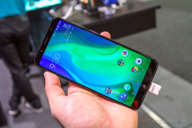
Since we are already on the subject of display, it is somewhat downgraded, compared to the U12+. Namely, due to its 1080 x 2160 pixel resolution. Still, it looks plenty sharp in person. HTC also didn't feel quite confident enough to call the particular panel a Super LCD6 unit (as per its traditional naming convention).
We can't really comment on its quality, for sure, until we get the U12 Life in for a full review, but the panel did look decently bright at the show floor in Berlin. Viewing angles were nice and wide and also didn't disappoint.
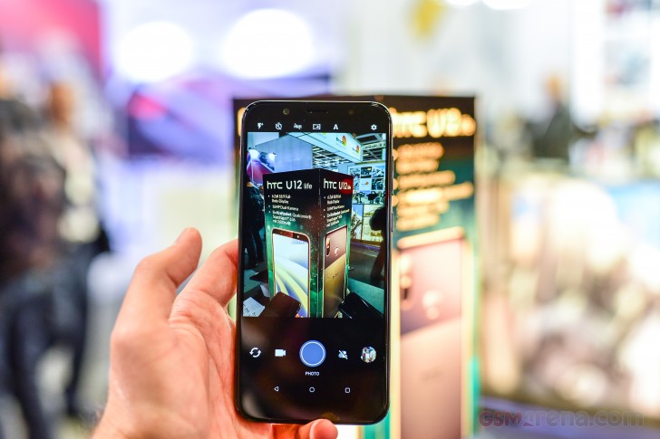
We would be lying if we said that the U12 Life is part of the trendy all-display crowd. It does have an extra-tall, 18:9 panel. But, beyond that, the top and bottom chins are fairly wide. The same is mostly true for the side bezels, on either side of the display.
We can't really complain too much about the look. What has us worried, though, is the suspicious absence of info regarding any protective finish on both the front and the back. The units we got to handle were already scratched and scuffed quite a bit.
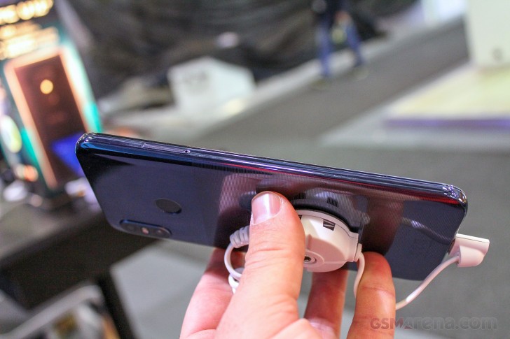
The frame of the U12 Life is pretty much subject to the same faith. HTC apparently decided to forgo the standard metal, sandwiched between glass approach and went for a plastic frame. It looks and feels sturdy enough, but doesn't really instill the same level of confidence as metal.
Plus, it definitely contributes towards the overall feeling of "lightness" of the U12 Life. For a phone, which measures 158.5 x 75.4 x 8.3 mm, 175 grams are really on the low end. Combined with the plastic feel of the finish, it's not really a great sensation. Dare we say, the U12 Life feels a bit too budget.
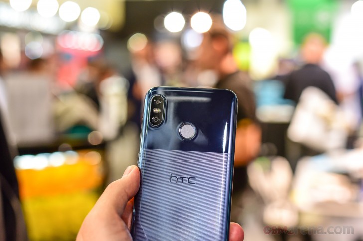
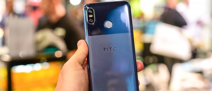
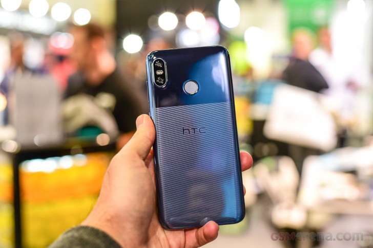
Looks, though, are a whole different story. We really have to commend HTC's design team on the exquisite work they have been doing on the back panels of recent models. Now, we can't say for sure if the U12 Life follows the same "Liquid Surface" design philosophy as the U12+, but it is just as visually stunning from the back side. Though, in a very different way.
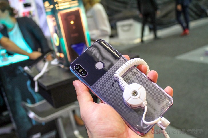
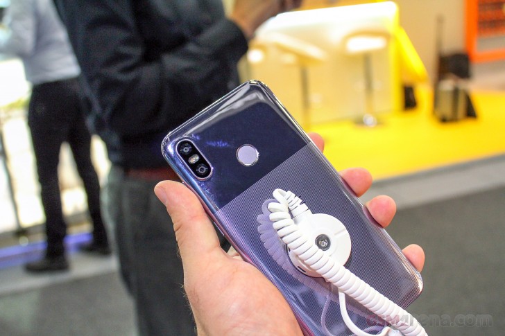
HTC really pulled off the two-tone look really well. Arguably better than Google. In case you were wondering, the pattern on the lower portion is not actually textured and the surface is smooth. Still, it looks really good in both Moonlight Blue and Twilight Purple color options.
It's just a real shame that HTC opted to make the panel out of "acrylic glass", which is a fancy way to say plastic. Hence, you might just need to cover that gorgeous back with a case to protect it.
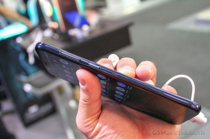
Touching briefly on the subject of controls and inputs - everything is pretty standard on the U12 Life. On the right - a volume rocker and power button. Both conveniently placed, comfortable, with the latter featuring a really nice textured finish. Just like the rest of the phone, these are still plastic, though.
On the left - a SIM tray, One of those hybrid affairs, which can either take a couple of nono-SIM cards or one of them can be swapped out for a microSD. On the top - a good old 3.5mm audio jack is checked and accounted for. On the bottom - a USB 2.0, Type-C port and a bottom-firing speaker.
One of two, in fact. We are happy to say that, in keeping with HTC tradition, the U12 Life has a stereo setup. It's hard to say just how it compares to the legendary BOOM speaker setup, while on the noisy show floor. So, we'll have to get back to you in the full review.
Unfortunately, we didn't get a chance to run benchmarks at the event. That's another thing left for the review. Still, you are all probably pretty familiar by now, as to what the Snapdragon 636 is capable of. Long story short - adequate, every-day performance. For a more detailed look, you can check out one of our recent Xiaomi reviews, like the Mi Max 3 or Redmi Note 5 Ai Dual Camera.
Reader comments
- ALFONSO
- 31 Dec 2019
- 7@h
what sense does it make a phone to challenge xiaomi .... lose at the start. you are a great home make top models and updates
- Anonymous
- 16 Apr 2019
- PEq
wonderful