Huawei Mate 30 Pro review
Design and 360-degree view
We're torn about which is the most striking design feature of the Mate 30 Pro - is it the display, or is it the camera assembly? Okay, let's start with the display.
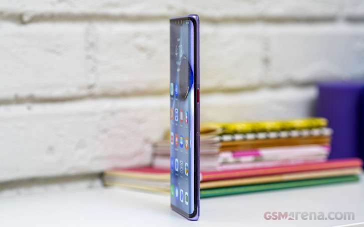
Only the second phone with a display with such extreme curves in recent years, the Mate 30 Pro was announced a mere 3 days after a similarly looking vivo NEX 3. Samsung's been toning down its side edge curvature in the latest generations of Galaxy flagships, after the proof-of-concept Note Edge got it all started, and it's up to the likes of vivo and Huawei to deliver such feats of modern phone design.
Huawei's Horizon display curves 88 degrees to the sides and if you look at the phone head on, you can't practically see any side bezels. You can see the edge portions of the display shift in color, obviously, and you need to decide where you stand on this trade-off - this one reviewer in particular is loving the Horizon display for the sheer coolness of it.
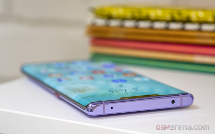
But when it comes to practicality, having the screen spill to the sides may not be a great idea. You see, it does come with certain implications. First up - fragility. Having virtually no frame on the sides means the phone is likely more prone to breaking - where you'd otherwise bump the stainless steel of the iPhone 11 Pro, on the Mate 30 Pro you'd be hitting the glass of the display. It is Gorilla Glass 6, which is fine and all, but to quote a famous YouTuber 'glass is glass, and glass breaks'.
Then there's the lack of physical controls. Short of a power button on the right, there's no other method of interacting with the phone other than touch. Huawei's come up with a double-tap on the side action which brings up a volume slider and that works alright once you learn the 'correct' tap. However, that means you have no mechanical way of launching the camera or activating the shutter release - forget about taking photos with gloves on (okay, nose taps still work, but that's not the most elegant solution, isn't it?).

Another consideration is misinterpreted palm input from touching the sides. Huawei says that the sides are treated as a separate area for the purposes of touch input and are turned off most of the time. While that may sound a little backward - why make a display this curved and then disable its sides? - we found palm rejection to pretty much work flawlessly, and we still like the look of the curved panel.
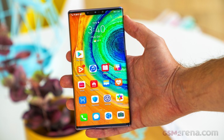
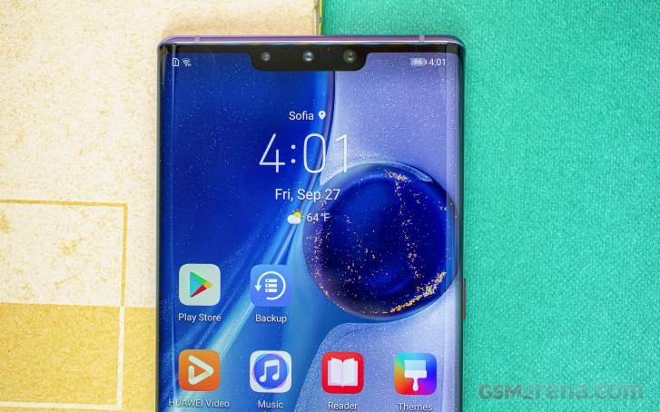
Unlike the bezel-less sides, there is some meat top and bottom, and up top, there's a notch too. It houses the selfie camera, the ToF duo, the proximity sensor, and the ambient light sensor - a lot of stuff. A notable absentee is an earpiece - the Mate 30 Pro vibrates its display to produce sound in voice calls, but there's no replacing a conventional driver for actual stereo output.
The Mate only has a single loudspeaker, ported on the bottom, which is where you'll find the USB-C port, the primary mic, and the card slot. Back to back, our unit would take two nano SIMs or a nano-SIM and a Nano Memory card - Huawei's proprietary memory standard, which no one asked for. Single SIM variants will obviously fit a nano-SIM and a Nano Memory card.
Meanwhile, on the top plate you'll be treated to a proper IR emitter - a round of applause to Huawei for still installing one on the Mate 30 Pro. Another mic is also in this vicinity.
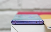
Single loudspeaker on the bottom • NM what? • IR blaster up top
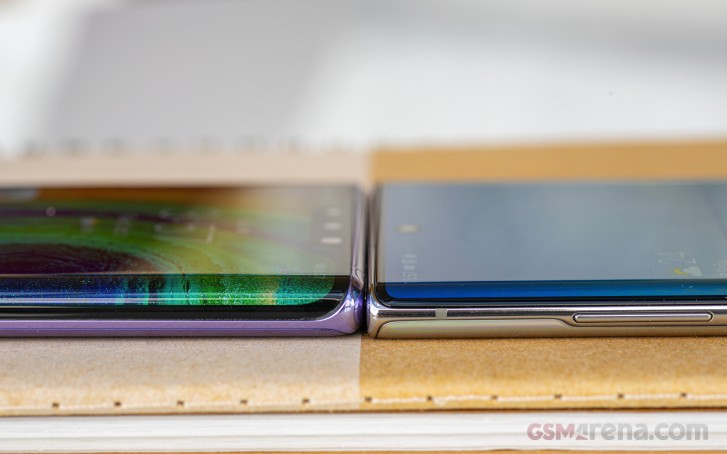
We mentioned above the lack of a frame on the sides, which is not exactly strictly true, per se. There is but a millimeter of shiny aluminum showing between the two pieces of glass, adding structure to looks. There's more of it on the top and bottom, where it's actually comparatively thick and almost confidence inspiring - as much as this is at all possible with all the glass around.


Thinnest of frames • Sole physical control • Aluminum top is plump
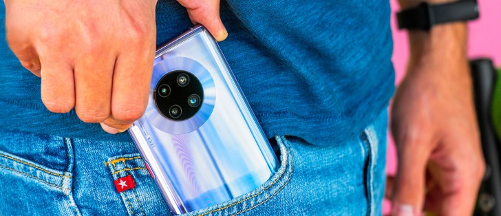
We finally made it to the back. A large black circle houses the Mate 30 Pro's three+one cameras - three regular image capture units and a ToF emitter-receiver pair. There's about a millimeter of a bump to make room for the quite big optics, but as it's centered on the back, it doesn't cause any wobbles.
Now, Huawei apparently thought that the camera cluster wasn't big enough, so they added an extra ring around it just as a design accent. Admittedly it makes for a unique look, but... let's just say it's not universally likable.
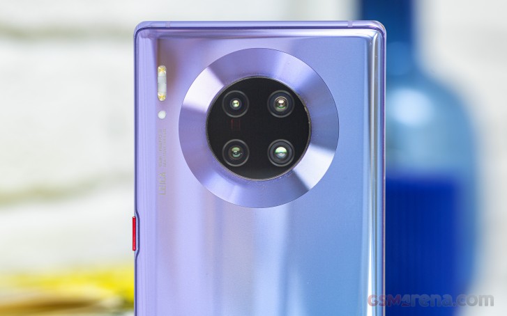
A dual-LED flash and a light temperature sensor didn't make it inside the camera circle and were placed in the top left corner. The mandatory Leica branding is also listing the focal length and aperture ranges - just like on a real camera's lens.
Our review unit is in the Space Silver color scheme - it's almost a mirror with a hint of a slight gradient in there somewhere. Other options include a classic Black, Emerald Green and Cosmic Purple.
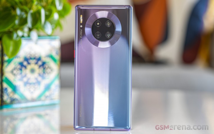
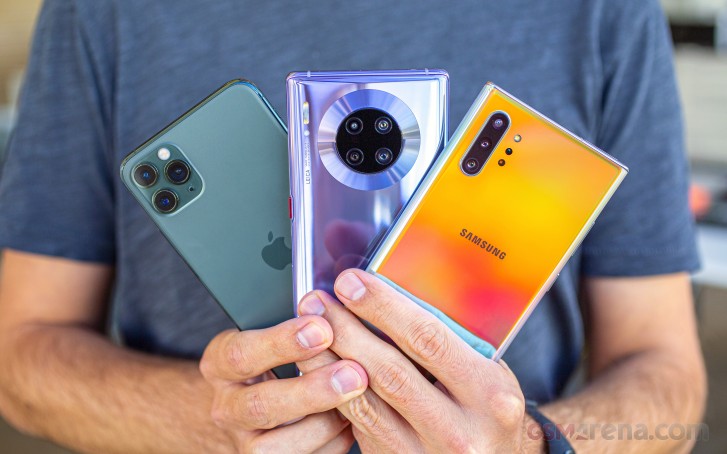
The Mate 30 Pro measures 158.1x73.1x8.8mm making it slightly more compact in footprint than a Galaxy Note10+ (some 4mm in both height and width) and as tall as and narrower than an iPhone 11 Pro Max.
It's thicker than either of those - the Note10+ is the slimmest at 7.9mm while the iPhone's waistline measures 8.1mm. The Mate 30 Pro is negligibly lighter than the Note10+ (196g vs. 198g) and considerably more so than the iPhone's 226g.
Reader comments
- Alan
- 26 May 2022
- HF2
Samsung 108mp in s20 ultra: :////
- Sam
- 24 Dec 2021
- f}f
Mate 30 pro or oneplus 7t pro mclaren ?
- Zedge13
- 09 Nov 2021
- nTt
Wtf...just watch youtube and you will be learning fast how to put gapps on huawei smartphone, great with no concerns!!!