Huawei Mate S review: Precision styled
Precision styled
Emotion UI v3.1
The Huawei Mate S boots the company's own EMUI. It's the latest EMUI 3.1, which is the first iteration to be based on Android Lollipop, instead of KitKat. It is also worth noting that we have seen Emotion UI 3.1 work on top of Android 5.0 in the past. This time around, however, it utilizes Android 5.1.1 and reaps all the benefits from Google's improvements. Still, from an interface and UX point of view, little has changed and Huawei users will feels right at home thanks to impressive level of continuity.
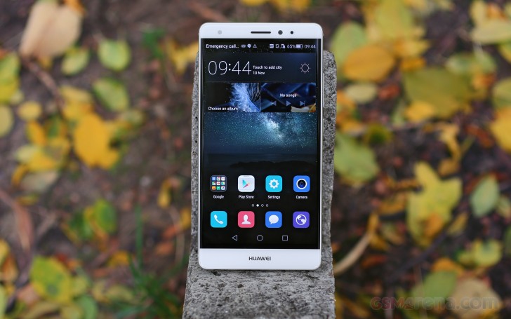
The EMUI 3.1 is based on Google's new platform and yet, it is the similarities with previous Emotion UI versions that seem to stick out, rather than the differences.
What Huawei has done, in a nutshell, is adopt Android Lollipop, without Google's new material design. The user interface has remained flat with almost no traces of Google's latest aesthetics. EMUI 3.1 remains true to its style and has preserved the user experience mostly intact.
Fans will also be happy to know that the OS is still packed full of various extras and additional functions, baked right in. Some of them we found to be quite useful.
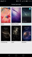
The default lockscreen features a nifty "sunshine" effect as you drag your finger across. Huawei's signature feature is the option for changing the lockscreen wallpaper automatically with beautiful images on various topics. You can also have widgets on the lockscreen, iOS-style shortcuts, and even dual clocks when roaming.
If you use the fingerprint reader for unlocking, then you can skip the lockscreen interface altogether.
In previous versions of the OS, these lockscreen graphics used to be referred to as Covers and have a pretty rich collection of customization options, including a dedicated download center, complete with channels, subscriptions and auto-updates. All that seems to be absent from the Android 5.1.1-based EMUI 3.1, or at least the Mate S, that is and it might be missed by fans.
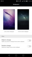
Still, some of the functionality remains and it is spread out between two interfaces. One is found within the settings menu, under Display options, where you can set the lockscreen and homescreen wallpapers separately. The rest of the tweaks are found in the extensive theming interface, but more on that later.
Swiping from the bottom of the lockscreen reveals a very iOS-like quick shortcut menu. It holds shortcuts to a recorder, calculator, flashlight and the camera.
Beyond the lockscreen we find a fairly standard Android homescreen with four customizable shortcuts, which are docked at the bottom and are visible on all homescreens.
There are nine homescreen panes at most - and at least a couple of them will be populated by the preinstalled apps.
As is customary for Chinese Android UIs, there is no app drawer like there would be on vanilla Android.
Anything you install pops up on the homescreen, just as it would on an iPhone or a Xiaomi. While this means that you don't have to bother creating shortcuts to your apps on the homescreens, it also means that you cannot effectively hide any of your installed apps either. You can, however, group them into folders.
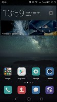
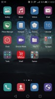
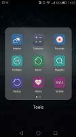
The homescreen keeps all your apps with only folders available for organization
A pinch on the homescreen triggers the familiar Overview mode to let you check out and organize the homescreen panes currently in use, remove or add panes as you please. Widgets are available too - it's mostly the stock Android ones, but Huawei has thrown in some of its own as well.
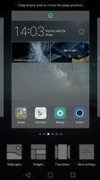


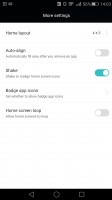
The overview mode • changing the layout grind and pane effects
Themes are available as well. A theme will change your homescreen wallpaper, lockscreen style, system and app icons, system font, system color and the sound profile. You can also adjust things like homescreen transition effects, and even change your wallpapers at random or specific time intervals.
The theming engine is so powerful that it can basically transform the UI and offer incredibly varied experiences. It even offers access to a vast online library of ready-made themes. Anything you download can also be customized further to your liking.
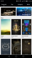
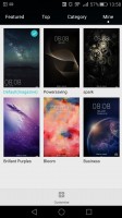
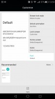
Powerful Theming engine with an online store
The notification area has two pages - one that hold all notifications sorted in a timeline, and another for all of your quick toggles. You can swap around the ones you want visible on the first three rows.
The shade has undergone some degree of modification in MIUI 3.1. It is now transparent and creates a blur effect underneath, quite reminiscent of iOS.
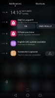
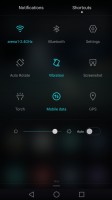
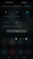
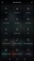
The notification area with toggles
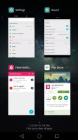
The Huawei Mate S features a task switcher that lets you swipe away unwanted apps. A swipe form the bottom of the screen clears everything and tells you how much memory you've freed up.
But the Mate S isn't just big on eye-candy. Huawei has invested quite a lot of effort in various usability and accessibility features and most things that are not customizable through theming can still be rearranged and moved around. The phone comes with features, such as customizable navigation bar, simple homescreen, Do not disturb mode, and even one-hand optimizations for system apps.
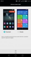
Simple homescreen with a Windows Phone style tiled interface
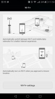
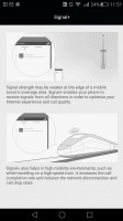
The Do Not Disturb mode is self-explanatory - you can schedule it when to turn on and off, and you can add a list of exceptions. And for the rest of the time, when you would like to ensure a clean and stable connection with the outside world, there is Link+. It has a smart WiFi and Mobile data switching component for stable internet, as well as a Signal+ mode for enhancing cellular connectivity when travelling on a fast moving vehicle such as a high-speed train.
Various display options are also accessible on a system-wide level. The UI can be tailored to your needs and the lockscreen can be as secure as you would like.
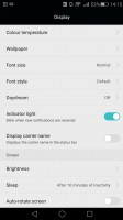
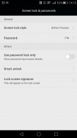
Display and lockscreen options
EMUI 3.1 offers granular control over app permissions and their access to various system functions, such as network data and notification areas.
The Mate S features a notification center, from which you can control which apps can send you the three types of available notifications - the shade notifications, the lockscreen notifications and the banner style notifications.
This level of control is also employed when it comes to the app access to network data. The user can control the rights of each application to access either WiFi or mobile data. This can save a lot of traffic and help you optimize your data plan and consumption in an easy and convenient way.
Huawei has given battery management an equally thorough treatment. EMUI has a dedicated interface for managing what it refers to as protected apps. The notion is that only applications that are deemed necessary by the user can be left to run in the background and consume battery and possibly network data, when the screen is off. Any app not on the list has no such privileges. This level of control is astounding and we really wish that other manufacturers would adopt similar mechanisms to give back users granular control of their hardware.
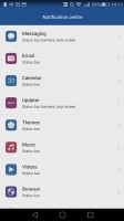
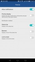
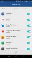
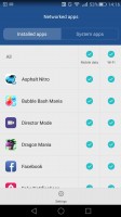
Extensive app permission management engine
The bottom navigation bar with the default Android controls is customizable - you can swap the task-switcher and back keys, or even add a shortcut for the notification area. You can hide the navigation bar and bring it back with an upwards swipe from the bottom. There is also a one-handed UI mode, for easier menu surfing on the go.
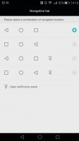

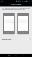
Navigation bar settings and single-handed mode
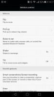
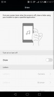
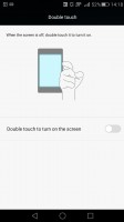
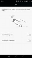
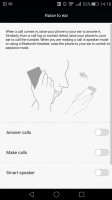
Motion control is also big on the Huawei Mate S. There are flip gestures, as well as picking up, tilting and even things like knuckle detection and drawing. All of those are extensively customizable to your liking as well.
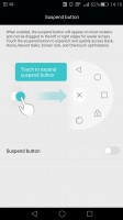
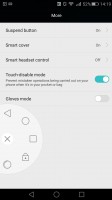
You can enable the so-called Suspend button - it's a virtual key you can move anywhere on the screen, allowing you to expand it to the primary Android keys - Back, Home, Task Switcher, Lock and Close all running apps. It will help you control your phone with just one hand.
And, if you fancy operating the Mate S entirely hands-free, Speech aware has you covered. The functionality resembles what we have seen on certain Nexus and Samsung Galaxy devices and boils down to the ability to trigger a voice command, even when the phone is locked and its screen is off.
Huawei does this by constantly listening for a "wakeup word", by default "okay emy". Once triggered, the phone wakes up and awaits further voice instructions, like placing a call. Speech awareness is also quite customizable. The wakeup phrase can be changed and you can also train the device to better recognize your voice.
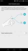
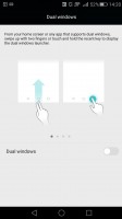
The list of accessibility features just goes on and on. Others that deserve mentioning include: glove mode, smart cover and smart headset control. The Mate S even has dual windows apps, just like Samsung's Galaxy Note series. It is a truly convenient way of getting more stuff done by having two active apps on screen simultaneously.
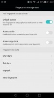
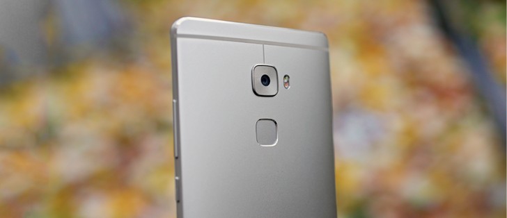
Finally, we should mention Huawei's excellent fingerprint technology implementation. It is superb on both hardware and software level. After quite a few one-on-one races with various handsets in the office, we can definitely say that the Mate S currently has one of the fastest, if not the very best sensors to date.
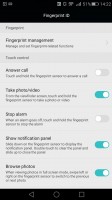
It works like a charm and managing prints is also a breeze. There is a maximum of 5 distinct ones you can have at any time, but that should be more than enough and the security feature can also be used for locking apps or multimedia content. And just when you thought there wasn't anything else you could possible want from a fingerprint sensor, it turns out there is, as Huawei's new added touchpad functionality gives it yet another interesting twist.
We admit, it is more of a gimmick, but scrolling through photos or pulling down the notification shade was surprisingly easy to get used to after a few days with the Mate S, so Huawei might be on to something.
Reader comments
- Waqar Masood
- 01 Dec 2020
- 6Ph
Huawei''s old models were bringing beauty.
- J.P
- 02 Apr 2017
- 0wa
hello every body, i need your support, i bought a Hawaii mate S 5 months ago, and until 2 weeks ago everything is going in a good way, suddenly the battery life is 50 % less then before and i have to charge my phone twice per day, and previously ...
- Sam
- 25 Nov 2015
- HsE
Every latest device of Huawei looks extremely gorgeous (P8, mateS) but onsceen bezels makes it look a lot cheaper . 1-2 mm of hardware bezel won't harm the beauty but 3-4 mm of onscreen bezel makes it worse . I don't understand are Huawei deaign engi...


