iPhone 6 Plus vs. Galaxy Note 4: The Big Bang
The Big Bang
User interface
iOS and Android used to be very different beasts but over the years they have borrowed from each other and from other OSes so much that they function in more or less the same way. Of course, iOS is purely an Apple creation, while the OS that runs on the Galaxy Note 4 is heavily influenced by Samsung but primarily developed by Google.
In the state we're testing it, the Galaxy Note 4 is running Android 4.4.4 KitKat with the latest TouchWiz on top, but in a few months there will be a major switch to 5.0 Lollipop and a new TouchWiz. The iPhone 6 Plus launched with iOS 8 and you can already download v8.1. This is the advantage of Apple developing software for Apple devices - updates are lightning quick.
The two devices start in pretty much the same place - a lockscreen with time and date, plus a camera shortcut. The latest iOS puts notifications on the lockscreens, Android 5.0 Lollipop does too, but this is still KitKat.
Simple unlock methods can be used but what both companies will have you use is the fingerprint reader. It's a fairly secure way to lock your device, that's actually quicker than the various PIN and pattern locks.
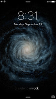
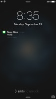
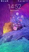
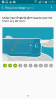
Fingerprint-protected lockscreens • Apple puts notifications on the lockscreen
Apple's implementation is a bit better, it just requires you to put your finger on the Home key, while with the Galaxy Note 4 you have to swipe it. Getting the swipe angle right can be difficult at first, considering you're holding a large phablet and aiming for its bottom (your thumb bends at an awkward angle).
Samsung does offer a cool extra feature here called Private mode. It hides a folder where you can stash sensitive files, the folder can only be accessed with your fingerprint.
The two platforms differ in where the widgets go - Android puts them on the homescreen, while iOS stuffs them in the notification area. Apple added landscape support on the iPhone 6 Plus, while the Galaxy Note 4 keeps its homescreen portrait-only.
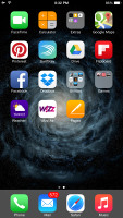
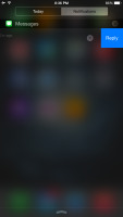
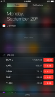
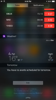
Apple keeps app shortcuts and widgets separate
Samsung has enriched the homescreen with a Flipboard-powered My Magazine screen where you get both news and social networking updates. You can turn it off if you don't like it.
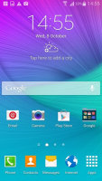
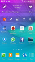


Samsung enhanced the lockscreen with My Magazine
Samsung's notification area may not have widgets, but it's still pretty busy. There's a scrollable row of quick toggles (which can be rearranged), followed by a brightness slider (which can be hidden), two buttons and only then the actual notifications. A quick toggle view is also available either via a tap of a button or a two-finger swipe.
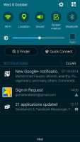
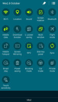
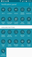
The busy TouchWiz notification area
Apple has placed its quick toggles in a different shade, one which is pulled from the bottom. The so-called Control Center has four shortcuts too, but it's not customizable like on TouchWiz. Starting with iOS 8 third party apps appear on the Share with and Open with lists.
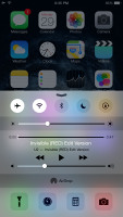
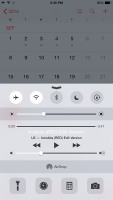
The Control Center holds the toggles and other controls on iOS, not the notification area
One cool thing that Apple did for notifications is that they appear on the top row of the screen and you can tap them for a short interaction. The currently active app stays in place so you get back to it with no overhead, which really improves multitasking.
Reader comments
- selim
- 25 Jun 2022
- 6p}
I phone 13pro
- Marvel
- 13 Feb 2022
- XBA
Samsung galaxy note s4 is more better than iphone 6s plus
- Shayman
- 11 Sep 2020
- Nue
You're are not alone. Typing this on a note 4. Changed the battery for the second time last week. Not my primary device though. Use sparingly these days