Jolla preview: First look
First look
User interface provided by Sailfish
Jolla wanted to turn some heads with a their new Sailfish OS, preserving much of the MeeGo flow to keep purists happy, while adding enough new elements to ensure it has a future when pitted against the likes of the Android, iOS, and Windows Phone in today's smartphone world.
As with any new OS, there's a fair amount of kinks that need to be ironed out, and Sailfish is not without its share of bugs. The most recent 1.0.1.12 version (at the time of this writing) squashed a huge amount of them and added a fair share of features, but it still carries the beta tag and we're sure Jolla will continue pumping out updates regularly.
Here's a quick video showing off the user interface in action:
Unlocking the phone with the dedicated power/lock button reveals the Sailfish lockscreen that displays the time, as well as any number of icons which indicate sound profiles, battery status, alarms, missed notifications, WiFi signal strength, and many more.
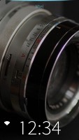
The Sailfish lockscreen is decidedly minimalistic
One of the first things you'll notice on the Jolla is that it features no capacitive or on-screen navigation/contextual buttons like on Android, WP and iOS. Instead it relies almost entirely on gestures to navigate through the interface. Closing an app, for example, is done with a downward swipe from the top of the screen.
An important distinction to remember in Saiflish is between a pull (a drag and hold on the screen) and a swipe (a drag and release).
Navigating from the lockscreen is generally vertical - a short pull down will reveal the date and "Pulley menu" containing various shortcuts, while the same pull up will show the battery level and network status.
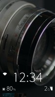
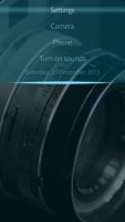
A short pull up reveals status info • A contextual menu is accessed with a downward pull
Swiping up will bring you to Sailfish's one and only homescreen. Initially it will be populated only by a row of shortcuts at the bottom, but as you open and minimize apps, it will get tiled with dynamic thumbnailed "Covers." To minimize an open app into a cover at any time, simply swipe from the left or right edge of the screen inwards.

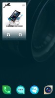
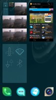
Minimizing apps will move them to the homescreen as Covers
Covers act not only as shortcuts to and from open apps, but also update dynamically based on their content. For instance, the Dialer cover will show you recent calls, while the Store cover will show you app download/update progress. You can have up to four large or nine smaller covers at once.
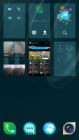
You can have four large or nine small Covers at once
Closing any number of Covers can be done by a press-and-hold on any of them and hitting the 'X' icon that appears. You can close all running programs by pulling down from the center of the screen and selecting 'Close all'.
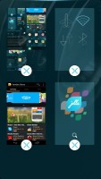
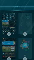
Closing your open Covers is easy
Furthermore, you can tell apps what to do via their Covers without actually having to open them. Certain Covers will have small icons underneath that indicate actions that can be performed by swiping a Cover left or right. These are called active shortcuts.
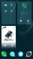
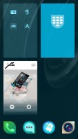
Swiping the dialer cover left will trigger the keypad "active shortcut"
Another swipe up from the homescreen will bring you to the app Launcher. The Launcher is where all of your apps are located, and can take up more than one vertically-scrollable screen depending on the number of apps you have.
The top row of apps will also show up on your homescreen, and you can drag new shortcuts here for quick access (it's locked at 4 and there's no folder support).
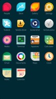
Swiping down from the homescreen reveals the app menu
If you're on the lockscreen, homescreen, or app menu you can quickly lock the device by swiping down from the top edge of the display.
The Events page can be accessed from at any time by swiping up from the bottom edge of the screen. This will show you missed calls and texts, as well as all sorts of social networking and update notifications. Rather un-intuitively, the Events page is not closed by reversing the opening upward swipe with a downward one.

The Events page is where all your notifications can be found
Certain apps and interfaces contain contextual menus (called Pulley menus in Sailfish), which are accessed with a downward pull from the center of the screen (not the top). To determine whether an app has a Pulley menu, simply look for an illuminated row along the top edge. We saw an example of this in the lockscreen above, where a pull down from the center reveals several shortcuts and a sound toggle.
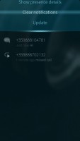
Some apps have a Pulley menu accessed by pulling down from the center
Actual performance does take some getting used to, partly because of the early (and consequently buggy) OS build, but also as a result of the gesture-centric interface. You have to be careful where you originate your gestures from, as starting from outside the display will oftentimes result in a much different action than intended. Also, the difference between pulls and swipes add another level of complexity that you'll have to be mindful of.
We don't say that it's a poor experience - overall it's quite interesting and nice, but some aspects of Sailfish OS are certainly less intuitive than others. With practice, some optimizations based on user input, and animation/sensitivity fixes of the UI elements, Sailfish has some real potential.
Reader comments
- jolla user
- 17 Jul 2016
- pW}
Have been using Jolla since day 1, and despite claims that Pokemon Go should work on it with some workarounds, I struggle and can not get it to work. I've long time praised my jolla for its security (no datamining by android, no ads, it just works). ...
- N9 user
- 30 Jan 2015
- 3qF
you dont count N9, a? and still you would like to own one you know it, so cut the crap.
- m
- 24 Nov 2014
- KIX
Time to update the review I guess.