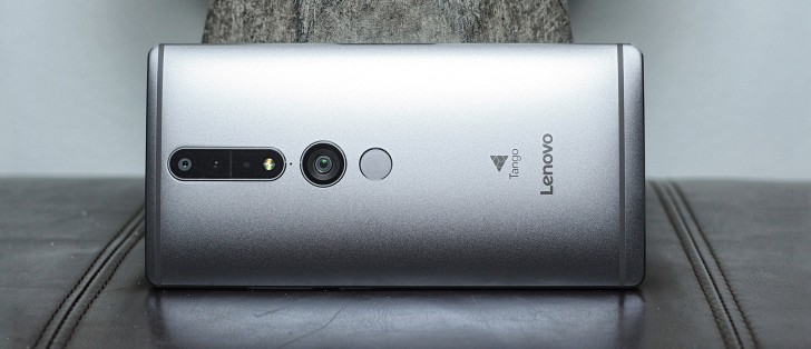
Lenovo Phab2 Pro review: Tango One
Tango One
Barebones UI
The Phab2 Pro's UI is nothing particularly fancy. It's not near-stock Android, nor is it a heavily skinned remake of the OS. Lenovo doesn't have a specific name for this UI, and the best we could say about it is that it does its job without fanfare. The only thing keeping the UI from looking stock Marshmallow is the notification shade and Quick Toggles.
In case you are wondering, this widget seen on the screenshots is there by default and tapping on it takes you to the pre-installed Accuweather app.
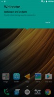
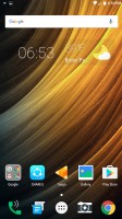
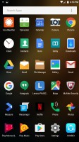
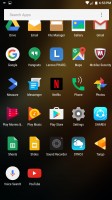
Homescreen: Welcome • Homepage • App drawer
With that said, the visuals of the notification shade, in particular, reminds us of Sony's Xperia UI a little bit. The stock launcher is bare-bones and there is no theming option. There is a notification that reads "Device is HD capable" that is permanently in the notification shade. We did not know what this was until we realized it meant the handset was connected to an HD Voice-capable carrier.
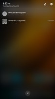
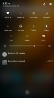
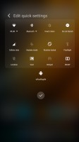
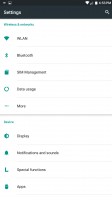
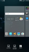
Notification shade • Quick toggles • editing toggles • Settings app • Homescreen settings


Choosing a wallpaper • Choosing a live wallpaper
One thing we don't like is the way notifications are displayed in the lockscreen. There is no preview of the message, and when you do expand the notification, its preview is simply gray text on whatever your wallpaper is. That'll mean if you like to read your notifications on the lockscreen, you'll need to use a wallpaper that contrasts well with black text. Usually, a lockscreen is supposed to show the text on an opaque background so that your wallpaper doesn't affect its legibility.
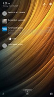
Lockscreen's notification preview is gray text
Even though the Phab2 Pro is, in fact, a 6.4 inch giant phone, there are absolutely no UI implementations to take advantage of the large display. There is no multi-window, nor is there an option that shifts the screen's contents to one side so that you can reach it more easily with one hand.
At least Google's keyboard (the default one on this phone) has the ability to switch to a one-handed mode. We're not sure about the one-handed UI, but Nougat (should it arrive to this device) should at least fix the lack of multi-window/split screen.
Tap and hold the comma button next to the space bar to access the one-handed keyboard.
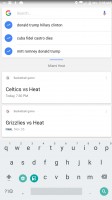
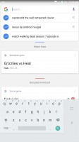
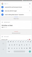
Google Keyboard entering one-handed mode • Left mode • Right mode
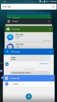
That brings us to the task switcher. It's AOSP-style with the stacked cards and there's a 'Clear-all' button at the bottom to regain all your precious RAM. And at the top there's a Google Search bar, accessible from any screen with a single tap of the multi-task / app switcher key.
The UI feels like it was taken off a shelf and doesn't take advantage of either the large screen, or Tango, even. Everything that takes advantage of the Tango camera setup are third-party apps, with the sole exception of the Lenovo AR camera, which is embedded in the camera app. The actual "Tango" app is a manager and finder of third party apps for Tango. More on Tango later.
Reader comments
- Anonymous
- 08 Aug 2017
- dWg
Right now tango is just a gimmick.
- Anonymous
- 26 Jan 2017
- 7jV
Two SIM and sd card one time used possible s
- Anonymous
- 26 Jan 2017
- 7jV
How many internal memory
