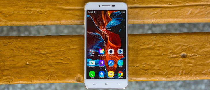
Lenovo Vibe K5 Plus review: Positive vibes
Positive vibes
User interface
The Lenovo Vibe K5 Plus runs on a heavily customized Android 5.1. Lenovo calls it Vibe OS, but unlike other manufacturers who make it a point to advertise their skins, Lenovo is more restrained about it. The interface is thoroughly reworked and Material design is only visible here and there. The company also rocks back and forth between user interface designs, and the Vibe K5 Plus resembles the K3 Note a lot more than it does the Vibe K4 Plus.
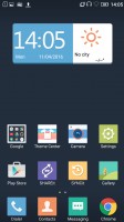
The lockscreen is a rather standard affair. The default layout consists of a clock widget with a date, followed by a list of notifications. You also get shortcuts for quick access to the dialer and camera.

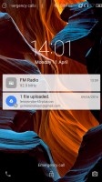
Default lockscreen
In typical fashion for a droid coming out of China, there's no app drawer - all your apps reside on the homescreens. New ones can be added with ease, existing ones can be rearranged and any homescreen tab can be set as default home. Screen transition effects can be selected, and you can choose whether to be able to cycle back to the first one after reaching the end or not.
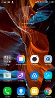

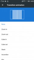
Homescreens
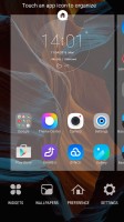
There's a wide selection of themes available too, complete with icon packs, and these can change the vibe of the Vibe K5 Plus completely. Some of them look better than others with non-system icons - the more customized the theme, the more out of place Google Chrome looks, for example.
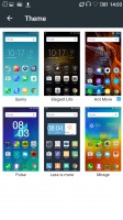
Themes
The capacitive keys below the display are Recent tasks/Home/Back, left to right. The recent tasks one doubles as a context menu button and that's a bit odd in truly Material design apps, which have the three-dot menu in the top right Making things even less intuitive, the context menu and the three-dot menu often contain different options.
Thanks to the ambiguous nature of the left capacitive key, getting to the recent tasks requires a long press, instead of a tap. Naturally, that adds an extra bit of waiting to an action you'd be doing constantly. There's a "Clear all" button, in the diagonally opposite top right corner, so you'd be stretching your thumbs a bit.
Additionally, there's a task manager that gives you more detailed information on what resources each app is using.
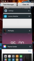
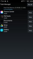
Recent apps • Task manager
The notification shade works in two stages. Pull down once with one finger, and you get notifications only, pull down a second time and you get the entire list of quick toggles, with notifications squished below. There's no priority row of toggles that gets opened on the first pull, it's none or all.
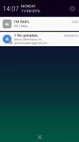
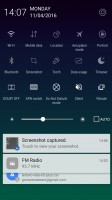
Notification area
Reader comments
- Anonymous
- 01 Oct 2019
- L5f
The worst phone ever. The quality built isnt represent a big brand like Lenovo. The display starts to fail at three month from new. Today i have a walkie talkie, because the display responds like a glass from the windows. Warranty dont exists. Very d...
- Asif
- 20 Sep 2019
- KIm
Betray time very lo
- Anonymous
- 16 Jul 2018
- U{R
This phone is very very bad battery is very very bad