Lenovo Vibe Shot review: Shoot to thrill
Shoot to thrill
Unboxing the Lenovo Vibe Shot
The Vibe Shot comes in a compact, well-designed box. The attractive package doesn't offer all that much - a small 1.5A charger, a flat microUSB cable and a card tray ejector tool. There are no headphones here, though. The retail package might be different in other regional versions. We suspect we're reviewing a grey import brought in directly from China.
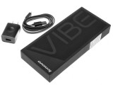
The Lenovo Vibe Shot retail box looks as stylish as the phone it holds
Lenovo Vibe Shot 360° spin
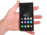
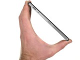
The Lenovo Vibe Shot measures 142 x 70 x 7.3 mm, not the most compact 5" phone around. The black glass bezel around the screen isn't very thin to begin with, but the metal frame protrudes further than that. The space above and below the screen is not minimal either, at least below the screen there are capacitive touch buttons to make it a functional space.
Hardware
When you first meet the Lenovo Vibe Shot you'll hear about two things - the design and the camera. In fact, the camera is the most attractive design element on the Shot. The metal frame and glass sandwich have become wildly popular in Android-land even though it's old news for iPhones.
The metal frame doesn't reach all the way to the front, meaning the glass frame protrudes from it and forms a second ledge. This makes it easier to hold the phone (since your thumb rests on the metal frame), but the two sharp edges may not be the most pleasant.
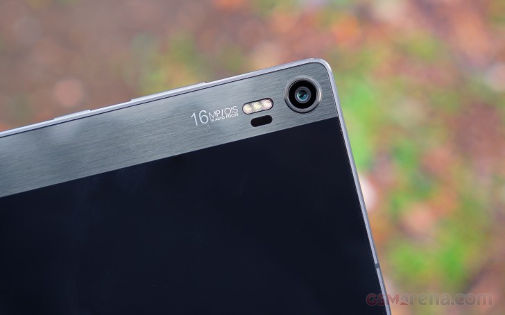
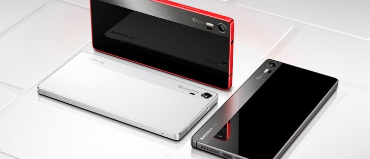
The front and back are panels of Gorilla Glass 3, all black. A brushed metal strip on the back decorates the camera and adds the characteristic digicam look at the rear.
The strip, though, is behind the back glass panel so the back feels smooth throughout. The camera (essentially flush with the back), plus the triple-flash and laser autofocus light add more to the attractiveness of its looks.
From the back the Vibe Shot looks like a point & shoot camera
The front is much cleaner, only the capacitive keys below the screen break up the sleek black look. The bezels around the screen are anything but thin, the Vibe Shot is one of the bigger 5" phones. The default black theme and the great black levels of the screen work so well together that at first glance, you might be misled to believe you are looking at an AMOLED display.
Anyway, above the screen is the 8MP/1080p selfie camera and the earpiece.
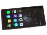
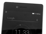
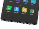
A brilliant display on the front • 8MP camera above • Capacitive buttons below
The front and back are all-white on the Pearl White version of the phone and black on the Graphite Grey and Carmine Red. The latter color option has the metal strip around the edge in bold red color.
The Vibe Shot right side is where all the hardware buttons are - starting with the volume rocker, going down to the power button, then the Auto/Pro camera toggle and finally the two-stage shutter key.
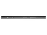
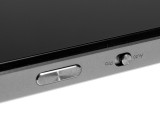
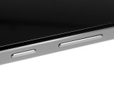
The right side: more buttons than usual • Camera shutter key and mode toggle • Power and volume buttons
The left side houses the two card trays - the top one holds two microSIM cards, the bottom one is for a microSD card. That's good news in the wake of hybrid slots that give you an "either-or" choice between dual-SIM and expanded storage.
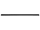
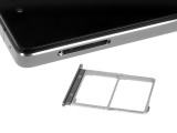
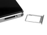
The left side: two card slots • Dual microSIM tray • microSD card tray
The bottom houses an old-school microUSB 2.0 port (the Lenovo-backed ZUK Z1 had USB Type-C, but not the Vibe Shot), two grills (only one of which covers a speaker) and even a lanyard eyelet (a rare sight).
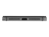
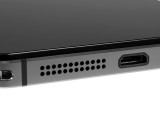
The bottom • vanilla micro USB 2.0 and a single speaker
The top is the plainest, holding only the 3.5mm audio jack and the secondary microphone.
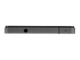
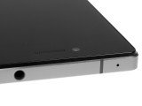
The top side • 3.5mm audio jack and secondary mic
The Lenovo Vibe Shot has one of the most memorable designs we've seen in a while, even if it goes for the common metal frame, glass sandwich formula. We wish it was more compact, but it looks - and feels - great in the hand.
Reader comments
- e
- 27 Sep 2019
- QJA
how to fix “Unfortunately the Process.com.android.phone Has Stopped”? need hep. tnxe
- AnonD-749750
- 05 Apr 2018
- thw
This camera phone have a star trails mode it is true can capture star trails?
