Samsung Galaxy S4 vs. LG G2: Neighbor squabble
Neighbor squabble
Software comparison
Both phones run Android 4.2.2 Jelly Bean, so they're slightly behind AOSP. Not that 4.3 brought a lot of must-have features and both Samsung and LG are working on 4.3 updates.
Each phone carries the most loaded version of its parent company's custom interface. We've seen them both plenty of times but since the flagships have new, exclusive features, it's worth to review them one more time before we go on.
Both the LG G2 and the Samsung Galaxy S4 have custom lockscreens, but they maintain that cool widget functionality that was introduced by Android 4.2 and add a few touches of their own. Both offer shortcuts on the lockscreen, but the ones on the Galaxy S4 are off by default as the custom widget on the right homescreen pane holds a grid of shortcuts. The LG G2 has the shortcuts and keeps the right pane as a camera shortcut as per stock Android specifications. You can tweak the galaxy S4 lockscreen to be the same effect.
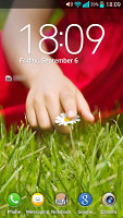
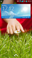
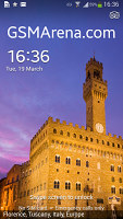
LG G2 lockscreen • Galaxy S4 lockscreen
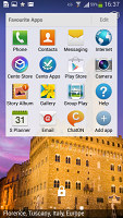
Then we come to the homescreen - there's very little difference here, both allow you to add and remove homescreen panes and rearrange them via an overview mode. There are shortcuts in a dock at the bottom of the screen and so on. One thing the Galaxy S4 does that we like is that when adding a widget, it will show you the silhouettes of all panes and the widgets on them so you can quickly spot where free room for the new widget is available.
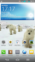
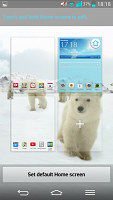
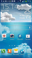
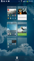
Homescreens on the LG G2 • and Samsung Galaxy S4
The notification areas are pretty similar too. A top row of quick toggles that can be hidden and rearranged, then a slider for the screen brightness and then the notifications themselves.
The LG notification area is busier - it adds a volume slider under the brightness slider (neither can be hidden) and if you enable QSlide (we'll get to it in a minute) you lose another row for the mini app shortcuts. If you also enable the Quick Remote (IR remote controls in the notification area) you get literally no space for notifications, not a good thing on a large 5.2" screen.
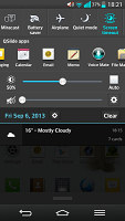

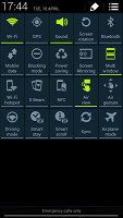
Similar notification areas • all toggles for the Galaxy S4 viewed at once
Samsung lets you hide the brightness slider, to reclaim lost space. Also, if you drag out the notification area with two fingers or tap the button in the upper right corner you can see all toggles at once (similar to stock Android).
In the display section we mentioned that the LG G2 has on-screen buttons and that their advantage is that you can customize them. The three standard keys are Back, Home and Menu and you can add to them the QuickMemo button or the Open notification area button. You can also pick between several arrangements, but unfortunately there's no App switcher button available.
The QuickMemo button is also available by tapping and dragging the Home button, it's next to the Google Now button, so we really think App switcher was more deserving of a place among the on-screen buttons than the QuickMemo button.
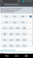
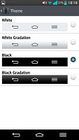
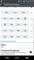
Configuring LG G2's on-screen buttons
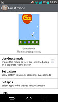
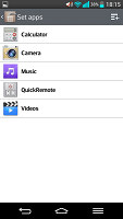
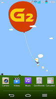
The LG G2 has Guest Mode - it basically lets you select a pattern that unlocks the phone and puts it in Guest Mode, where only a selection of apps or content is available. This will make you more at ease when you give your phone to someone else.
Let's talk multitasking, after all big screens and powerful chipsets were born for it. The LG G2 has two modes of multitasking - QSlide 2.0 and Slide Aside. QSlide 2.0 is a selection of floating mini apps that can be moved around, resized and made transparent. You can have up to 2 QSlide apps at any one time.
There are a couple of disadvantages with this - we couldn't find any QSlide compatible apps in the Play Store and you cannot interact with transparent apps. If make the texting app transparent to chat while watching the video, you'll discover you can no longer type in it, even though you can still see the text fine.
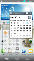
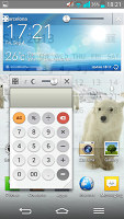
QSlide apps float freely above the rest of the UI
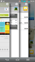
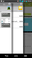
Then there's Slide Aside - using three fingers, you can swipe up to three apps off the screen and then bring them back out in order using another three finger swipe. It's very similar to how Chrome handles tabs, but since you need three fingers it's strictly a two-hand gesture. It's a nice way to navigate between a handful of apps but we find ourselves using the phone with one hand more often than two, so Slide Aside won't see much use, if you ask us.
Samsung's solution is called Multi-window. Instead of taking up space in the notification area, it lives in a separate panel on the left or right (you can hide and show the arrow that opens the panel by long pressing Back). Instead of floating, overlapping windows, Multi-window splits the screen in two and each app gets one half. It doesn't have to be half though, you can easily adjust the screen ration of the two apps however you like. There are buttons to close one of the apps, to maximize one app (both are practically the same) and to swap their places.
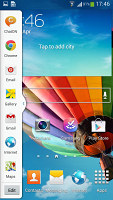

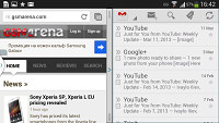
Multi-window splits the screen into two
The upside of this is that each app gets its own space rather than have some of its controls by the other app. Also, there are already a few apps that support Mulit-window available in the Play Store.
In Note 3 Samsung has also made it possible two instances of one and the same app to run simultaneously (e.g. you can keep tap on two different web pages for instance or have two simultaneous chats with two different people) and we expect the Galaxy S4 to get it too with the Android 4.3 update.
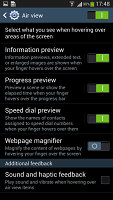
Samsung kicked off a competition of having the most advanced gestures and it's in the lead. We already mentioned Air View - hover your finger above the screen and you get preview of what's in a folder, what song comes next and so on.
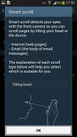
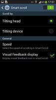
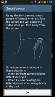
Smart Screen is a suit of features, which includes Stay (screen is kept on as long as the front-facing camera can see your face), Rotation (the proper rotation is selected using the camera, not accelerometer, for when you're lying on your side), Pause (pause video if you look away from the screen) and Scroll (scroll by tilting your head).
Then there are the Air Gestures - you can wave your hand in front of the phone to scroll web pages, move between emails and songs and answer an incoming call. You can also place a call by lifting the Galaxy S4 up to your ear while viewing a contact in the phonebook or reading an SMS from them. Also, if you have missed notifications and don't see the LED light, Smart Alert will vibrate the phone when you pick it up.
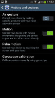
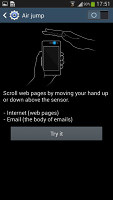
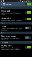
Air Gestures and Motion gestures
LG's answer includes Smart Screen (the analog of Smart Stay) and Smart Video (basically, Smart Pause). There's also an option to fade out a ringtone when you pick up the phone and answer the call when you put the LG G2 up to your ear.
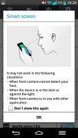
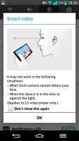
LG G2's Smart Screen and Smart Video
Section winner: Samsung Galaxy S4
It's was a close call, but better multitasking, notification area management and more Smart this-or-that functions give the Samsung Galaxy S4 an edge over the LG G2.
We do like the Guest Mode on the G2 (that's usually reserved for Android tablets) and Slide Aside seems like a curious feature, but these are not enough to come on top of Samsung's proprietary feaures.
Reader comments
- richard
- 08 Jul 2018
- fu%
LG 2 z much better than S4
- Feride LG G3
- 02 May 2016
- SHp
LG G2 is much better than S4.cpu processor and camera rock on g2. S4 is not so good. LG is much bettet brand than Samsung.
- Anonymous
- 14 Mar 2015
- 7Xg
I do not owe S4 so I'll just comment on G2. Phone is nice. Speed and battery the best. Accessories like headset and charger still in good condition unlike some that won't last a few months. However,after 1 yr and 3 mos,my phone starts to flicker. I h...
