MWC 2017: LG G6 hands-on
LG at MWC 2017
Software
Now that we have a display that's outside the norm, what do we do with it? Well, you see, 18:9 can be reduced nicely to 2:1, and that's obviously two 1:1 squares next to each other.
 It's all about the squares
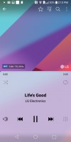
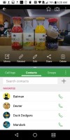
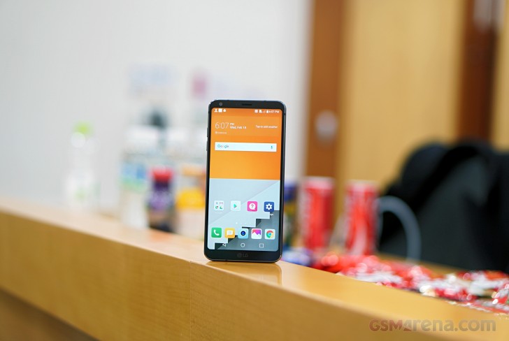
LG has played with the squares wherever it can and it makes for a coherent overall user interface, which the company calls Full-screen UX. Basically, in most of the native apps you get a 50/50 split with the information logically divided between the two parts.
For example, the music app displays the album art in the top half, while controls are grouped in the lower section in immediate reach. In between the two squares, the progress bar is both accessible and unobtrusive.
Similarly, an incoming call places the contact's photo and details in the top card, and the buttons for answering or rejecting the call are in the bottom one.
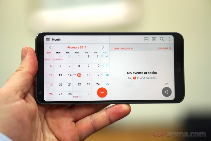 Month view on the left, events on the right (or lack of events, but still)
Other apps don't get to benefit from the double-square action, but the tall display is tall regardless. For example, in messaging apps you can see more of the conversation on one screen (so less scrolling), and it's even more appreciated with the keyboard pulled out.
The G6 comes with Nougat out of the box, which shouldn't be a surprise given that the V20 was the first phone to launch on Android 7.0 and it was some months ago.
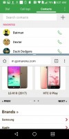
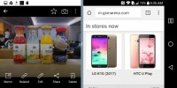
Nougat brings its own goodies, but one particular feature is made even better on the 2:1 screen, and you've probably guessed it - it's multi-window. With the taller screen the two apps now have more room to breathe, and it's a boon for productivity.
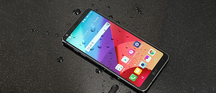
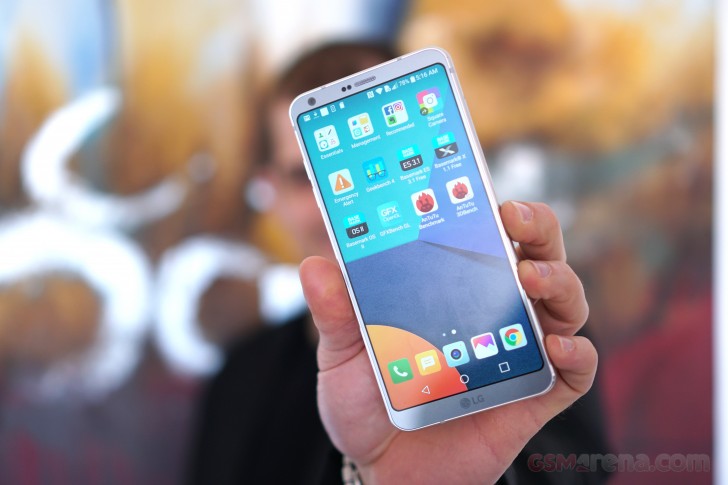
So, the display is rounded to make it more durable, right, but LG has taken that physical property and transferred it into software. Icons have had their corners filed away to resemble the display corners, only with a smaller radius.
Meanwhile, the icons for third-party apps, which aren't rectangular, are placed on a background with the same shape as the rest of the icons, so each app has the same 'weight'. Compare that to the G5, where YouTube or Hangouts, for instance, looked really tiny next to the stock apps.
One potential issue that may arise from using a display with an aspect ratio other than the prevalent 16:9 is how apps will scale interface elements and content for the G6's 18:9 aspect. LG says that the aim is to display content in its native ratio by default - so 16:9 videos, for example, will be pillarboxed (black bars on the left and right).
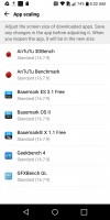
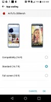
16:9 compatibility mode can be set on a per-app basis
As for apps, the default view provides a 16.7:9 area for the app, reserving the bottom 1.3:9 strip for the navigation buttons. For those apps that can't handle it, a compatibility mode will allow for a 16:9 app area on top, with the remaining 2:9 taken up by the navigation area.
Benchmarks
The LG G6 is powered by the Snapdragon 821, which is still the reigning high-end chip from Qualcomm, though that's going to change in the coming months with the release of the S835 on the Galaxy S8. The S821 is the SoC that's inside Google's Pixel and the OnePlus 3T, plus a few upmarket Xiaomis, and that's not counting the numerous devices running on the slightly less powerful, but otherwise mostly identical S820.
The scores we got out of the G6 are in tune with what we've seen before from the S821, with a few minor variations here and there. We were curius to see how the extra pixels affect the graphics performance (onscreen tests are rendered at 2,672x1,440px instead of 2,560x1,440) but the difference is practically negligible.
Of course, all these numbers should be viewed under the premise that they have been obtained on a device running non-final firmware. Last-minute tweaks may introduce changes, though the ballpark shouldn't change.
GeekBench 4 (multi-core)
Higher is better
-
Huawei Mate 9 Pro
5845 -
Galaxy S7 edge (E8890, Nougat)
5645 -
OnePlus 3T
4364 -
Xiaomi Mi Note 2
4278 -
LG G6
4209 -
Google Pixel XL
4152 -
Lenovo Moto Z Droid
4130 -
Samsung Galaxy S7 edge (S820)
4128 -
Sony Xperia XZ
3868 -
LG V20
3824 -
HTC 10
3621
GeekBench 4 (single-core)
Higher is better
-
Huawei Mate 9 Pro
1939 -
Galaxy S7 edge (E8890, Nougat)
1911 -
OnePlus 3T
1890 -
Xiaomi Mi Note 2
1824 -
LG G6
1733 -
HTC 10
1708 -
Samsung Galaxy S7 edge (S820)
1696 -
Lenovo Moto Z Droid
1694 -
Sony Xperia XZ
1578 -
LG V20
1576 -
Google Pixel XL
1507
AnTuTu 6
Higher is better
-
OnePlus 3T
165097 -
HTC 10
154031 -
Lenovo Moto Z Droid
151619 -
LG G6
143639 -
LG V20
141945 -
Google Pixel XL
141186 -
Xiaomi Mi Note 2
140324 -
LG G5
134541 -
Samsung Galaxy S7 edge (S820)
132849 -
Galaxy S7 edge (E8890, Nougat)
129629 -
Huawei Mate 9 Pro
128719 -
Sony Xperia XZ
124266
Basemark X
Higher is better
-
OnePlus 3T
36958 -
Xiaomi Mi Note 2
36506 -
Lenovo Moto Z Droid
36322 -
Galaxy S7 edge (E8890, Nougat)
32609 -
Samsung Galaxy S7 edge (S820)
32160 -
Google Pixel XL
30861 -
LG G6
30507 -
Sony Xperia XZ
29548 -
LG G5
29456 -
LG V20
29385 -
HTC 10
28882 -
Huawei Mate 9 Pro
27600
Reader comments
- Awab
- 15 Jul 2020
- uWG
I bought LG g6 phone 28 june and i am using it since there is no issue thankgod i am in nought i. Am having good battery timing now i want to go to pie bcz i wanna see whats interesting in pie version any of u which are using pie give me some suggest...
- Anonymous
- 09 Aug 2019
- IbF
On the G6 the power button is on the back same Button as the fingerprint reader jerk off
- Anonymous
- 31 Jan 2018
- kui
Good question.
