LG G Pad 7.0 review: Back at it
Back at it
Minimalist Optimus UI
The LG G Tab 7.0 is running Android 4.4.2 KitKat with the latest Optimus UI, which we saw premiere on the LG G3. Optimus UI is now more mature and has gone the flat, minimalist way with simpler, colorful round icons. The core way of navigating the UI is now much closer to stock Android and we like it the better for it.
Here's a quick look at how Optimus UI performs and looks on the G Tab 7.0.
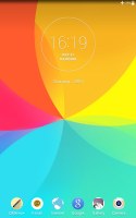
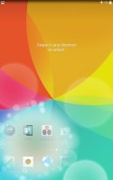
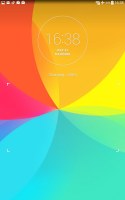
The lockscreen looks similar to what we've come to expect from LG and its peers. There's a clock widget on the top along with six app shortcuts on the bottom.
You have the ability to add widgets by swiping to the right, and you can also double tap to wake the device at any time. LG gives you a choice of four unlocking effects.
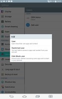
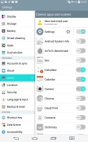
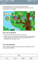
Since this is an Android tablet you have the option to add other users to it. There three users you can add - a regular user with full rights, a restricted user for which you can select what types of apps and functions are accessible and Kids Mode user - designed to give your children access to the tablet without allowing them to pay for services and apps and mess with the system settings.
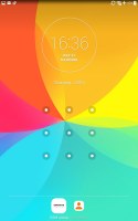
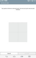
You can enable more secure locks, including pattern, pin, password, or LG's own Knock Code that uses a series of taps to wake the device and unlock the screen.
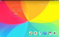
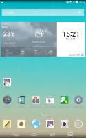
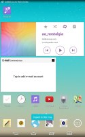
Past the lockscreen, you're greeted by the familiar Android homescreen. As on most droids, you can have multiple homescreens populated by a wide selection of apps shortcuts and widgets, and even folders.
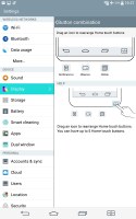
The navigation buttons are on-screen which ensures better response time and less chance of mechanical wear but also means you're effectively giving up part of your screen estate. The background behind the buttons is transparent and they obediently move out the way when you're watching a video or image so it's not that bad. Plus, the LG G Pad 7.0 lets you customize either white or black color schemes, and even add quick shortcuts for Dual window, QSlide and QMemo+, and even the notification bar.
LG's Smart Bulletin at-a-glance service isn't preinstalled on the LG G Pad 7.0 so the leftmost homescreen is just a regular homescreen pane.
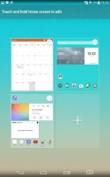
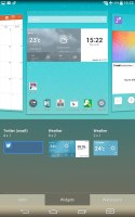
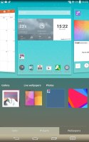
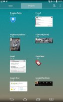
A pinch zoom on any homescreen lets you see them all at a glance, where you can also remove any or set default. To populate any of them, simply hold a finger on to a blank area, and drag an app or widget from the resulting screen.
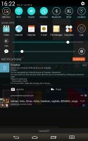
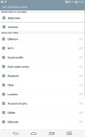
The notification area is business as usual - a swipe down from the top bar displays a scrollable row of quick toggles, some sliders, and any notifications you may have. You can expand/collapse notifications with a two finger swipe, and dismiss them by swiping left or right.
The toggles have been redesigned to fit LG's new flatter look with rounded icons with cyan accents on a black canvas. It still looks overpopulated with sliders and QSlide shortcuts, and toggles taking up around 70% of the notification area and leaving only the remaining area for the actual notifications.
Holding down on a toggle in the upper row will take you to the relevant option in the settings, where you can also edit which toggles and sliders are shown.
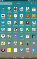
The app drawer also looks and acts the same. Aside from the usual alphabetical and chronological sorting of apps you can also rearrange the grid any way you see fit. Apps can be uninstalled directly in the app drawer, which is great for getting rid of bloatware (LG usually throws in a lot).
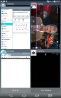
Getting to the recently-opened apps is done with the dedicated on-screen button. The interface shows a list of thumbnails for each app. You can swipe them away one by one, or use the close all option. There's also a shortcut to the special Dual window feature.
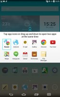
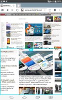
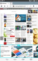
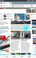
Dual Window really shines on the bigger display of the LG G Pad 7.0. It allows two different apps to run simultaneously but unlike Samsung's Multi window, it doesn't allow the same instance of one app twice. There are only two apps allowed on the screen - some Samsung tablets allow up to four.
The LG G Pad 7.0 remembers recent selections for quicker access, and lets you split the screen anywhere you want rather than the middle, top 3rd, or bottom 3rd.
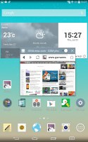
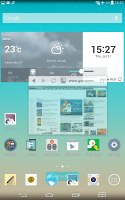
Besides Dual window, many apps have the ability to run in small resizable floating windows which LG has dubbed QSlide. QSlide applications can either be accessed from the notification area, or from within supported apps themselves by clicking the special shortcut icon.
Optimus UI is very useful and now offers a cleaner look. But it is still very complicated for the first-time adopter of Android, or even first-time LG users for that matter. The app drawer is filled with apps and settings, the homescreen is customizable in so many different ways - adding widgets from the app drawer or from the homescreen.
But once you get to know your way around Optimus UI it will empower you to get what you want from Android. Despite having only 1 GB of RAM and the Snapdragon 400 and not 600 or 800, the LG G Pad 7.0 navigates fluidly and there are almost no hiccups or unwanted stops to speak of.
Reader comments
- Anonymous
- 07 Jan 2017
- Nug
how do i use this pad it has no sim and how do i used it at home i dont have wi fi net work
- big joe
- 07 Jan 2017
- Nug
the pad it has no sim and how do i use it to connect when you at homeSearch
- Ajayi
- 04 Nov 2016
- Nue
Android version 4.4.2,Soft ware version V41010d. The network is blocked(Now used in Nigeria)
