LG GD900 Crystal review: Crystal clear
Crystal clear
S-Class goes on the glass
The S-Class UI has already taken a prominent place among full touch phone interfaces. LG seem to have struck gold with it and the new fancy 3D UI will thrive across touchscreen feature phones and Windows Mobile handsets alike.
The S-Class builds heavily upon previous UI solutions in the LG range and thus still feels familiar enough even with the number of innovations introduced.
The capacitive touchscreen is quite responsive and haptic feedback has always been on the LG feature list. Hardware graphic acceleration is essential: everything from homescreen to dropdown menus roll, sweep in, unfold and rotate extra smoothly. The LG Arena gave us a good glimpse of all that, the Viewty Smart continued the trend, here we are with the Crystal and waiting to see the upgraded S-Class in the still unannounced BL40 Chocolate.
Some may bemoan the lack of any distinction between the LG Arena and the Viewty Smart in terms of interface - same icons, same menus, etc. However, the LG Crystal does offer for the first time the S-Class White theme, along with the standard one. This enables the device to really stand on its own and prevents any confusion with the other LG handsets using the same UI.
Let's proceed with the rundown of the S-Class UI: it is still novel enough to warrant a closer look, but there is very little increase in functionality unless the white theme is groundbreaking for you.
The first thing to note is the four homescreens, which break down the interface into four easily manageable chunks: widgets, contacts, shortcuts and multimedia. You can easily see their new clothes from the screenshots below.
The eye catching 3D Cube is the core of the interface - the four homescreens are placed on the sides of a cube that you roll by finger sweeps. You can zoom out by pressing the dedicated center key and roll the cube to select a homescreen. The 3D Cube interface is nothing unique: it dates back to the HTC Cube launcher and gets various interpretations like in the Samsung Jet we recently reviewed.
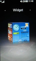
The sides of the cube are the homescreens
The Shortcut homescreen is well known since the LG Cookie and LG Prada2. The empty space can be populated with various shortcuts for different apps. But given the wonderful main menu, we are not sure this screen is all that necessary.
The Widget homescreen offers a bunch of widgets we've seen before in previous LG or Samsung handsets - there's the analog clock, calendar, world time, WeatherBug, games, FM radio, memo, and a calculator.
The messaging widget you see on the top of the widget screen is a new addition. It gives you quick access to the voice, text or email features, as well as a log of new events in any of the above categories.
The third Cube wall contains the Contact homescreen, where you can assign photos to various contacts for quick access to their numbers and SMS/call options. They are displayed on a rotating reel, similar to how the fourth multimedia homescreen is filled with pictures and songs. All the reels are touch-optimized and on some occasions are very quick and efficient.
Most of all though, these 3D simulations throughout the interface are just there for the sake of good looks rather than any practical purpose. We find the Contact homescreen the most appropriate for a homescreen and in fact many users prefer it, while the Multimedia and Shortcuts seem to be there just for the sake of completing the four walls.
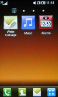
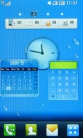
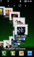
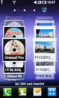
The four homescreens - Shortcuts, Widgets, Contacts and Multimedia
Still, no matter which homescreen you choose, the UI never skimps on eye candy - smooth animations, reflections, 3D spatial effects, motion blurring - it's all there for your viewing pleasure. And better still - the 3" WVGA screen makes sure the image quality is exceptional.
Snow-white main menu
The LG Crystal main menu is accessible via the dedicated shortcut on the home screen. LG have opted for a layout of four rows of menu items that are scrollable horizontally. In this way almost all menu items are accessible simultaneously without switching tabs, as it used to be on previous LG touch handsets. Turning the phone sideways, the auto-rotate kicks in listing all menu items with smaller icons fitting the screen perfectly with no need for scrolling (but with no text labels either). This time the menu theme is white by default, with circular thumbnails reminiscent of bubbles.
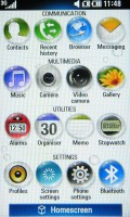
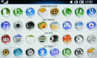
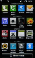
The Crystal main menu in portrait and landscape mode • the old familiar theme
The LG Crystal has the basic task manager that is launched upon a press-and-hold of the Cube key on the handset's left side. This is another way to access the most common features, not just switch between the active ones. The active apps are signified by the respective icon bouncing up and down in a nice animation.
LG decided to extend the basic functionality of the task manager with the "Gesture shortcuts". When you choose this option you'll have nearly 20 predefined shortcut-moves you can assign to different applications in the multitasking menu.
Having touch gestures is a very useful option for starting the applications you use the most, not to mention it looks extra cool (in a geeky way) to start applications with gestures instead of just pressing an icon. Bear in mind that the gestures are recognized only when they are made on the glass keyboard. On the screen they will not work, but that's understandable because every move on the homescreen will be recognized as a swipe and will automatically scroll to the next one.
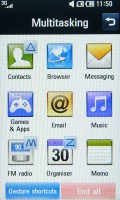
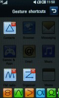
Pressing and holding the Cube key launches the multitasking menu • gesture shortcuts
If you want to see how gesture control works, check out our hands-on video.
Multitasking is limited - only two applications can run at a time and Java apps interfere with other apps. For example, with a Java app running in the background you won't be able to turn the Radio on.
Tapping the Status bar at the top of the screen launches a semitransparent menu that can be used to toggle Wi-Fi and Bluetooth on and off, change profiles and view recent events.
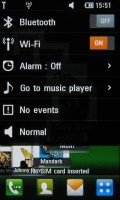
Easy access to common settings
Unfortunately, this connection manager menu is available only on the homescreen. It would have been handier if it was usable throughout the interface - the way it is in the Android OS.
Reader comments
- Dika
- 27 Jan 2012
- Iaq
I bought last year bought from Mongolia. So now my phone when calls ringing have problems screen wasn't working. crystal cover is broke very easily droped. So also these style is very rare out. So what should i do and where i buy these phone agai...
- ken
- 23 Dec 2010
- fsR
have same problem and i took it to lg repair store who want to upgrade it